HOME | DD
 EricLinquist — First Digital Inking Job

Published: 2010-10-05 13:03:32 +0000 UTC; Views: 1150; Favourites: 8; Downloads: 46
Redirect to original
Description
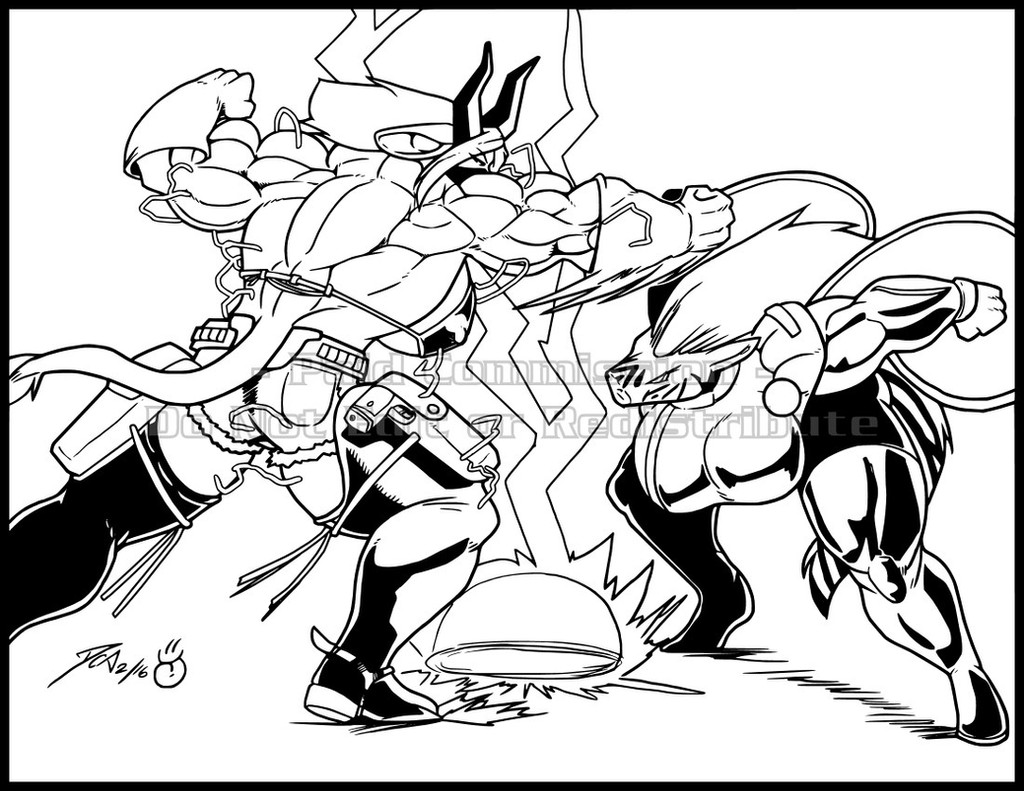
Artists are responding to my requests for an inker to partner with and I couldn't be happier about that. It also seems to have spurred some DA denizens to ink some of my more recent pencils with great results!During one exchange with Jonathan Price aka Dualmask , who turned in this digital inking job [link] just for practice, I got motivated to try and learn for the first time how to ink digitally!
This is my first digital inking effort ever. The piece was from Toink Wright aka Battlereign who won the last ANGEL CORPS pencils contest I ran! I loved it so much and had always wanted to ink it, so I figured, "Let's Go!"
It depicts my man Crossfire fixing to throw down with the deadly evil alien Axxus K'Tahn! I liked the composition of them squaring off so much that I edited out Charger and the backgrounds and let the looming tension just fill the page! Plus, yes, I was tired from all the wild detail!
This is all Photoshop and I didn't use the pen tool handles for smooth curves even once but intend to get on top of that on my next piece!

Related content


Comments: 22

For a first time, this is way, way better than anything I've done so far. You should be proud.
It's not really my place to say, but I think some of the lines are a bit thick and some of the shadows make it a bit difficult to figure out the figure, but than again I'm not really cut out for criticizing.
 (Smile)")
")
👍: 0 ⏩: 1

I think you're right there. Ideally the inked image should be discernable before the colors get added, but both figures seem to demand heavy line weights: Axxus because he's a big ol' massive monster, and Crossfire because he's looming large into the foreground. Guess I'll figure this stuff out as I get better! Thanks!
👍: 0 ⏩: 1
Not a problem. I had difficulties on my first job too (though my issues there were a lot more problematic). BTW, how do you do your coloring? I've been planning to try color, and I have no clue where to begin...
👍: 0 ⏩: 1
I searched around and found a Photoshop tutorial a long time ago that explained how to set it all up. I'll see if I can find you a link or, it should be easy for you to search and locate one on Google.
👍: 0 ⏩: 1
Alright, thanks. It might not be as effective though since I use GIMP for my digital work.
👍: 0 ⏩: 0

Looks pretty good! But you should be more careful about line weights the next time... the monster should be done using thinner lines! The panel is not 100% readable at first sight, unlike the pencils.
But I know how hard that is to do on the first few tries, anyway
 (Wink)")
👍: 0 ⏩: 1
Valid point, Cristian. No excuses, but it was tough because Axxus K'Tahn is a much more massive figure, generally demanding thicker line weights while Crossfire, though not massive, is looming bigtime in the foreground, which also tends to dictate heavier line weights because he's closer! I wonder if it would be worth it to lasso Crossfire and "expand him" to thicken all his line weights in the foreground (or alternatively, "shrink" Axxus" to lighten his). Either way, maybe good colors should help establish each character's planes. We shall see. 
")
👍: 0 ⏩: 1
Another thing you could easily do is lowering the opacity of the creature, or adding a blur... that would make the foreground figure look more like... a foreground figure
👍: 0 ⏩: 1
Hmmm....terrific tips man! Thanks!

👍: 0 ⏩: 0

I like the look you pulled off here. It has a more natural feel to it than my approach, probably because I use the pen tool for most of the major curves (I only do really small details with the stylus in hand, like hatching, etc.). My hand just isn't steady enough to go over a drawing with the brush alone (digitally or otherwise), if I could do that, I'd be inking with nibs and india ink.
Nice work!
👍: 0 ⏩: 1
Major thanks! I went over stuff a lot! Hope I can master the curves soon as that piece is not coming easy! More to come, man!
👍: 0 ⏩: 0

Nicely done!
I've tried my hand at digital inks, but couldnt pull it off, so I know this is not an easy task! I'll stick with my nib and brush
👍: 0 ⏩: 1
Thanks, buddy! The more I learn about digital inking, the faster and better I think I can get at it! If I suck at it, I can always go back to the Pigma Sakura markers! lol!

👍: 0 ⏩: 1
I think everyone has thier own style, and should go with it!
This is way back....my feeble attempt in manga studio.. [link] It was making me sick, haha, so forced myself to stick with traditional.
👍: 0 ⏩: 1
Oh my. I see what you mean! Looks like your path ultimately paid off for you so far!

👍: 0 ⏩: 0

Thanks Rod. This way of inking seems to have some real potential. Feathering can be perfect, mistakes can be corrected, no mess, can create fine detail. Have to learn all the tricks though. I'm far from fast at it...yet!
👍: 0 ⏩: 0

Wonderful job.
A good inker is a valuable asset to an artist.
I'd give my right arm for one! (but then I wouldn't be able to draw)
👍: 0 ⏩: 1
Thanks, Eric! Keep that right arm though!

👍: 0 ⏩: 0

That's pretty sweet. I normally work by ink and brush. Maybe I should convert.
👍: 0 ⏩: 1
Thanks, Tyler! I normally used Pigma Sakura markers and/or rapid-o-graphs. Now, at least, I can use both if I have to or move exclusively to digital! Tried brushes a few times - very challenging!

👍: 0 ⏩: 1
Yeah, they're hard. I'm still trying to get the hang of it. I have some prismacolors and Pigma Sakura markers but aesthetically the brush looks better to me because it feels somewhat more organic.
👍: 0 ⏩: 0