HOME | DD
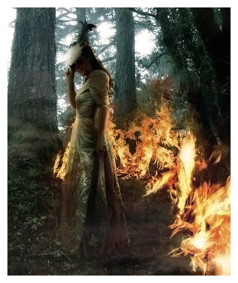
 ErikShoemaker — Firebug
Published: 2008-02-05 18:39:14 +0000 UTC; Views: 2842; Favourites: 41; Downloads: 77
Redirect to original
Description
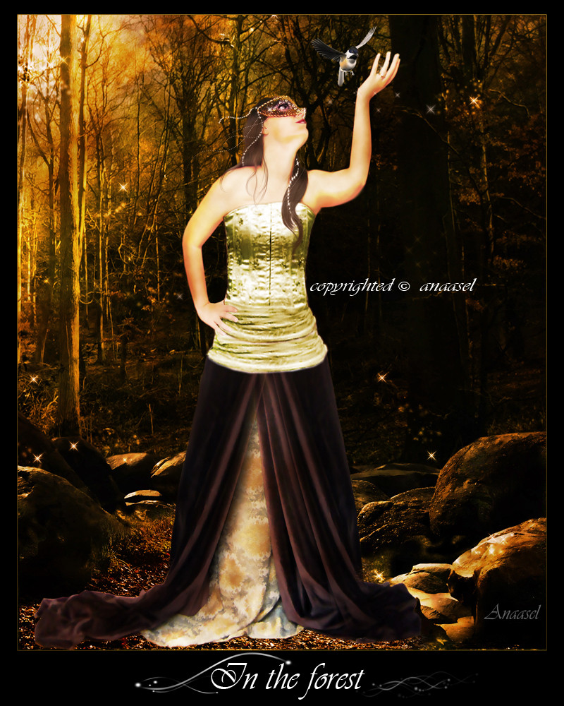
Euhh I don't like it that much, dunno what it is that bugs me... I had a lot of problems with the colors this time and the bg looks kinda lq :/So I'll probably move it to my scraps, but at first I wanna hear what you guys think about it.
It's my entry for the 4 Elements Contest: [link]
Of course my element is fire
 (Wink)")
credits
Misty 3 by ~SephirothXer0-Stock
Masquerade 16 by *PhotoStockMarket
firepack 1 by =shutupandwhisper
Hair Brushes by *ro-stock
Hair Brushes Pack 01 by ~gorjuss-stock
Assorted Brushes by ~xyunaxfantasiesx
Star Brushes by ~Rabieshund
Related content


Comments: 55


it's a great idea and the work is really good, maybe the problem is the light

👍: 0 ⏩: 0


it looks cool, i just don't think the stock, bg and fire go together.
👍: 0 ⏩: 0

es ist richtig geil !!^^ aber die farben sind nicht so toll =O
👍: 0 ⏩: 1

Your great piece is featured here: [link]
(this is a copy/paste message)
👍: 0 ⏩: 0


Looks pretty nice already.
As to what bugs you, I guess it's the trees. If there's fire at the bottom, they should have orangeish lighting, not the whitish/greyish they have at the moment. Also, the very bright sky may be a bit disturbing. Maybe, a different sky might help as well.
As it's fewer work, I'd first have a try at the lighting though.
👍: 0 ⏩: 1

maybe I try to work on the lighting again, thanks for your constructive critisism!
👍: 0 ⏩: 1

nice work yet theres a lot of coverups like in the end of her dress .. i like the fire though nice work u did with the lines
👍: 0 ⏩: 1


awesome! it looks great ")
👍: 0 ⏩: 1
thanks, glad you like it! That cheers me up a bit
👍: 0 ⏩: 0

thanks, glad you like it
👍: 0 ⏩: 0

hmm, I think it's really awesome looking  (Smile)")
👍: 0 ⏩: 1
I thought about that too, but it was hard to execute... thanks for your suggestion though!
👍: 0 ⏩: 0


sieht super aus aber i was stört mich kann aber nich sagen was
but..GREAT JOB^^
👍: 0 ⏩: 1


sagt der richtige
👍: 0 ⏩: 1
wdnv? nbavjlvbrawerhjblajerhiuawe!!!111111
👍: 0 ⏩: 0


sieht gut aus, is aber nicht so über geil wie deine anderen. (is auch schwer zu toppen
das helle, durch die baüme scheinende, licht passt meiner meinung nach nicht so gut rein und "beisst" sich mit dem feuer, weil man 2 sehr helle lichtquellen hat. vielleicht ist es das, was dich "buggt"
👍: 0 ⏩: 1
joa, danke schon mal für die Kritik, mal sehen ob ich noch was änder^^
👍: 0 ⏩: 0
AvatarStyles [2008-02-05 18:57:07 +0000 UTC]
Yea man das ist vol hammer geworden, das feuer passt volll gut
👍: 0 ⏩: 0

schaut eigentlich ziemlich gut aus..
aber finde auch das iwas in der gesamt optik nicht so stimmt.
kann dir abe rnicht genau sagen was aber momententan stört mich das feuer links also der anfang davon ein bisschen
👍: 0 ⏩: 1
joa danke, mal schauen ob ich noch was dran änder ^^
👍: 0 ⏩: 0

really, I was made an impression with the efect of this image, awesome!
👍: 0 ⏩: 1

ich finds super cool, auch wenn manche Übergänge irgendwie.. naja sind, aber all in all its pretty cool
👍: 0 ⏩: 0

Uhh schick^^...Hattest aba schonmal bessere^^....
👍: 0 ⏩: 1
| Next =>