HOME | DD
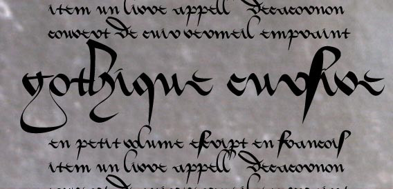
 Errance — Gothique Cursive
Published: 2006-05-22 14:26:07 +0000 UTC; Views: 30971; Favourites: 215; Downloads: 9965
Redirect to original
Description
This is the fist part of this font, just the lower case letters, no punctuation & numbers.It was inspired by a 1413's manuscript.
The final font will be an opentype one, with ligature, final letters, etc but I've a lot of work to do to finish it.
 (Smile)")
It's difficult to read & the "s" look like the "f", don't worry, it's normal.
Related content


Comments: 37


Many thanks for getting this far with the gothic cursive font. I could still wish for additional variants of r and v, among others, and less peculiar and/or more typical numerals. But what is really needed is the "combining diacritical" and similar characters that support the tradition of Latin abbreviations (many of these traditional abbreviations were carried into French scripts as late as the 17th Century and perhaps even beyond). Most of the required symbols are already defined in the Unicode standard, thanks to MUFI (www.mufi.info). Why is there a need for such a font? It is extremely difficult to discuss Latin and French paleography without a font that actually resembles the manuscripts! At least it is possible to come a little closer to that goal, using 1413 Cursive for the text and borrowing some of the diacritical marks and abbreviation signs from other fonts. I hope you will be able to extend this font!
👍: 0 ⏩: 1

I've looked the Mufi documents, but it contains a lot of characters. It'll take a lot of time to do that. If you can list the most important missing characters, I can add them.
Once I'll do them, I may work on the less important ones.
👍: 0 ⏩: 1
A tall order, because there are so many abbreviation signs in common use during the period where the gothic cursive scipts were fashionable! But I'm working on it! My guess is that about half a dozen additional letter variants and maybe a dozen "combining diacritical" forms and other symbols would do the trick. I'm collecting examples of these from 15th Century manuscripts from French-speaking Switzerland.
👍: 0 ⏩: 1
Some first steps: I have posted a table of the signs that I have encountered, with examples of most of them, at [link] . (I will update this table as I collect more information.)
Also, I have posted an interesting document from 1417, half in French, half in Latin, containing typical abbrevations signs in each language, at [link] .
👍: 0 ⏩: 0

I am nuts about (french) medieval hands, esp. about "civilite" type of letters
Thanks for this, great work
👍: 0 ⏩: 1
I hope one day I have time to do another typo like that..
👍: 0 ⏩: 0


Hope you like what I did with this font!
[link]
Yes, it's a real one ")
 (Wink)")
Thanks for making it!

👍: 0 ⏩: 0


Ta police est splendide. Vraiment magnifique. J'espère que tu réussiras aussi à faire les majuscules, parce que ça rend vraiment super bien dans Word. Alors avec les majuscules, wouhou!!! La gothique cursive est ma préférée, c'est aussi la plus dure à calligraphier à la main je trouve, car elle est moins précise que les autres. Je n'ose même pas imaginer le boulot pour en faire une police -__-
Bon courage, en encore bravo pour ton travail.
👍: 0 ⏩: 1
Merci ! Je pense que tu vas être content, j'ai presque fini les majuscules en fait. Je m'y suis remis il y a quelques mois & là, j'en suis au "V", mais il me reste encore à raccorder les lettre proprement, ce qui va prendre du temps. Mais peut-être que dans une semaine ou deux...
👍: 0 ⏩: 1
Waaaaahhh c'est super!!! J'ai installé ta police sur mon PC et j'avoue que c'est super joli. Bravo pour le boulot, ça doit pas être rien, j'ai jamais essayé mais j'ose à peine imaginer le temps que tu y passes. Bon courage, et encore bravo!
👍: 0 ⏩: 0

Sorry...
Do what you want with it (exept commercial use), if you put your work on DA, send me the link please, I like to see what the others can do with my font.
👍: 0 ⏩: 1

Hey. I liked your font, and I used it a little bit in this piece. Hope you're ok with that. [link]
👍: 0 ⏩: 1
No problem, thanks a lot.
I like to see what people do with my work.
👍: 0 ⏩: 0


i like it. great. i am not sure, but i think it is "f" which is fater than the other letters. that's great. (i hope you know that "f" an the "long-s" don't have exactly the same shape!)
👍: 0 ⏩: 0


I've wanted fonts like this for a long time. Thank you!
👍: 0 ⏩: 0

Wow, great font
👍: 0 ⏩: 0


A really nice font! Thanks for sharing it. Your other stuff is very beatifull to! So nice infact that ill +Watch you!
👍: 0 ⏩: 0

I don't speak French, but I am about to download it.

👍: 0 ⏩: 0

beautiful beautiful. I'll definitely download this font. reminds me of sleepy hollow.
👍: 0 ⏩: 0

Wow, elle a l'air top, je vais l'essayerpour voir (en plus, la gothique cursive : ma préférée !!
Merci Errance
👍: 0 ⏩: 1
Elle est encore moyenne, j'ai du boulot à faire dessus.
👍: 0 ⏩: 0


AAAAAAAAAAAAAAaaah c'est une police en fait ^^
Je peux l'implémenter sur mon PC ?

👍: 0 ⏩: 1
Oui oui, c'est une police & tu peux l'installer.
👍: 0 ⏩: 0

Pas mal dis donc
👍: 0 ⏩: 1
C'est vraiment pénible... pour un premier essai, j'aurai du prendre plus simple.
Je dois faire en sorte que toutes les lettres se lient ensembles, donc il faut tout vérifier, lettre par lettre.
👍: 0 ⏩: 0