HOME | DD
 Errance — Gothique Cursive V.II

Published: 2007-08-12 20:54:26 +0000 UTC; Views: 92601; Favourites: 438; Downloads: 30692
Redirect to original
Description
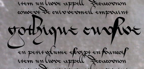
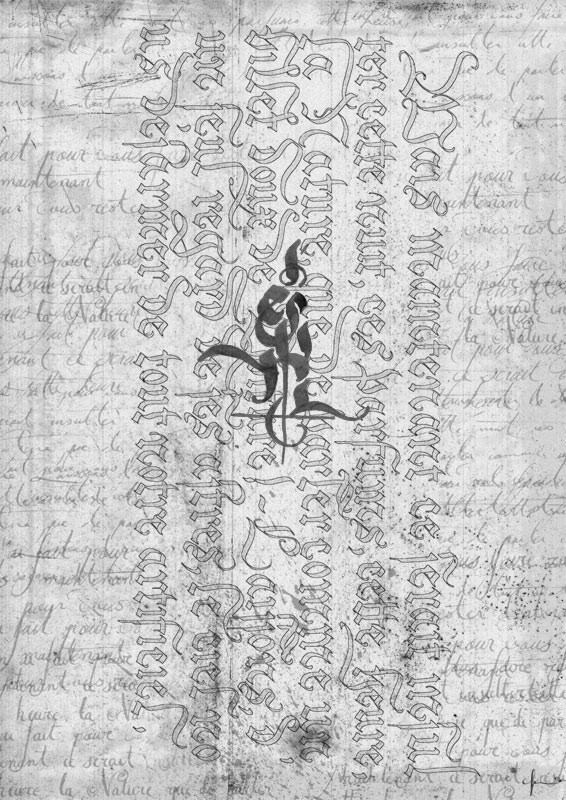
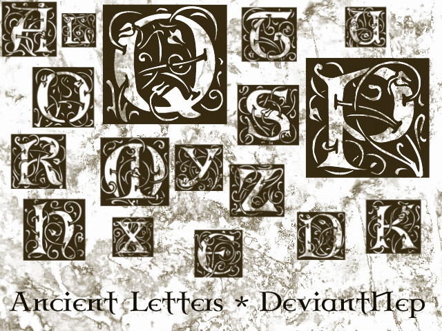
This time, it's the complete font, but not the final version. I need to improve some glyph.But this font includes opentype feature, the red caracters on the picture. With an appropriate software (like an Adobe one : Photoshop or inDesign), you can activate OpenType fonctions. So the final "s" is not the same as the inside "s", "de" is a special glyph & the letter "e", "t", "n", "g" & "y" are different when they ended a word.
Please tell me if you do something with, I really want to see it.
 (Smile)")
No commercial use.
Cette fois, je suis presque au bout, même si certaines lettres ont besoin d'amélioration.
J'ai ajouté des fonctions Open Type qui fonctionne avec des versions récentes de Photoshop par exemple, cela permet d'avoir des lettres finales & des ligatures.
Par exemple, le "s" final est différent du "s" dans un mot, de la même manière que "ss" s'affiche encore légèrement différemment. D'autres lettres possèdent aussi des terminaisons spéciales quand elles sont en fin de mot, comme le "y" ou le "n".
Bref, à terme, cette police pourrait simuler plus précisément l'écriture avec plusieurs variantes pour certaines lettres.
Pas d'usage commercial svp.
Related content


Comments: 86


Je suis tombée amoureuse de cette typo.
J'étais en pleine recherche pour mon futur tattoo quand je suis tombée dessus.
Je suis simplement déçue du résultat pour certains mots, qui font un peu brouillon et qui du coup sont un peu difficile à comprendre, mais tout ça ca se retravaille
👍: 0 ⏩: 0


This deviation has been chosen as a feature of the week
on *Word-worth-1000-pics which is a community project
promoting visual art deviants
It has been found from the word : "WORDS " 


👍: 0 ⏩: 0


Ugh, I think I'm missing a step here... I download it, and it opens in Window's Font Viewer, and I am unsure how to get it to become usable. If someone would be so kind..?
Much thanks

👍: 0 ⏩: 1

Open up the C drive and search for the title of the font; it'll come up with the file and you can move that to the fonts folder.
👍: 0 ⏩: 0


thanks for this amazing font, used it here
[link]
[link]
[link]
[link]
👍: 0 ⏩: 0


Hi! I used one letter of your font here [link]
👍: 0 ⏩: 0

This font is so crazy! But i like it. :]
👍: 0 ⏩: 0

umm i feel foolish asking this but how do you add this font do ps i downloaded it and i have it saved but how to i take it from the folder on my desktop to ps?
👍: 0 ⏩: 0


phenomenally gorgeous font
please keep them coming.
you are one hell of a fontographer
👍: 0 ⏩: 0

fantastique, j'arrive pas à tout lire mais c'est tellement agréable à la vue *_*
je te donne credit si je l'utilise

👍: 0 ⏩: 0


Very nice work. I used your font for my work, take a look: [link] Thank you.
👍: 0 ⏩: 0

mmmm il fort possible que je fasse un essai avec
👍: 0 ⏩: 0

Totally awsome font! Definitely going straight into my fonts folder! Thanks a bundle!
👍: 0 ⏩: 0


This font looks amazing...cheers for sharing your work
👍: 0 ⏩: 0

Ahhh, magnifique, vraiment du beau boulot!!! J'adore, c'est vraiment un boulot fantastique!

👍: 0 ⏩: 0

ah parce que c'est pas fait à la main? c'est photoshop! wow, ils peuvent faire du bons boulot, ces mecs-là, quand ils veulent!
en tout cas, c'est très beau à voir, ce rouge et noir.
 (Wink)")
👍: 0 ⏩: 1

Hé non, c'est une bête police d'écriture faite maison
Donc ça marche aussi sur word & sur tous les logiciels. Le rouge représente les fonctions opentype (qui est une police d'écriture plus avancée que les classiques), qui change automatiquement les lettres en fonction du contexte (en rouge l'opentype, & à droite la police sans les fonctions activées).
👍: 0 ⏩: 1
hmm... very technique tout ça. Moi je trouve juste que ça rend bien!
")
👍: 0 ⏩: 0


Vraiment superbe à la vue. 
👍: 0 ⏩: 0
<= Prev |