HOME | DD
 Errance —
Johann Hering's calligraphy
Errance —
Johann Hering's calligraphy

Published: 2012-02-22 22:01:03 +0000 UTC; Views: 22926; Favourites: 610; Downloads: 90
Redirect to original
Description
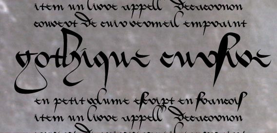
Gothic Fraktur (XVIIe) on laid paper with ferro gallic ink & gouache.Text size : 21*15cm.
Reproduction of the Calligraphic Writing Styles by Johann Hering.
Related content


Comments: 93

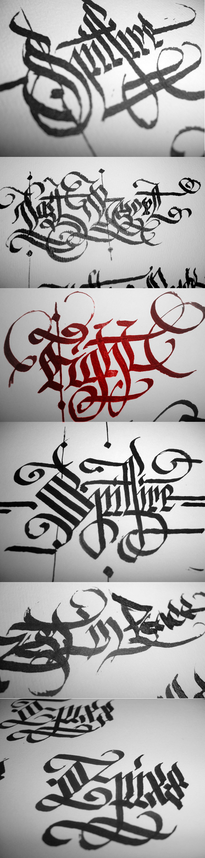
I use a metal quill (brause) & traditional iron gall ink (that why the black fade, I take centuries to be completely black). The more thinner line have been done with brush.
👍: 0 ⏩: 1

That is so nice! I've never learned how to use a quill but would love to learn. If you see any of the text in my pieces, what I've done is faintly write the text by hand then use a brush to fill in the letters. Of course I keep getting asked if I'm using ink but the entire time I'm using watercolors.
👍: 0 ⏩: 1
You can use watercolors with a quill, you can have good results with it. I think it's a lot longer to draw the letter than to write them.
It's never too late to learn to write with a quill, you just need little practice.
 (Smile)")
👍: 0 ⏩: 1
Aww thanks for the info! I'll keep that stuff in mind the next time I decide to go ahead and do a written piece. ^_^
👍: 0 ⏩: 0

I ams eething with envy right now, my writing is barely legible let alone as stunning as your work!
👍: 0 ⏩: 1
My real writing is not easy to read too.
 (Wink)")
👍: 0 ⏩: 1


aussitôt posté aussitôt une daily deviation ! bravo
👍: 0 ⏩: 1
C'est parce que je suis trop fort. ^^
👍: 0 ⏩: 0

Congrats on the DD! I really love the flourished capitals - it's so hard to do even when based on a model!
👍: 0 ⏩: 1
It took me a lot of time to do this one, I love them too but it's so long...
👍: 0 ⏩: 0


Beautiful handiwork, truly. I just can't read what it says.
👍: 0 ⏩: 1
The important thing is not the text, so don't try to read
")
👍: 0 ⏩: 0


Belle réalisation. Je sais comme il est difficile de faire de belles courbes nettes, et c'est pas si mal. Bon, faut pas se coller trop près de l'écran, mais franchement elle fait son petit effet. Allez, je critique, je critique, mais j'avoue que pendant ce temps je ne produis pas grand chose.
Ca fait vraiment plaisir de voir des trucs nouveaux dans ta galerie en tout cas!
👍: 0 ⏩: 1
L'effet global est correct, mais de près, j'avoue que la calligraphie est nase & les courbes pas parfaites. En fait, j'ai pris un papier semi-historique avec des vergeurs, donc pas lisse du tout, ça a pas mal faussé mes traits. Mais pour une fois, je suis quand même satisfait du résultat & c'est très très rare que ça soit le cas.
Il faut que je continue de m'entrainer.
👍: 0 ⏩: 1
Un peu qu'il faut que tu continues à t'entraîner, tu feras des merveilles à force. Et bravo pour la daily deviation!
👍: 0 ⏩: 0

Really like the design, very beautifully done. I love the detail. The only flaw I could find with it was the difficulty I had in reading it. Other than that, amazing!
👍: 0 ⏩: 1
For me too it's difficult to read
But the most important think is the beauty of the letters in this case, not the text.
👍: 0 ⏩: 0

This is a great work really. The fine lines look very accurate and your writing is excellent. The layout looks good from afar, however, it is not easy to read. I know that there are different opinions about it, but personally, I prefer a clearer design which is readable without too much thinking. Anyway, nice job!!!
👍: 0 ⏩: 1
I agree with you, it's really difficult to read now, but 5 centuries ago, it was not a problem.
When I do a calligraphy like this one, the readability is optional for me, the most important think is the harmony & the beauty of the letters.
👍: 0 ⏩: 1
Yes, it definately depends on how you see typographic art. For me, the text should be presented in the most beautiful way, but still the contence should be clear. If you say it is allabout beauty, you are also right. And in this case I have to repead my first statment: It is really a beautifully balanced work.
👍: 0 ⏩: 1
But the main difference is that is calligraphy & not typography, each work is unique & there is not way to do exactly the same. Calligraphy can be totally abstract.
It depends for what & for who it is done.
👍: 0 ⏩: 1
Sure, you're right. Maybe we can say the following...if you want to present a text, you should do so. If you want to present callygraphy, you are totally free in everything you're doing!

👍: 0 ⏩: 0


i like this a bunch.
question: my calligraphy ink smears all over the damn place. there is some variation depending on the surface (i.e., it smears incredibly easily on natural vellum, and only somewhat on bristol board). am i just using crappy ink, or is this an endemic problem for all calligraphy? if so, how do you deal with it?
👍: 0 ⏩: 1
I think your ink is crappy.
On natural vellum, you can use iron gall ink or extra-fine gouache.
On paper, any ink should work, bristol board may be to smooth, most on my works are aquarelle paper.
Always wash your quill after you use it.
👍: 0 ⏩: 1