HOME | DD
 Essai — Andrei and Princesse Colored

#rockman_zxa #capcom #fancharacter #livemetal #biometal #fan_character #megamanzx #rockmanzx #megaman_zx #megamanzxadvent #rockman_zx #rockmanzxadvent #megaman_zxa #rockman_zx_advent #megaman_zx_advent
Published: 2019-05-02 21:41:01 +0000 UTC; Views: 4712; Favourites: 150; Downloads: 15
Redirect to original
Description
*Edit: First round of fixes.
*Edit 2: More shading and a lot more fixes.
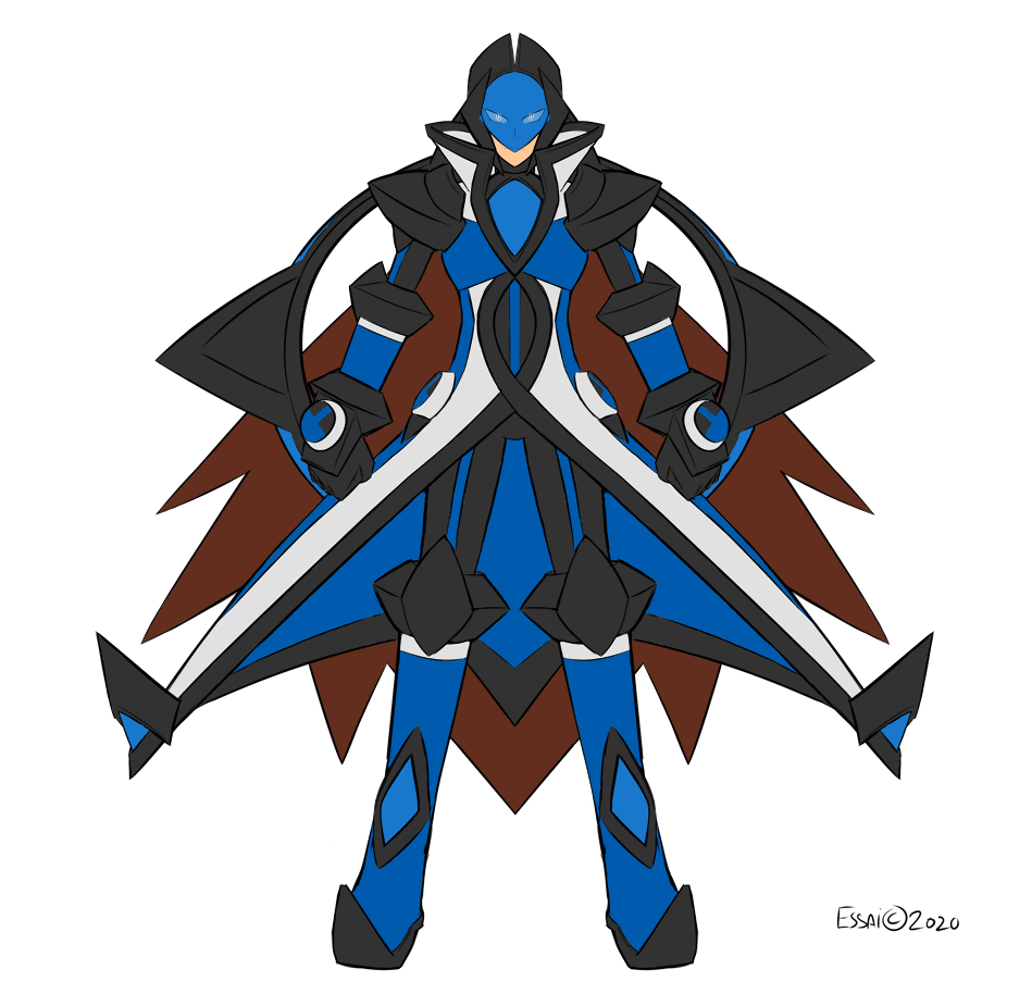
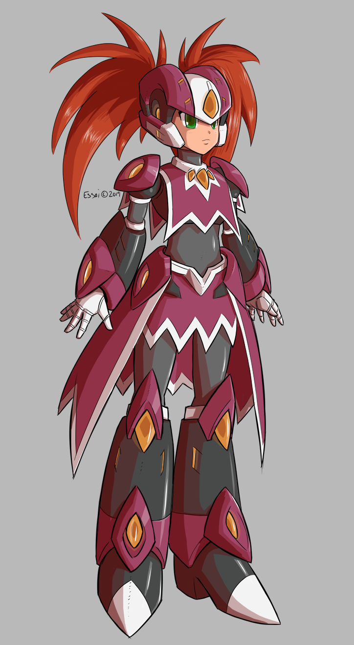
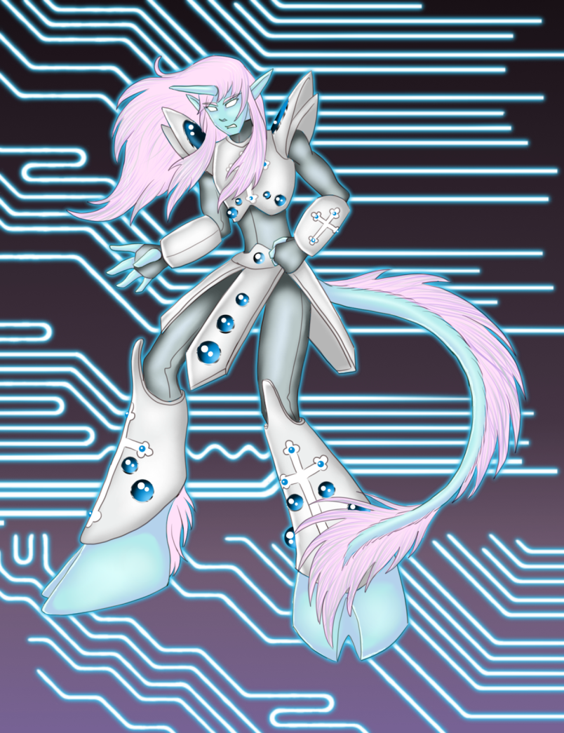
I think it's done. My friend and I's ZX OC's, Andrei & Model E and Princesse and Model S.
Original: www.deviantart.com/essai/art/A…
Intuos Pro, SAI 2.0 Beta.
Megaman ZX / Rockman ZX is © copyright to Capcom.
Andrei & Model E(ssai) is © copyright to me.
Princesse & Model S(ymphony) is © copyright to fortissimo .
Related content


Comments: 9


the Zero/ZX series were never a style that struck my fancy (I was a fan of the 'big boot' stuff, personally) but I really like these designs.
Of course, your usual style and flare always adds that extra polish. They both give an aura of power and elegance, with Princesse having just a modicum of delicacy that belies her prowess. A 'lady of war' if you will.
👍: 0 ⏩: 0


Amazing, Simply they are Gorgeous designs and i like them, From the shading to the Color Palettes! I wish i could Draw like this, Im sure i will one of the days in the Future. Keep up the Good Work Essai!
👍: 0 ⏩: 0


Interesting stuff for sure. Tho I'd say the guy looks a lot better than the girl. Like he stands out the most, the girl doesn't have a bad base but like there are a few things here and there that seem to contribute to her losing spotlight. Some of the lineart and shading is notoriously more simple done (the hand holding the gun is a good example of it looking too "basic"), the face is awkward and feels dimensionally flat.
Her design is fairly neat in concept, tho I think and as I've been learning through trial and error that there is some artwork that GREATLY benefits from doing away with fully black lineart, because there are times then black lineart just makes the artwork look dirty. Perhaps a lighter color could do her some justice.
Beyond those things, they look cool, but can definitely be improved.
👍: 0 ⏩: 1

Made some changes based on your feedback. As for their designs I think they compliment each other quite well.
👍: 0 ⏩: 1
They do, but it was my appreciation that the girl wasn't on the same quality level, and I can see indeed that she looks much more clean now.
👍: 0 ⏩: 0