HOME | DD
 etc-etc-etc — 1171

Published: 2006-03-02 09:48:57 +0000 UTC; Views: 858; Favourites: 28; Downloads: 111
Redirect to original
Description
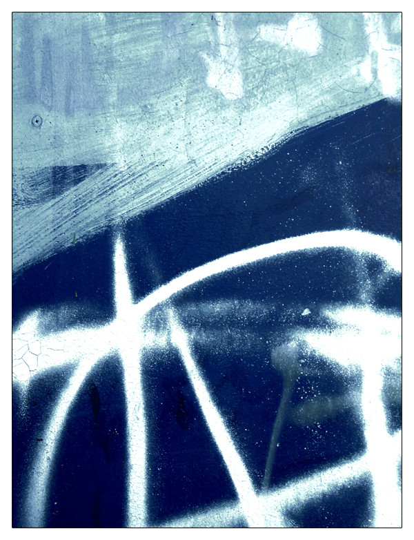
I'm not entirely sure how I feel about this one. It has a few aspects I really like, but it still feels slightly 'off' to me.... not sure why.I'll put it here to see what you kiddies think though anyway
 (Smile)")
Related content


Comments: 21

i don't see anything off about this... the symmetry is wonderful and the writing adds some kind of 'industrial' effect... like it's disturbing the urban symmetry, or something like that.
but blah blah, i like it.
👍: 0 ⏩: 0

I think it works. And well. It works because it reminds you of the ocean and that overrules any tiny tiyn flaws this may have.
At least in my opinion.
👍: 0 ⏩: 0

i love how much it alludes to other scenes than its own.
👍: 0 ⏩: 0

I like it .But I prefer to cut off the blue part ,I think the rest of it works fine separately.
But it`s just my opinion
👍: 0 ⏩: 0
If I try to read your text I am amazed to discover that at at 33.2 years...someone was cuft for cumming 1171 x in public
Seriously though... the edges on this are interesting... not sharp but like a painting.. running and a bit uneven...
Did you see the neat shapes hidden in the blue? possible cool macro just there!

👍: 0 ⏩: 0

I love it man.  (Wink)")
")
👍: 0 ⏩: 0

Not sure about the green slimey stuff...perhaps thats what makes it a little 'off', the greenish colour looks wrong... But the blue looks madhouse, I wish you could have captured some more of that grafiti down the bottom (i assume thats what it is)
Is there a story behind this one? a deeper meaning i've missed?
👍: 0 ⏩: 0

so sophisticated this work...i like the contrast of these colors.
👍: 0 ⏩: 0

I'm actually rather fascinated by this piece....
I'm not sure why.
But it's very umm... attractive?..
I cant think of a better word.
👍: 0 ⏩: 0

Very nice, the restricted colour range and the divisions into different horizontal bands seems to work for me.
👍: 0 ⏩: 0

Nice and simple, love the txt, but dont like how its croped out and has no space.
👍: 0 ⏩: 0

great colors, and also great textures yea.. great shot!
👍: 0 ⏩: 0


I love the subdued tones, and layered-ness of this... I must agreee with what has been said, I feel the crop is to tight for the lettering, which makes it feel as if it was overlaid afterwards.
Nonetheless, this is a very nice one to look at, and keep looking at!
👍: 0 ⏩: 0

it feels off because of the lighting.
my resistance is futile, though.
its got my number.
👍: 0 ⏩: 0

i really like it.
but if your tryign to put your finger on what seems off, it may be that the top part with the lettering looks quite detached from the rest of the dirt and colour below.
👍: 0 ⏩: 0


I am not sure what you mean. Perhaps in your imagination you wanted something different from this. Looking at it with a fresh view, not knowing what you saw in reality, I would say it is finished, as it is. The composition is good, the horizontal shadow in the centre works very well. Maybe the blueish/metally light could have been more white? I think it's a very good idea to express this kind of doubts here. Responses might help you...
👍: 0 ⏩: 0

the blue down the bottom is where it's at  (Cool)")
👍: 0 ⏩: 0

perhaps it's that the text is overly included, not cut out, the 3 is complete, not half in the drawing, so there is a real obvious temptation to see it as a the subject, rather than the whole wall. The text kinda of seems as though it isn't attatched to the picture, maybe...I don't really know what I'm talking about.
But I adore the textures and the coloursin this, I'm so happy to see another piece from you
👍: 0 ⏩: 0

I like it. I like the layeredness.
I wish the M was real though. And not half gone.
It's still brill.
👍: 0 ⏩: 0