HOME | DD
 Eternal-Shadow-S — Predecessor and Successor
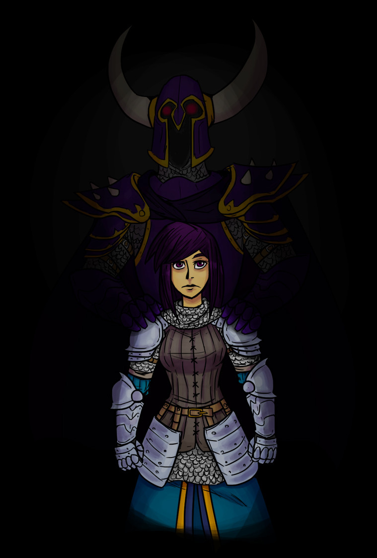
#armor #digitalart #fantasy #overlord #uriel
Published: 2018-08-06 07:49:10 +0000 UTC; Views: 639; Favourites: 20; Downloads: 1
Redirect to original
Description
The main character from the story I've written, along with her Overlord predecessor.Related content


Comments: 11

👍: 1 ⏩: 1

👍: 1 ⏩: 1
👍: 1 ⏩: 0

Hello! I'm from project comment and I'd just like to say first off that this is really cool OwO you did a great job with the armor and the character designs are really cool too, the Overlord looks kinda creepy (That's a good thing!) and Uriel is looking good as well :3
But there are a few things that could be improved, such as:
I think her skirt thingy at the bottom should sort of fade off into the darkness instead of just cutting straight off. Also I know other people have said this but her pose is pretty stiff and square. Also I think you could have done more shading because if it's THAT dark then there's bound to be some pretty intense shading. While I do like Mr. Overlord-guy in this picture you probably could have covered him with shadows if you get what I mean. Here, I made an example.
By the way his eyes are wonky...
But anyways, in my humble opinion it adds a bit of mystery to him (I also made her skirt thingy fade out at the bottom but that's not a huge deal so don't worry about it.)
BUT ALL IN ALL I REALLY LIKE THIS!
You have great potential and your art is really nice to look at ^^
👍: 0 ⏩: 1
Thanks! Had a similar idea to the shadow thing, but thought it looked too dark.
👍: 0 ⏩: 1
Sometimes it works, sometimes it doesn't.
👍: 0 ⏩: 0

I like the composition of your piece, the colors are interesting and the armor designs are cool. I’m not a fan of horns in helmets but in this case gives the “predecessor” a more violent presence, and that’s good. I like that you detailed the mail under the plates and the way you made the plates shows a good understanding of how European armor is made, I like the pose of the predecessor. Your use of lighting is really good, so the characters really pop to the eye with ease.
Some nitpicks:
I think the pose of the successor is a little too square-y? I think it needs a little more dynamism.
The predecessor doesn’t look particularly intimidating, probably if you used a lower angle that could be helped (that’s difficult to do, but it could help).
The successor’s expression is a little too uninterested (not uninteresting, but uninterested in what she’s looking at), maybe a more hopeful or decided expression could give her a more juvenile look, a more dead or angry expression would give her a more dangerous presence.
You did a great job with this, I hope to see more from you in the future, your composition and drawing is great!
Goodbye and keep drawing :3
👍: 0 ⏩: 1
Thanks for all this! For some reason, whenever I get to these kinds of sketches, my work becomes a bit stiff. I get so overly conscious about trying to show their entire body that I forget about perspective and dynamics.
👍: 0 ⏩: 0