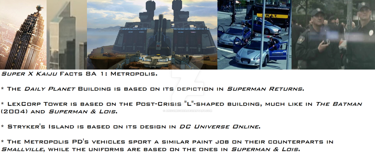
HOME | DD
 EvanBryce — PR Invincible Redesign Final
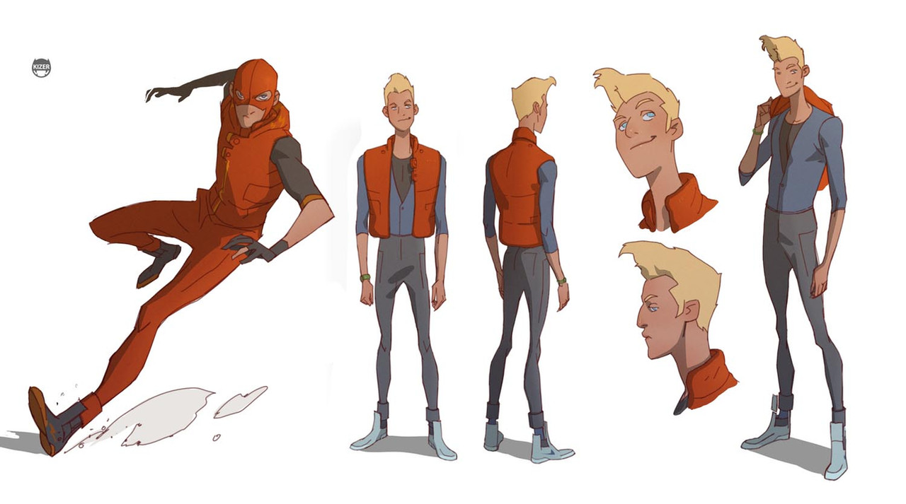
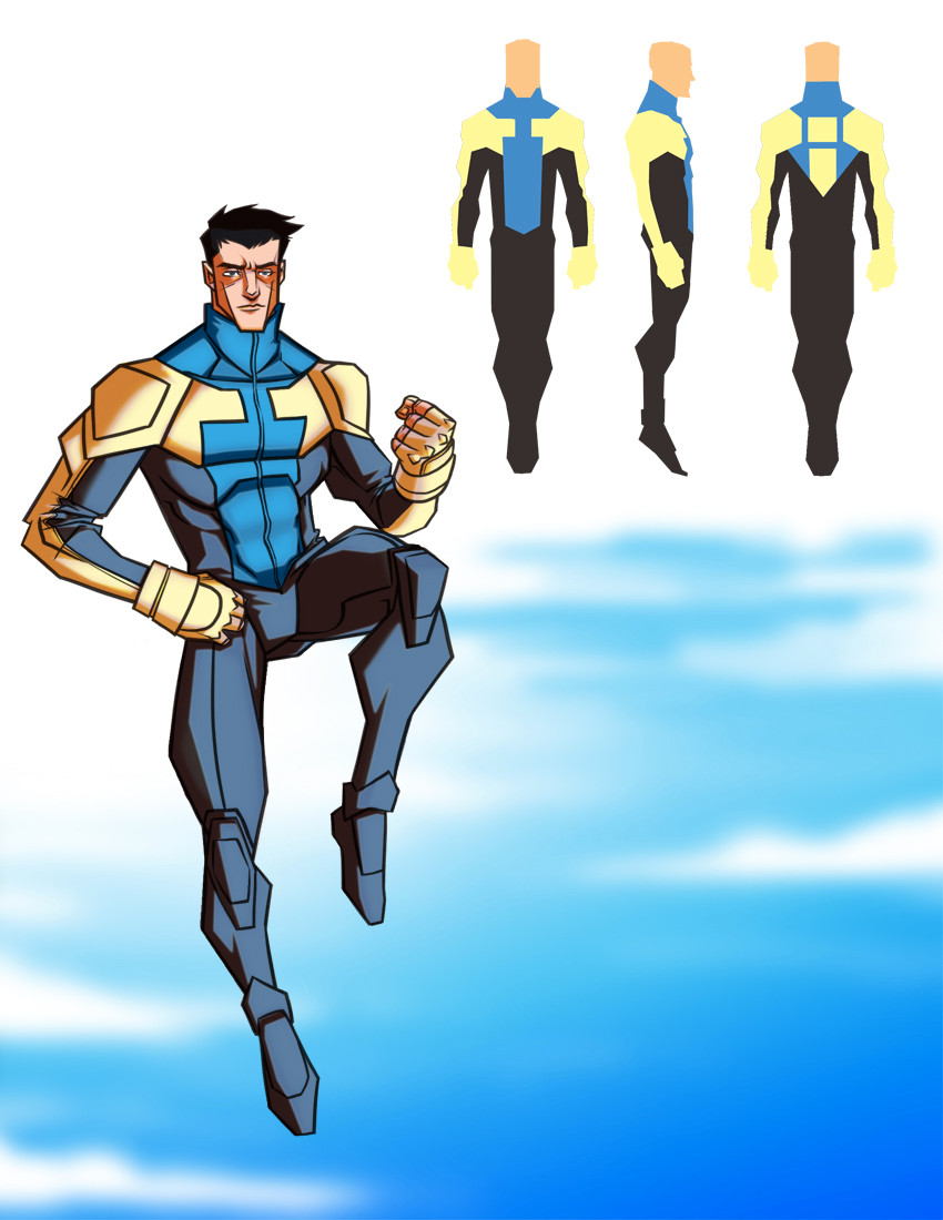

Published: 2011-11-29 01:43:14 +0000 UTC; Views: 2300; Favourites: 39; Downloads: 41
Redirect to original
Description
My finished Invincible re-design that I just sent off!This is the first time I was happy with a submission I sent off to Project Rooftop. I wasn’t going to send anything out, but , , and Ryan Solesbee really helped me have fun first, THEN decide to send it off. Which was most definitely the way to go, thanks again fellas! Check out Jake’s and Tommy’s pieces by clicking their icons! They've got some fantastic designs!
Tumblr made my process picture way too small for most people, so here’s a link to a larger sized (viewable) pic: [link]
Anyway, had a lot of fun with this piece, take a look around Deviantart to see what people are putting together. Should be some interesting entries!
Related content


Comments: 14


I love the shape and silhouette of your figures. They're very fluid.
👍: 0 ⏩: 0

Love it Evan! Feels very much in line with the character and the previous design. This is a winner in my book!
👍: 0 ⏩: 0


Great design, Evan. I love it! I really wish I had done something for this one. Stupid NaNoWriMo.
👍: 0 ⏩: 0


Awesome ! I love the color choices.
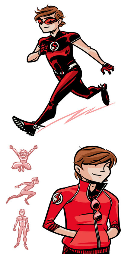
But I keep my advice : the other was cool too.
👍: 0 ⏩: 0


")


I really like this one. It feels a bit more solid for Mark's brother, but I do like that color combo and layout.
👍: 0 ⏩: 1

I agree, I drew him a little more youthful, and the black/red combo is traditionally Oliver's. But I thought throwing in the white, goggles, and "i" formation would bridge the gap a bit. In looking at most of the designs, people went blue/black, blue/yellow/black. Which are traditionally Invincible's colors, so that makes sense. I just wanted to be contrary for the sake of being contrary...also for the sake of the current storyline with Dinosaurus it makes sense.
👍: 0 ⏩: 1
I think it was a strong choice, and I think you and Tommy going with the white definitely makes your designs pop in a way that most of the others don't.
Also, I love the not quite full sleeves. I toyed with that idea for a bit and just couldn't make it work, but I always like it.
👍: 0 ⏩: 0