HOME | DD
 exit82 — stripedVECTOR

Published: 2008-02-29 03:42:40 +0000 UTC; Views: 3008; Favourites: 57; Downloads: 212
Redirect to original
Description
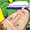
I am not really sure what I was going for here. More playing around/experimenting with new things. Let me know what you all think! (Wink)")
~UpdAte~ Likes this much better. Although I really liked the previous background, it just wasn't working for me. Agree? I think I will throw a image of the first one in scraps, for anyone who wants to see it...
source image found [ here ] / source deviant
Related content


Comments: 25


 (Smile)")

I love how everything merges together.
The color scheme is cute!
Me and my picky-ness. Just two teensy things:
I'm not particularly fond of that little white dot. Is it the mouth? I keep imagining her face to be all scrunched up and puckered with the little dot there. That may be just me, though.
And the little bulge in the right leg? A knee? I don't know, it doesn't look quite right to me. I'm no expert on human anatomy, though.


")
👍: 0 ⏩: 1

The little dot near the mouth is actually a lip piercing. Looking at it again, the knee (bulge on the lag as you call it
👍: 0 ⏩: 0

that is such a good idea!!! i love this piece :]
👍: 0 ⏩: 0

yeah, this bg is much better on the eyes....very nicely done.
👍: 0 ⏩: 0


Oh gosh, that is the coolest vector ive seen in ages! Very creative.
👍: 0 ⏩: 0


^_^ Exit, this is great! This could potentially be a cool wallpaper. Put the girl to one side and extend the stripes to the other. ")
👍: 0 ⏩: 0


It's still cool, but I liked the honeycomb better.
👍: 0 ⏩: 0

this is very fun....a neat idea. but i agree, i think that the top and bottom are a little distracting....maybe even just a solid color would work.
👍: 0 ⏩: 1

amen. solid color or just plain white. Keeping it simple is sometimes the better choice. kinda reminds me of a James bond opening sequence.
those stripes are trippin my balls off
👍: 0 ⏩: 0


The stripes are absolutely awesome! My eyes are having so much fun. Although the top and bottom background are not the perfect match...
Your gallery is great! Btw.
👍: 0 ⏩: 1
Thats kinda how I feel... I am just not sure about the background. I love how everything else came together, but the background has just been getting to me. Might have to revisit this one
👍: 0 ⏩: 1
I'm sure it will be perfect.
👍: 0 ⏩: 0