HOME | DD
 expresso-boy — Progress Shots + Walkthrough Tutorial
by-nc-nd
expresso-boy — Progress Shots + Walkthrough Tutorial
by-nc-nd
Published: 2012-10-16 01:53:59 +0000 UTC; Views: 12947; Favourites: 321; Downloads: 105
Redirect to original
Description
Hi guys. Tutorial/Progress shots time! woooh. Honestly though, I just wanted to upload something for this week. I should be doing another free art but the problem right now is time. Work is consuming my life right now.") Buuuuuut hopefully by the weekend, I'll be able to continue on doing what I need to do: create more art.
Buuuuuut hopefully by the weekend, I'll be able to continue on doing what I need to do: create more art. ")
So yeah... here goes the walkthrough/tutorial. Hope you guys like it.
The whole thing was done using Adobe Photoshop CS4.
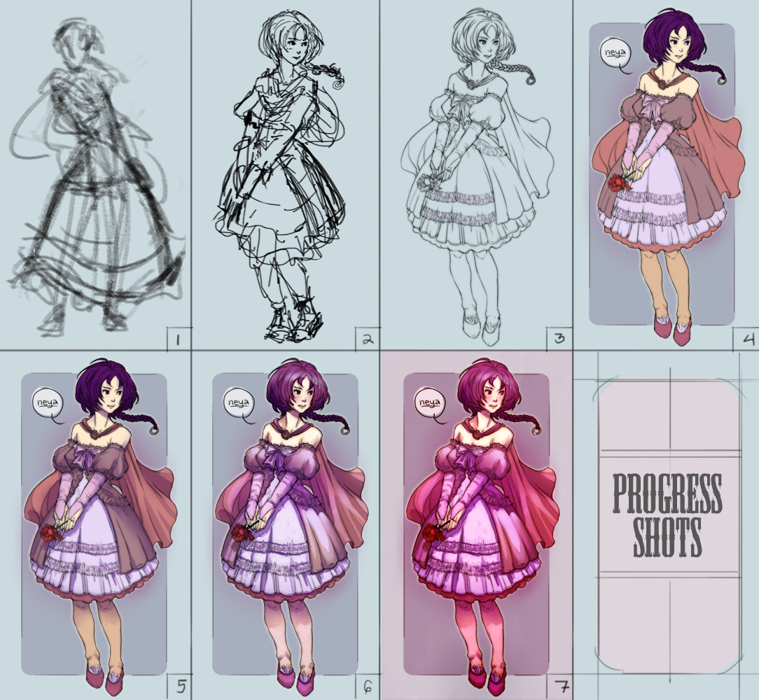
(1) With the default chalk brush thingy in Photoshop set to multiply with a low opacity and flow, I started working on some studies and thumbnails and ended up with this sketch. This will be my initial base for the artwork. Key things to consider here is flow and rhythm. Later on, I decided that the flipped version was better to look at and therefore decided to use that instead.

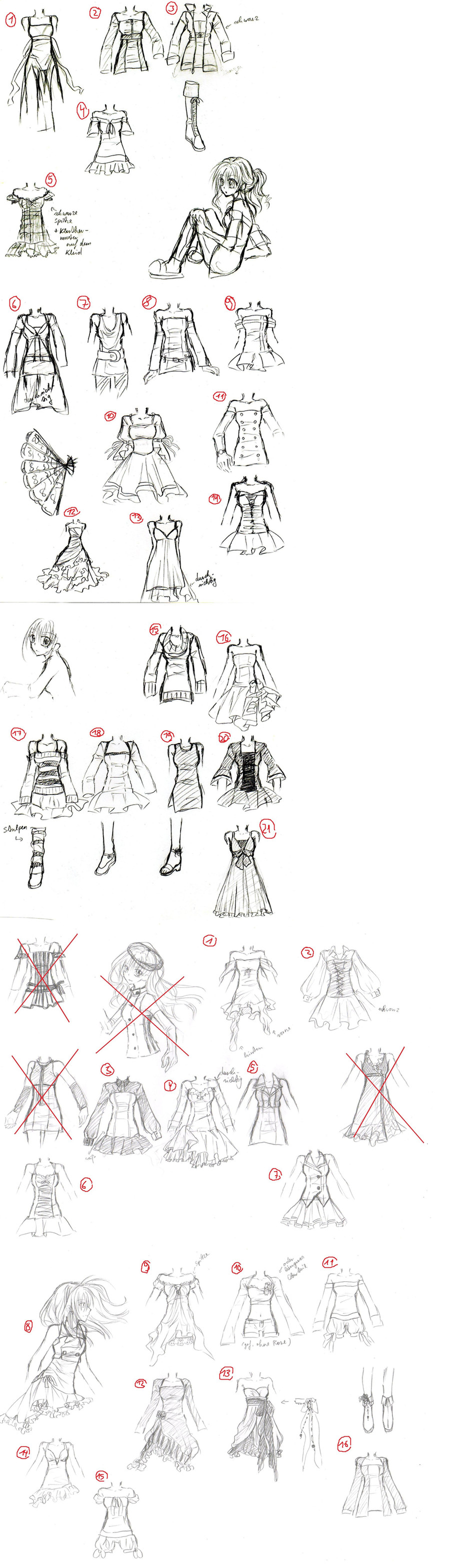
(2) With the base sketch established, I started forming/sculpting out the details in preparation for some tight linework. At this stage, drawing time drastically goes to slowdown mode. I started thinking and researching what suits the character fashion-wise. Since I'm a big fan of dressing up characters for no apparent reason (for real though, I do it to make 'em extremely cool looking even though sometimes I go overboard because of it
), I decided that a sweet lolita concept will suit her best with a dash of the over-used little red riding hood concept (hence, the hood).(3) Tight linework. This stage is the most time-consuming. Back then, I do lines way too perfectly that it sometimes "kills" the character because it looks way too flat when I finish the tight linework. That explains why I've been uploading "dirty lines" recently for me to balance out a tight but at the same time "fresh"-looking linework. At this stage, knowledge of anatomy and basic shapes is a must. I myself still do have troubles with this but I'm able to compensate by looking at reference materials online. Love your cylinders and spheres and cubes and mold them to form new shapes. It sounds cliche but it really works. Details for the dress was done by looking at the references I collected regarding sweet lolita fashion designs. As far as creating the linework itself, just be aware of the total flow of the image while doing tight linework. It will make or break your final artwork depending on how you render your lines. Tight linework is NEVER about "tracing" your sketch lines. It's about choosing the right lines in order to make everything look united.
(4) Basic flats. Pretty self-explanatory. In order to lay down color flats quick and easy, create a layer folder with a "knockout" mask in order to avoid colors leaking out of the lines. A "knockout mask" is basically just like a cardboard cutout of your drawing used as a reference mask. ( I know, I know, it doesn't make a lot of sense but trust me, it'll make your lives a lot easier. I'll prolly explain it a lot more in depth the next time around. sorry about that
)(5) Shading. There's two types of shading that I do: "volumetric" (I just created the term... I dunno if it actually exists XD ) and direct shadows. I do "volumetric" shading by using gradients to create volume out of a flat, two-dimensional object. This can be achieved by imagining an objects over-all form. For example, the lower part of the dress has a bell-shaped form, with this information in mind, the center part of the said bell-shaped form will be the lightest area while the sides will gradually fade into its darker shade. Direct shadows are created by objects blocking the light source which will create a crisper and sharper shadow (the arm's shadow against the dress).
(6) Highlights. Since this is a "cell-shaded" type of coloring, lighter shades of the base color usually works or in this case, i just used a screen layer with low opacity and colored over areas that would be hit directly by light.
(7) Final Artwork and Post Processing. I just made an adjustment layer with color balance to create that certain feel I'm satisfied with.
---
I wish I could write more things on how I do things buuuuut time is a real killer here... soooo I hope this helps even just a little. ;_;
Related content


Comments: 14


wow, even if a little bit girly.... looks like a decent tutorial thanks
👍: 0 ⏩: 0


this is awesome! What brush is used for the lineart????
👍: 0 ⏩: 1

hey there! thanks!
👍: 0 ⏩: 1
oh wow duh hahah thank you ^ 0 ^
👍: 0 ⏩: 0


Very nice! What brush did you use for the third step? It looks glowy
👍: 0 ⏩: 0

VERY COOL!!! So how do you get the gradient tool to color where you want it? Or are you using a brush?
👍: 0 ⏩: 1
hey there! thanks and sorry for the late reply,
 (Smile)")
👍: 0 ⏩: 1
um... hehe so... how do you do that with the gradient tool then? How to do you set it that way? hehe sorry... Little confused.
👍: 0 ⏩: 0

