HOME | DD
 FabianMonk —
Always Funk
FabianMonk —
Always Funk

Published: 2007-11-29 01:26:39 +0000 UTC; Views: 127413; Favourites: 5656; Downloads: 8503
Redirect to original
Description
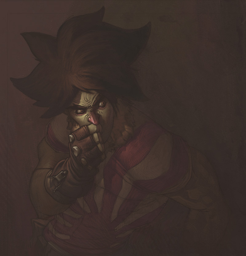
FUNK TILL THE BITTER FUCKING END!!So this is the pimped out version of the right hand side image of the Badfunk Triptych .
Not really much to say here other than that it was hella fun to do some serious rendering again. I don't think I'll be painting any of the other Triptych pieces like this, cause frankly I don't have a lot of time, and other, to me more pressing, ideas in my head that need to come out.
By the way, let me know what you think of the typography. I just want to know if it's readable to you. The kind of effect I am going for is that it is easily enough readable when you're looking at it, but doesn't constantly penetrate your vision when it's only in the corners of your eyes, if that makes sense. Basically I hope it's not super distracting and attention demanding, but not hard to read either when you try.
//EDIT: by the way, beats me why I didn't mention this three years ago or whenever I posted this, but I didn't invent the type. I don't want to take credit for something I didn't do, Eduardo Recife from Misprinted Type ( [link] ) is the brilliant mind responsible for that. I hand lettered this particular one, just for the visual effect. Also, that's not supposed to be an excuse, if you think that anything about the typography doesn't work it's definitely my fault. Just wanted to give credit where it's due (even if waaaaaaayyyyyy too late, really).
Just for fun, process screen shots:
1: [link]
2: [link]
3: [link]
4: [link]
5: [link]
6: [link]
7: [link]
8: [link]
Plus, some people asked for wallpaper version of the Triptych. I never provided any of those. If there's still interest, let me know. Meanwhile, here's a wallpaper-able version of this one: [link]
Done entirely in Photoshop CS.
Pin stripes are ballin'.
Related content


Comments: 537

Thank you , wish you a fantastic weeken
 (Smile)")
👍: 0 ⏩: 0


I appreciate the process shots. I also like how you wrapped the curlicue for the A around his arm. It ties the text with the guy and the 2d smoke above.
👍: 0 ⏩: 0


Holey freaking CRAP, I SO love that you gave us SO MANY progressions! This is seriously inspirational. Your lines colors and composition set the mood amazingly, well deserved DD congratulations!! <3
👍: 0 ⏩: 0


have loved this piece for years. glad to see it get a dd
👍: 0 ⏩: 1


the type is readable but doesn't drawn the eye only to it. Its drawn to it as you follow the picture. The AL was harder to determine but it still works nicely.
👍: 0 ⏩: 1

Glad it works for you! Thanks!
👍: 0 ⏩: 1


The process of creation looks very hard and lenghty, but the final work is beautiful!
👍: 0 ⏩: 0


The smoke and the lighting on are my favorite parts on this picture.
Thank ye for the process pictures btw.
👍: 0 ⏩: 1
No problem. I should probably do that more often, people seem to really enjoy those...
Also, thanks!
👍: 0 ⏩: 0


Very inspiring work! The way you mix different medias is incredible, unique! And the process pics were interesting to see.
👍: 0 ⏩: 1
This is just Photoshop, from beginning to end. Thanks though!
👍: 0 ⏩: 1
What, I was sure you had used inks there ")
👍: 0 ⏩: 0


thats a great work, i didnt like so much the text, but still cool... so i like a lot de link number 7...
👍: 0 ⏩: 0


I love the dark feel to it, and his pose is very eye catching.
👍: 0 ⏩: 0

Not readable imo - the word "funk" is quite clear, but I wouldn't hahve known the other word was "laways" if I hadn't been told. I think it's because it's too crammed up and has too much going on around and behind it - if it were spread out more it would be more readable.
Nice creepy piece otherwise, like a poster breaking out into 3D.
👍: 0 ⏩: 1
Thanks for the honest feedback!
👍: 0 ⏩: 0

amazing, and your typography works pretty well, not distracting but readable if you focus
👍: 0 ⏩: 0

Well done and congratulations.
...and the typography looks just fine to me.

 (Wink)")
👍: 0 ⏩: 0

this is so absolutely stunning... and a bit creepy... but mostly stunning
👍: 0 ⏩: 1
Hahahaha, glad you think so!
👍: 0 ⏩: 1
what can i say? there's just something about men with three horns on their heads... are they horns?
👍: 0 ⏩: 1
Tentacles, actually, but it's cool. :]
👍: 0 ⏩: 1
tentacles can be sexy...? where are the sucker pads?
👍: 0 ⏩: 1
Who says they need to have sucker pads? :]
👍: 0 ⏩: 1
sucker pads are awesome! and they would avoid embarrassment on the part of those of us who can't distinguish between octopussy legs and hardened keratin horns...
👍: 0 ⏩: 1
Aaaaahhh, fuck it. I admit you are right, I could have made the tentacle aspect more obvious if I had wanted to, but honestly I don't think that that makes or breaks the piece, so I think I am alright in the end. Thanks for the support!
👍: 0 ⏩: 1
no, totally, the piece is fine with it's tentacle ambiguity. it's an awesome picture in any case
👍: 0 ⏩: 0


...OMFG...when I so this, im crying cause i think i never can make the same...;_;
its so...i've to shut up my mouse.You can feel this yourself.
One word more: Congratulation.
👍: 0 ⏩: 1
| Next =>