HOME | DD
 FabianMonk — Phillydank
Published: 2006-03-26 18:03:09 +0000 UTC; Views: 14797; Favourites: 413; Downloads: 2124
Redirect to original
Description
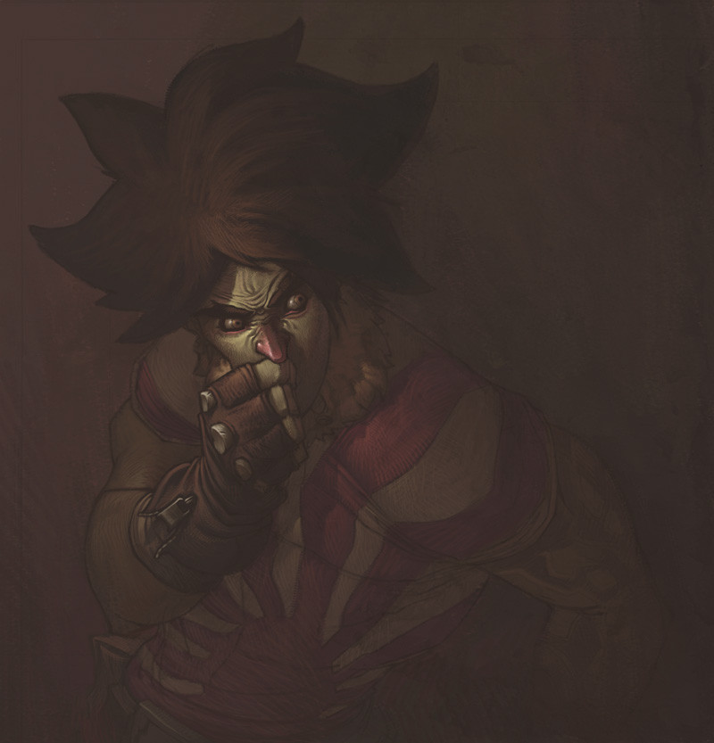
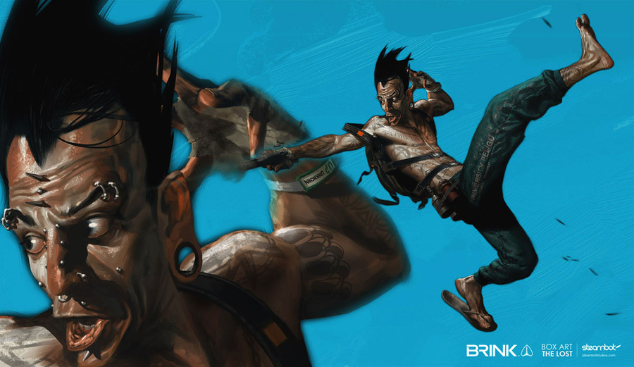
Here's something I did late one night inbetween projects. Meat linked this man's art over at the SS boards a couple days back (talk about linkage...), and I just couldn't get over how freaking amazing his art was. So I sat down and tried to apply some of his colors to my own style. It's a quicky, hence the roughness level, but I totally intend to color an image full blown like this at one point.Pencils: Christopher Copeland!
Colors: Me (Monk)
Software: Photoshop CS
The character is Philly the Kid in case you're wondering, courtesy of LeSean Thomas's upcoming OGN CannonBusters.
Related content


Comments: 106


So skillful!
I've faved this as I am really taken by the technique. Can you explain how you achieved the cross hatching, did you use a tablet?
👍: 0 ⏩: 0
So skillful!
I've faved this as I am really taken by the technique. Can you explain how you achieved the cross hatching, did you use a tablet?
👍: 0 ⏩: 1

Yeah, definitely used a tablet. Thanks!
👍: 0 ⏩: 0

Badass cool! The colors are dark and moody, really good work.
👍: 0 ⏩: 0


Thanks for your link Monk, You have a great inspired. I see a wonderfull world on there.. Thank you very much..
-
sory for my English.. I am from Java
 (Smile)")
👍: 0 ⏩: 0
Do you like Rembrand? your lighting remember me with him. awesome..
👍: 0 ⏩: 1
Rembrand's cool, but I don't really look at his work often. This was more inspired by [link] than Rembrand.
👍: 0 ⏩: 0

awesome way to do this, not using blacks and shading up from the brown.
👍: 0 ⏩: 0


woah... i need to color like that.
cool ;D
👍: 0 ⏩: 0

total expresion!!! I like it so so so much.
Lo has clavado, colega.
👍: 0 ⏩: 0


i would love to just watch you work. i want to see how you do it. sigh.
👍: 0 ⏩: 0


this is just nice... on how you maintain the shape in a such low lighting like that 'n prevent it from being total black... didtcha color manage it after you paint these?
👍: 0 ⏩: 1
Nope... just straight up painting.
👍: 0 ⏩: 1
wow... thats cool, i always use 'em over 'n over 'gain in one pic, i've got all my 4 thumbs up for you dude... 'n i loved your work even before i joined DA from my friends comp, just dont know it was you, gonna watch you! visit my gallery sumtimes 'kay?
👍: 0 ⏩: 0

May I ask what brush setting did you using for coloring this one? My guess is just the hard round brush with ~50% opacity and full flow, but I am not sure... (Sorry for the dumb question, I am actually learning from your coloring........:-P)
👍: 0 ⏩: 1
Opacity 100%, both opacity and flow set to pen pressure.
Also, I used this brush : [link]
👍: 0 ⏩: 1
Thanks!~~ That's really helpful, as always...
👍: 0 ⏩: 0

Nice job!
already it thought about making a tutorial one of its style of colors?
👍: 0 ⏩: 0


best colors ever!!!!!
PLEASE!!! WE WANT A TUTORIAL!!!!
just to feel we could be like u some day...
PLEASE
👍: 0 ⏩: 0


egads...
it's like an emotive protrait now.. Monk you is a rising and a rising fast mate!
pssst... Philly got a cold here?... his nose be much red...
👍: 0 ⏩: 1
I think I made Phillster entirely too evil in this one. But yeah, the red nose is a stylistic choice - the homeboy who's art I was checking out when I got inspired to do this makes most of his noses red. I actually really love that touch, and I think I'll be applying it everywhere from now.
Everywhere.
👍: 0 ⏩: 2
no, i noticed where you pickedit up from.. great job eitherway dude.. i like it too... gives a certain character.. ehe
👍: 0 ⏩: 0
I meant 
What the fuck is anyways.
👍: 0 ⏩: 0

That nose is so righteous. I love the whole paranoid hatred chic.
👍: 0 ⏩: 0

The colours are simply mind blowing. The emotion that has been captured is incredible. The tone of the piece simply feels right.
- Zen
'And I never got no sleep'
👍: 0 ⏩: 0
You've created a most badass character, even though I think I caught him totally out of his element.
👍: 0 ⏩: 1

yeah, philly actually THINKING about something is rare indeed. he's not the brightest of the bunch,haha! sick job man!
👍: 0 ⏩: 1

I think somewhere deep down Philly is a thinker...........of course you created him so i may e totally wrong.
👍: 0 ⏩: 0


the soft dusty brown tones are a wonderfully refreshing change from the brash stark colours that digital art seems to lend itself too, and hence this is a very surprising image. You capture an unnervinge sense of character, concealed behind a pale dust, faded but with the face just glinting through slightly. Fresh and exciting work! Wonderful!
👍: 0 ⏩: 0

roughness level?! hot damn...I would attribute it to style
but if you insist on putting more work into another piece, then I can't wait to see what you do with that one
great work (someone else's color scheme or not, you did a rockin job with it man)

👍: 0 ⏩: 0

whoa amazin job wit the colors man simply amazin! wat exactly is the thought process behind this like how do u no which colors to use and and howdid u do the light effect like that? and what tools in painter do u use?
👍: 0 ⏩: 1
| Next =>