HOME | DD
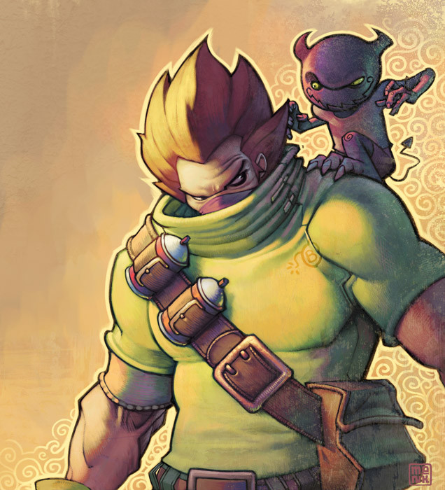
 FabianMonk — Guiltyface

Published: 2008-03-12 21:30:10 +0000 UTC; Views: 23275; Favourites: 786; Downloads: 503
Redirect to original
Description
YEAUH it's another one of those!Collab with the mighty Kweli Copeland !!
Thought I'd throw this up before I leave for London tomorrow. Bound to be a fun ride! I've heard it's a great city so I'm excited.
ANYWAY. Pencils by Chris, colors by yours truly, done in Photoshop.
Also thanks to Skaffa for the creative input.
Related content


Comments: 92

I see you already have!
Or was that accidental? Either way, looks cool dude.
👍: 0 ⏩: 1

i would like to use to make a fan art...
👍: 0 ⏩: 1
Absolutely, go right ahead! Make sure you show me when you're done. :]
👍: 0 ⏩: 0

i love this thing is awesome if you have msn i would like to talk to you please.you can check out my work i just started...
")
👍: 0 ⏩: 1
Sure, just add me if you haven't already. My msn is monk-art@hotmail.de
👍: 0 ⏩: 1
Yo sorry for running off like that the other day. I also forgot to add you to my MSN list so you'll just have to hit me up again at some point and I'll add you as well.
Cheers!
👍: 0 ⏩: 0

WAYMONDOBEYONDBUGGERBALLSTOTHEWALLSMAXCOOOL~~
kthxbye.
👍: 0 ⏩: 0


love this man. the colors and the composition. awesome expression.

👍: 0 ⏩: 0

amazing as usual. the texture was a nice touch
👍: 0 ⏩: 0


I'm feeling slightly inspired by the effects on both of these characters. You've done a good thing today.
👍: 0 ⏩: 0

i can stop staring at the man in the black hoodie sick coloring
👍: 0 ⏩: 0


u are crazily good man!! I really like your works!
👍: 0 ⏩: 0


the value change of the jacket in the back is absolutely stunning bro. interesting contrast between front and back... it really makes you keep looking.
👍: 0 ⏩: 0


This guy looks like that one dude from "Rumble Fish"
👍: 0 ⏩: 0

dark!!!
screw up the yellow! go with the darrrrrrk!!!!
go go go go go go!!!! >>>>>
👍: 0 ⏩: 0


the lineart is AMAZING, and your colours are wonderful, as usual. i especially love how you rendered the dude in the background, with the white hair. fantastic job on his hoodie! you two are a great team.
👍: 0 ⏩: 0


Amazingly cool drawing! i love what you did with the zippatone colouring! how the hell didi you do that?
👍: 0 ⏩: 0

Super Collab, dude! looks great! the poses and colors totally rocks!
👍: 0 ⏩: 0

i definately dig the darker one that is so awesome, great texture man , this should be a poster
👍: 0 ⏩: 0

I wish i know how to do that kind of style here is my gallery ~Gdmosley
👍: 0 ⏩: 0

nice effect with the dots. Is that an overlay layer or something like that?
and cool composition with the black stuff at that guys head and all that
👍: 0 ⏩: 0


awe this is awesome monk! how did you do the coloring for the guy in the front ?

👍: 0 ⏩: 0

So this was a collab? Damn i want to become as good as you guys
👍: 0 ⏩: 0

Man I love the texture on the clothes of that darker guy. I so wish I could colour like that now xD
👍: 0 ⏩: 0

like th blend of the different colours -- wickedly perfect -- later days
👍: 0 ⏩: 0


I love the two color styles. I still can't get that pulp-style with the dots. I just don't know how to do it.
👍: 0 ⏩: 1
Get an area you wanna convert to half tones, copy and paste it into a new document, convert to grayscale, convert to bitmap and mess around with the settings a bit.
At least that's how I do it. Might be unnecessarily complicated but I don't know an easier way yet.
👍: 0 ⏩: 1

this piece is really nice.
is dude in the back the split personality of the guy in the front?, his evil side.?
looks tight
👍: 0 ⏩: 1
A bit more complicated than that, but sort of.
👍: 0 ⏩: 0

Your character ROCKS Monk, and Chris did a killah job! But seeing your colors on these pups brings a whole new life to the draws. You always blow me away man. Slick Mighty Monk strikes again!
Personally I dig the dark version alot. Has a great fresh flair to it. Was that just a spontaneous take on him, or something y've considered for a while? None the less, I'm taken, ABSOLUTE!
Killah!
ChEErZ~
👍: 0 ⏩: 1
| Next =>