HOME | DD
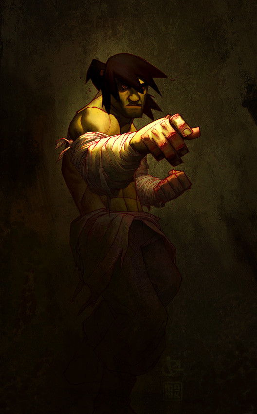
 FabianMonk — Naruto colors step by step

Published: 2006-06-04 00:42:33 +0000 UTC; Views: 77932; Favourites: 718; Downloads: 3766
Redirect to original
Description
//EDIT: it has been brought to my attention that Naruto actually has blue eyes. Shame on me. Also, the whisker marks got lost in the process. These mistakes are fixed in the new final version however: [link] !So some of you may have seen the most badassed warm up drawing that LeSean did of Uzumaki Naruto. And if you did, then chances are that you also saw how he followed this up with a step by step of how he went about drawing it.
Well I thought it might be cool if I presented something in that same vein, seeing how I had plans on coloring this baby regardless of what happened. An explanation of the individual steps follows below.
Pencils: LeSean Thomas!
Colors: Me (Monk)
Software: Painter IX
The tool I used in Painter was the Dull Conte.
Step by step:
#1: Easy. I saved the line-art from LeSean's DA account onto my hard drive and opened it up in Painter.
#2: Since I already knew ahead of time that I was going to go for a slightly warmer kind of feel, I decided to color the line-art a slightly saturated purple red, to accentuate the sunlight/summer color palette I was going for. I did this by creating a new layer above the background layer in Painter, setting it to "colorize", and filling it completely with the desired color.
#3: Probably the most important step out of all: laying down the flats. I know this step is tedious, and it's boring, and nobody really wants to do it (at least... most people don't), but trust me on this one, it's a vital step. Lay down your flats, all of them, before you go in to start rendering your piece. Laying down your flats gives you a very good idea of how you're going to approach your piece. It will give you a better understanding of the palette you are going to use, thereby giving you a better feel of the atmosphere and mood that you're going to create (and I can't stress enough how important mood is). I know it's tempting to just lay down flats in one area and then immediately go into rendering it, but especially if the piece is more elaborate and complicated, you might want to have a complete idea of the entire picture before you move on. I basically always work from dark to light. I put down very dark flats, and then slowly apply more and more highlights.
The way I lay down my flats in Painter is by creating a new layer above everything else, setting it to "gel", and the just filling in areas with the brush tool (in this case Dull Conte).
#4: The first layer of highlights. Pretty simple, I create a new layer, set to normal, and just paint away. Obviously I kind of avoid the pencil lines, since I'm painting above them and don't want to ruin them - but it's not a tragedy if I happen to cross them from time to time, as long as it's nothing major. The thing with the first highlight layer is, I basically fill in all the areas that LeSean didn't designate as shadows. I go all the way up to the pencil line with my colors on this layer.
A general rule of thumb for me for highlights is that the first couple of highlights work towards a VERY saturated highlight, and then I slowly work back to a more desaturated color. Of course sometimes I stay completely saturated, sometimes I don't even do saturation to begin with - it depends on the mood I want to achieve. In this case, bright warm colors = saturated colors.
#5: Another layer of highlights. Basically the same as step four, only that on some select few parts, I don't draw the highlights all the way to the pencil line. The light source is set so that it's coming from the left. Accordingly, more light will be hitting Naruto's right (our left) side. So I extend the highlights all the way to the pencil on the left, but I kind of fade them a tiny bit towards the pencil on the right, if that makes sense.
#6: Same as step five, another layer of highlights. As you can see, I'm getting more selective with where I'm putting my highlights. It's time to put some thought into which areas you think stick out more, aka which areas get hit by more light. For example, I'm not applying the highlights of this layer to the area right underneath Naruto's right arm (his right). Or to the far right (his left) of Naruto in general. This time around, I choose to put highlights only where I think they would actually show up. But I don't get too picky quite yet, I still stay somewhat broad.
#7: NOW I get selective. This is the last layer of highlights, and I decide carefully where to put it. Not much to say here, I basically shrink down the area of where I put highlights the further I go. It's more of a practice thing to know where to put your brightest highlights and where not to put them. Also, observing how light and shadows behave in real life helps a LOT.
#8: I'm done with the highlights, more or less. But seeing how LeSean pencilled in the shadows already from the beginning, you can see that there is a lot of contrast in the picture right now: very dark shadows compared to rather bright highlight areas. In fact, it's too drastic for my tastes, so I decided to color in the shadow areas as well, make them lighter. This is exactly the same process as the highlights. I just fill the pencilled in shadow areas with approximately 2 - 3 very subtly lighter colors. Shadow doesn't mean that no light hits that area, it's just less light hitting it. So, shapes in shadow still appear "3D" - I still render them like any other object that's hit fully by light. It's just that the transitions inbetween the individual highlights are very subtle (if you put as many highlights in the shadow as in the actual highlight area, then it wouldn't be identifiable as a shadow any longer now would it).
Small note: in case I don't agree with the way LeSean layed down shadows in one area, I can just completely paint over those areas with highlights. In this piece, I did that with the drop shadows from the small pieces of debris swirling around Naruto. Nothing major at all though, and LeSean has a very solid idea of light and form anyways.
#9: Another slight tweak to the shadows. I still thought that at some parts the shadows were too drastic, especially in the transitions between light and dark. So on the left side of Naruto (his right), as well as on his right leg, I smoothed over some of the shadows a bit, brightening them a bit. I did this also because like I already said, I wanted his right side to be hit by light stronger than his left, to sort of create a focus (instead of having the piece contrasted equally all over, leaving no room for a center of attention).
#10: Last step! I thought it wouldn't hurt the piece to spice it up just a little more, so I added a white "rim lighting" on Naruto's right side. You can see this in a lot of Hyun Tae-Kim paintings, and it's a great way to not only pop the character from the background, but also to accentuate certain forms. Plus, it looks neat.
That's it. I'm done with this one, and I call it a wrap.
Some very very minor things are out of order in the step by step, but have no influence on the process whatsoever (such as the fact that I added my signature in last, but on the very first layer, so when I created the step by step it shows up from the beginning). One last thing: in LeS's step by step of the drawing he also noted the time it took him to draw the image. I didn't do this hear, since I stretched this piece out between several projects and evenings. But I can guarantee that it took me a lot longer than 2 hours (which is how long it roughly took LeS to draw the lines). This is mainly because I'm not the fastest, but also because the tool I used, the Dull Conte, is a little special. In order to get a good effect with it and in order to not ruin it's beautiful texture, you have to kind of plan your strokes a little in advance, and lay them a bit slower and more carefully than normal (it's not brain surgery, but it does draw out the process a bit).
Okay, the end. I hope this was informative to at least some of you. If people still have questions, I'll be ready to try and answer them madscore. Also, thanks again at this stage to LeS for the seriously fun drawing.
Cheers!
Related content


Comments: 174

Well nowadays I work only in Photoshop and I have my own texture that I painted on a piece of paper and scanned in and embedded into my brushes.
But this here is an old piece, and I used Corel Painter, which has a wide selection of brushes with textures already built into them. For this piece, it was the Dull Conte tool.
👍: 0 ⏩: 0

How long does it usually take you to complete an elabotate painting? For example a piece like the Drama Kingz promotion for Lesean Thomas?
👍: 0 ⏩: 1
Hey there, sorry for the ultra late reply, I'm rarely active on DeviantArt these days.
Anyway, I wouldn't call the Drama Kingz poster particularly elaborate, I did that one in one and a half days. I had solid line-art to work with, and only coloring is always faster.
If I do an illustration entirely by myself, it takes longer. The pieces I've been doing for Sideshow Collectibles usually take around a week of actual work (the process itself sometimes takes longer, simply due to waiting on feedback, etc).
👍: 0 ⏩: 1
Cool. Thank you for taking the time out of your schedule to answer my questions. I apologize for the late response.
👍: 0 ⏩: 0

Finally a somewhat detailed coloring tutorial from a) a guy who know how to do it, and b) in Corel Painter. Good job man! And Thank you!
👍: 0 ⏩: 0

Great tutorial bro! I no longer use painter, I can't stand the interface... But I was wondering what the equivalent would be in PS? How much do you blend and use opacity etc? Or are you just laying down flat highlights on top of each other like cel shading? There appears to be some smooth blending especially on the clothes, but overall it looks cel shaded. How the hell do I do that? (also I don't have a tablet yet)
👍: 0 ⏩: 1
Sorry for the late reply.
Honestly, I don't know how I would do it without a tablet. I make extensive use of the pressure sensitivity, I'd be kind of lost without it.
I also don't use Painter anymore, same reason you mentioned: the interface. It's been a couple of years though, maybe I should give it another try. The brushes were pretty awesome. But these days I just use Photoshop, and versions CS5 and higher actually have simulated "3D" brushes, those are pretty neat.
👍: 0 ⏩: 2
Also, what opacity/flow level, and brush hardness do you prefer using, and is there a big difference between normal and multiply mode? Depending on the colors you choose won't they come out looking the same way?
👍: 0 ⏩: 0
No worries, mine comes just as late... I see. Very interesting. In the meantime I've had a chance to play around with a tablet at my community college and just ordered one! But playing around with it, the results i was getting wasn't exactly the same as this picture... While i know i need to practice more with it, i was wondering what level of opacity do you use with the paint and is there an equivalent setting in photoshop for painter's "gel." Would it be multiply? Hmm...
👍: 0 ⏩: 0


is there any kind of thorough video tutorial on how to color like this? i wanna learn the process
👍: 0 ⏩: 1
Probably. I don't know of any video tutorials but if you google digital painting tutorial or something or just hit up YouTube right away, you should find a bunch.

👍: 0 ⏩: 1
oh ok.. what about any links to great tutorials here in deviantart?
 (Smile)")
👍: 0 ⏩: 1
Sorry man, I don't really know of any tutorials in general. Obviously I've read some here and there but never bookmarked them or anything...
But DA has a search function too, so you should be able to find plenty.
👍: 0 ⏩: 0

Yeah, that was my bad. It's been pointed out to me though, if you check the image description there's a link to an updated version in there. Thanks!
👍: 0 ⏩: 1

 (Wink)")
Check the image description. :]
👍: 0 ⏩: 1
")

I'm not sure if its been asked yet, but when adding lighter colors on, are you making a new layer for steps 4-7?
👍: 0 ⏩: 1
Well the process I use these days is different anyways. I don't think I did, but basically that is up to you. If you use a new layer for each step then that allows for more flexibility later on, in case you want to change something, but I don't think it's really necessary. Just try it out and see what works best for you. Cheers.
👍: 0 ⏩: 0

wow awsome coloring steps and tutorial. i learned a lot from this. did u use photoshop for this or another program
👍: 0 ⏩: 1
For this one I used Painter. But the process is basically the same for me on each program.
👍: 0 ⏩: 1
is painter any different than photoshop cause thisis the first time i hear about it
👍: 0 ⏩: 1
It's a little different. Most of all the user interface is a bit... terrible, in my opinion. At least when you compare it to PS, it lacks quite a bit and can be a real headache to get used to at first.
But it's worth the results, in my opinion. Painter mainly focuses on imitating traditional media. You get to choose from a wide variety of brushes that specify on imitating a certain traditional medium. In Photoshop, you have a brushes palette and that's pretty much it, what you do with it is up to you. In Painter, your brushes palette is divided into many sub sections, one for each medium (for example oil paints, acrylics, chalk, charcoal, etc. etc.).
Of course it's still no replacement for the real deal, but it's a good approximation in my opinion. You can get some really nice natural blending effects in Painter, which you'd have to try and reproduce intentionally in Photoshop for example.
👍: 0 ⏩: 1
wow now I see, I think now I'm gunna get paint and test it out. Thnax for the info
👍: 0 ⏩: 0
I actually have no idea, probably one of the very first.
👍: 0 ⏩: 1

Alright man.
Good work.
Thanks for replying!
👍: 0 ⏩: 0

hey I can do step 1 ")
great work you have my fav!
👍: 0 ⏩: 0

Very awesome tutorial but have one question: what dimensions did you color this in? I'm having a good time colring with the conte brush but I have a feeling that I may be working on too big of a surface because when I resize all of the details are lost
")
👍: 0 ⏩: 1
Where the hell did that mean smiley come from? I think I may have accidentally clicked on it while my mouse moved over. lol no hard feelings at all
👍: 0 ⏩: 1
I usually try to work at a resolution of 300 dpi or higher. As for exact image dimensions, that varies from image to image, but usually it's several thousand pixels in both width and height.
Cheers!
👍: 0 ⏩: 1


Okay! Well, I decided to give it another go with your advice in mind.
[link]
So? What do you think?
Any better? ^^''
👍: 0 ⏩: 1
In terms of color choices, definitely. The range of colors on the hair especially, much better than the other piece, at least in my opinion.
One thing though, be careful with using white backgrounds. White is as neutral of a color as you can get, so you'll have a hard time getting a mood across if you use a white background. In this case it's okay (although I would get rid of the lined paper or whatever it is, it makes the piece look more messy), because it's just a single character shot, nothing more. But keep in mind for the future that if you're trying to evoke a mood, lay down a solid background color first. Just saying.
👍: 0 ⏩: 1
I'll definitely keep that in mind! ^_^
Thankyou so much for your help, I really appreciate it! ^_^
👍: 0 ⏩: 0
Hey, I know you get lots of comments, but I really need help with this. ^^''
I tried using your method in Corel Painter X and well...
It didn't turn out to well.
I only managed to do part, but could you take a look at it and tell me what I'm doing wrong?
[link]
Thanks! Any help is appreciated! ^^''
(Btw, I'm using an Intuos 3 and Dull Conte 15 if that helps at all. =/)
👍: 0 ⏩: 1
Whoops. ^^
Meant to upload this one, since it focuses on the colors:
[link]
👍: 0 ⏩: 1
Well for one, that's a very broad question. This tutorial is really just more of a step by step. A look into how I do things, my method. As such it's a bit hard to say what you're doing WRONG, because this doesn't even teach you any RIGHT way, just my way.
It's not really a tutorial that will take you by the hand and teach you exactly how to go about things. Because in the end, no tutorial like that exists. Learning things like this takes time, dedication and study. I wouldn't expect something you can read in 15 minutes to present you with a grand revelation.
That being said: I think the number one thing you need to do, is to start painting from life. If you're already doing that, do more of it. Because your placement of shadows doesn't seem very natural, and your color choices on the skin don't seem very convincing. Just take photos off the internet if you can't find any opportunities to do life drawing/painting with a model. Places like DA or Google Image Search can be great resources, just snoop around and take any pictures that seem interesting to you.
Painting from life, if you do it a lot, will teach you all you need to know about lighting, colors, surface textures, etc. etc.
This tutorial is no substitute for that.
One question though, did you really vary the colors in your skin tones from light to dark? Because it seems to me like you're just using the same color in lighter / darker variations. If you are in fact doing that, try for example to push your shadow colors more towards the blue end of the spectrum, and your highlight colors more towards the yellow end, and see what happens.
Another thing that jumped out to me was that you've got a blue/purple background (cold), but you've painting very red/orange shadow colors (warm). That causes a conflict. Colors in the shadows take on the colors of the surroundings. If you want warm shadows, use a warm background, etc.
Hope that helps a little.
But honestly, paint from life. It's the only way to really improve your skills thoroughly. No simple tutorial can teach you what you will discover through painting from life.
👍: 0 ⏩: 1
Okay, I think I'll practice that this winter break.
👍: 0 ⏩: 0

You are an amazing artist, you were really helpfull, and this rox!
Nice, gratz man!
👍: 0 ⏩: 0

Lol, Naruto has blue eyes, dude. But, don't rape me, I'm just pointing something out.
👍: 0 ⏩: 1
Lol read the image description dude.
👍: 0 ⏩: 0


Everything is P-E-R-F-E-C-T !!!!!!! Except the eyes.. Naruto's eyes are blue ! But a mix in the color doesn't make it bad infact, it's.. *pass out*
👍: 0 ⏩: 1
| Next =>