HOME | DD
 FabianMonk — Naruto colors step by step

Published: 2006-06-04 00:42:33 +0000 UTC; Views: 77773; Favourites: 718; Downloads: 3766
Redirect to original
Description
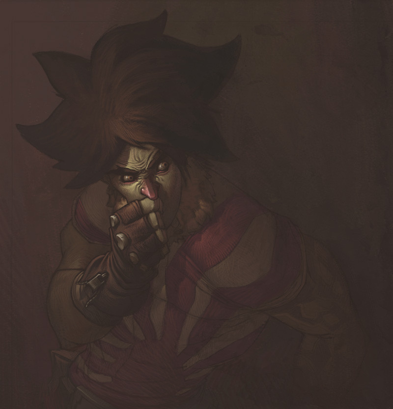
//EDIT: it has been brought to my attention that Naruto actually has blue eyes. Shame on me. Also, the whisker marks got lost in the process. These mistakes are fixed in the new final version however: [link] !So some of you may have seen the most badassed warm up drawing that LeSean did of Uzumaki Naruto. And if you did, then chances are that you also saw how he followed this up with a step by step of how he went about drawing it.
Well I thought it might be cool if I presented something in that same vein, seeing how I had plans on coloring this baby regardless of what happened. An explanation of the individual steps follows below.
Pencils: LeSean Thomas!
Colors: Me (Monk)
Software: Painter IX
The tool I used in Painter was the Dull Conte.
Step by step:
#1: Easy. I saved the line-art from LeSean's DA account onto my hard drive and opened it up in Painter.
#2: Since I already knew ahead of time that I was going to go for a slightly warmer kind of feel, I decided to color the line-art a slightly saturated purple red, to accentuate the sunlight/summer color palette I was going for. I did this by creating a new layer above the background layer in Painter, setting it to "colorize", and filling it completely with the desired color.
#3: Probably the most important step out of all: laying down the flats. I know this step is tedious, and it's boring, and nobody really wants to do it (at least... most people don't), but trust me on this one, it's a vital step. Lay down your flats, all of them, before you go in to start rendering your piece. Laying down your flats gives you a very good idea of how you're going to approach your piece. It will give you a better understanding of the palette you are going to use, thereby giving you a better feel of the atmosphere and mood that you're going to create (and I can't stress enough how important mood is). I know it's tempting to just lay down flats in one area and then immediately go into rendering it, but especially if the piece is more elaborate and complicated, you might want to have a complete idea of the entire picture before you move on. I basically always work from dark to light. I put down very dark flats, and then slowly apply more and more highlights.
The way I lay down my flats in Painter is by creating a new layer above everything else, setting it to "gel", and the just filling in areas with the brush tool (in this case Dull Conte).
#4: The first layer of highlights. Pretty simple, I create a new layer, set to normal, and just paint away. Obviously I kind of avoid the pencil lines, since I'm painting above them and don't want to ruin them - but it's not a tragedy if I happen to cross them from time to time, as long as it's nothing major. The thing with the first highlight layer is, I basically fill in all the areas that LeSean didn't designate as shadows. I go all the way up to the pencil line with my colors on this layer.
A general rule of thumb for me for highlights is that the first couple of highlights work towards a VERY saturated highlight, and then I slowly work back to a more desaturated color. Of course sometimes I stay completely saturated, sometimes I don't even do saturation to begin with - it depends on the mood I want to achieve. In this case, bright warm colors = saturated colors.
#5: Another layer of highlights. Basically the same as step four, only that on some select few parts, I don't draw the highlights all the way to the pencil line. The light source is set so that it's coming from the left. Accordingly, more light will be hitting Naruto's right (our left) side. So I extend the highlights all the way to the pencil on the left, but I kind of fade them a tiny bit towards the pencil on the right, if that makes sense.
#6: Same as step five, another layer of highlights. As you can see, I'm getting more selective with where I'm putting my highlights. It's time to put some thought into which areas you think stick out more, aka which areas get hit by more light. For example, I'm not applying the highlights of this layer to the area right underneath Naruto's right arm (his right). Or to the far right (his left) of Naruto in general. This time around, I choose to put highlights only where I think they would actually show up. But I don't get too picky quite yet, I still stay somewhat broad.
#7: NOW I get selective. This is the last layer of highlights, and I decide carefully where to put it. Not much to say here, I basically shrink down the area of where I put highlights the further I go. It's more of a practice thing to know where to put your brightest highlights and where not to put them. Also, observing how light and shadows behave in real life helps a LOT.
#8: I'm done with the highlights, more or less. But seeing how LeSean pencilled in the shadows already from the beginning, you can see that there is a lot of contrast in the picture right now: very dark shadows compared to rather bright highlight areas. In fact, it's too drastic for my tastes, so I decided to color in the shadow areas as well, make them lighter. This is exactly the same process as the highlights. I just fill the pencilled in shadow areas with approximately 2 - 3 very subtly lighter colors. Shadow doesn't mean that no light hits that area, it's just less light hitting it. So, shapes in shadow still appear "3D" - I still render them like any other object that's hit fully by light. It's just that the transitions inbetween the individual highlights are very subtle (if you put as many highlights in the shadow as in the actual highlight area, then it wouldn't be identifiable as a shadow any longer now would it).
Small note: in case I don't agree with the way LeSean layed down shadows in one area, I can just completely paint over those areas with highlights. In this piece, I did that with the drop shadows from the small pieces of debris swirling around Naruto. Nothing major at all though, and LeSean has a very solid idea of light and form anyways.
#9: Another slight tweak to the shadows. I still thought that at some parts the shadows were too drastic, especially in the transitions between light and dark. So on the left side of Naruto (his right), as well as on his right leg, I smoothed over some of the shadows a bit, brightening them a bit. I did this also because like I already said, I wanted his right side to be hit by light stronger than his left, to sort of create a focus (instead of having the piece contrasted equally all over, leaving no room for a center of attention).
#10: Last step! I thought it wouldn't hurt the piece to spice it up just a little more, so I added a white "rim lighting" on Naruto's right side. You can see this in a lot of Hyun Tae-Kim paintings, and it's a great way to not only pop the character from the background, but also to accentuate certain forms. Plus, it looks neat.
That's it. I'm done with this one, and I call it a wrap.
Some very very minor things are out of order in the step by step, but have no influence on the process whatsoever (such as the fact that I added my signature in last, but on the very first layer, so when I created the step by step it shows up from the beginning). One last thing: in LeS's step by step of the drawing he also noted the time it took him to draw the image. I didn't do this hear, since I stretched this piece out between several projects and evenings. But I can guarantee that it took me a lot longer than 2 hours (which is how long it roughly took LeS to draw the lines). This is mainly because I'm not the fastest, but also because the tool I used, the Dull Conte, is a little special. In order to get a good effect with it and in order to not ruin it's beautiful texture, you have to kind of plan your strokes a little in advance, and lay them a bit slower and more carefully than normal (it's not brain surgery, but it does draw out the process a bit).
Okay, the end. I hope this was informative to at least some of you. If people still have questions, I'll be ready to try and answer them madscore. Also, thanks again at this stage to LeS for the seriously fun drawing.
Cheers!
Related content


Comments: 174


Monk this is phenomenally inspiring to see your coloring in process. I know a lot of people have asked you to show a little behind the scenes and it's awesome that you made this. You have a freakin' badass talent, my friend.
👍: 0 ⏩: 1

Well thank you very much for that.
I swear, you make me blush like every time.
👍: 0 ⏩: 0

The gel layer doesn't paint over the line art, so I can lay my flats "underneath".
👍: 0 ⏩: 2

Yeah, I felt like asking you about the Gel layer... in Painter, there are Gel and Multiply - I actually can't see much difference between them, so I'd like to know why you prefer one over another
Oh, and this is a great step-by-step, very helpful indeed ")
👍: 0 ⏩: 2
Yeah, they're almost the same! In Painter's Help, it says Gel "tints the underlying color with the layer's color", and Multiply "combines the two colors to create a darker one", and that Gel is equivalent to Photoshop's Darken.
In fact, that doesn't make any difference regarding to lineart... still, I don't know if there are any other specific utilities for them. And they still look the same to me
Thanks for the response!

👍: 0 ⏩: 0
I don't really know if there is a difference. I just started using gel because it achieved what I wanted. But multiply is probably just as good.
👍: 0 ⏩: 0

ahhhh (bonks head) sort of like 'multiply' in photoshop hehehe
thanks very mucho
👍: 0 ⏩: 0

Mann, das ist wirklich beeindruckend zu sehen wie du beim Färben vorgehst! Respekt!
👍: 0 ⏩: 0

If I wasn't colorblind, this would be the coolest thing ever. Heck... It's still the coolness.  (Wink)")
 (Smile)")
👍: 0 ⏩: 1
Thanks dude, glad you're digging it.
👍: 0 ⏩: 0


So, how many people commented saying that Naruto's eyes are blue?
👍: 0 ⏩: 1

amazing work. . .really made le sean's lines come to life. . call me way more than impressed you blew me away with this one. heh
👍: 0 ⏩: 1

You lost me at about step 6 there... Steps 1-3 didn't make much sense either. lol I'm no serious artist. what's going on here? looks good though.
👍: 0 ⏩: 1
What exactly didn't make any sense here?
👍: 0 ⏩: 2
Well, I see you started out with a blue layer. Then you might have added a little red to make it purple (or so I believe. am I right?) Well, just go ahead and highlight the important changes you made at each step. Step 9 looks identical to step 6 to me (I have zero experience in coloring / shading.) For the life of me, I just can't figure out how you make a flat thing on paper seem to have 3D form. Well, I don't need an explanation for that last sentence unless you want to answer that, but I just want to know the significant changes that you've made at each step from #5 or 6 to #9
👍: 0 ⏩: 1
Dude, did you... did you read the image description?
👍: 0 ⏩: 1
Right after I sent you that message I felt really stupid and read the description. Now I know what you're doing. I worry myself sometimes

👍: 0 ⏩: 0

Hm, I would like to talk on that one too. Um, the steps, all I need to know is do you keep adding on new layers after the flats (flats are on the same layer right?), or you paint on that same layer? And flats, they are normally dull dark like that right? And the shading, since this one was already done, what order would you have done the shading if it was you that had to do it first? First or last, compared to the highlights? And you say you keep adding highlights to the pic, um, in normal mode, so that means there is a possibility of it going out the lineart. I use a mouse and that's not easy for me to do, so would there be the same affect if I had it in multiply, even if I choose a lighter color?
👍: 0 ⏩: 1
1.- For this tutorial I did all the individual highlights on seperate layers, but only so that I could then make them visible/invisible to capture the step by step process. Usually I would put all the highlights on the same layer.
2.- Flats are whatever you want them to be. I paint from dark to light, so I choose dark and desaturated flats (since shadows are usually less saturated).
3.- I paint from dark to light, so I would have done it the exact same way as I did here, I would only have had to decide where to put them.
4.- No, if you put the layer in multiply it won't have the same effect, since you're not painting above the line-art. You'll get a similar effect, but not the same (and when it comes to painting over the pencilled in shadows you wouldn't get anywhere close).
👍: 0 ⏩: 1
I think that made things alittle clearer. Thanks for taking the time.
👍: 0 ⏩: 0

It's amazing how you're always able to make anything look good man. I didn't like this lesean naruto, but you made it look awesome.
👍: 0 ⏩: 0

Always a treat to see your process man. It's great to hear you hammer home mood and atmosphere in the colors.
👍: 0 ⏩: 0

U work hard man,and here it is the result..congrats for your technique
👍: 0 ⏩: 0


Impressive as always Monk
👍: 0 ⏩: 0

Dan-dan-da-dan-dan-da-DOOOOOPE! Cheers for this mista. How does it feel to be a free man?
👍: 0 ⏩: 1
no longer constrained by the evil tentacles of schoolness....
👍: 0 ⏩: 1
Who told you that? I may not have classes any longer, but I still have one last major exam coming up in a little under two weeks...
👍: 0 ⏩: 1
ahhh so. thought you meant school was totally finished when you were talkin about it last week. well, good luck for the exam dude. peace!
👍: 0 ⏩: 0


this is rally awesome man! Its cool to know how you make your stuff, I'll take some advice, thanx a lot!
👍: 0 ⏩: 0

you're a god among mortals my friend. truth be told, Mikey ~LightBombMike and i were talking recently about ~luxun who seems to be your spiritual succesor... lol... and in the course of the conversation we agreed that you had surpassed even two... lets just say very very well known colourists... hats off to you man.
about the tutorial tho, i do have an honest question as a line artist. quite a few colourists i have been fortunate enough to work with, yourself included, have told me that its better to not render my own shadows etc w/ pencil shading. but here, Lesean did so and it doesnt seem to have been a problem. and ive read here and there that when trying to land gigs professionally, instead of X'ing your blacks or not shading whatsoever, doing so shows that you are putting the time and care into your piece and not just "leaving it all to the colourist." what are your thoughts on it tho?
👍: 0 ⏩: 1
Hey man! Thanks for the kind words homedank. Glad you're digging this.
On the blacks: personally, I prefer when there aren't any. When the line-art is nice and open, it gives me the most freedom. See, when you put down the shadows, then I've already got to stick with the lightsource you defined. Plus, a lot of times when the penciller lays in the shadows, he doesn't put enough thought into it. At least not as much as he put into the drawing itsself. Plus, an equal amount of pencillers don't have a very solid understanding of light and shapes. So what that leads to is that they put down contradicting shadows, or leave some out where they should be, or just generally mess up a bit. And that makes it harder for me to get a good end product.
So, basically yeah, I prefer no shadows, but it depends. I mean here for example, LeS is not one of those pencillers that doesn't know what he's doing. He's got a very solid grasp on lighting, so I don't have to worry much. And well... rendering out his pencils shadows in this case wasn't any more work than it would have been for me to render out my own shadows. In this case I just had to clean up a little more to not show the pencil residue as much.
Concerning breaking into the industry, with the caring aspect: I have no idea how editors or publishers view this matter. All I've got to say is, that for one, it depends on the style the colorist uses. If you're going to have solid black shadows, inked and all, but then want someone to go in and paint the colors... that rarely looks that great... it works, obviously, but I kinda feel that solidly inked lines match cel shading or cuts, but not paints.
Second, the penciller can add in the shadows, sure, but he's got to know what he's doing. He shouldn't just be adding shadows for the sake of adding shadows, he has to take as much care with it as the colorist would. And that shit takes time, obviously. In most cases the pencillers don't have that time though, and then I would say just leave it for the colorist. There's a reason why you've got him, haha...
👍: 0 ⏩: 2

all this is very informative. i'm glad you take time out to answer questions. very admirable, my friend.
👍: 0 ⏩: 0
word. youre wisdom defies your age, young jedi. that's gonna be a real pain in the ass as im pretty obsessed with doing my own shadows and what not, but i will really try to work on it.
incedentally, i'm trying to get to Germany. it probably wouldn't be until around late 2007, but if you're still there, we need to kick it, 5 point style! (obscure south park reference.)
👍: 0 ⏩: 1
Five point style is RIGHT, if I'm there then.
👍: 0 ⏩: 1
i hope so man. wouldnt it be funny if i went to germany and your ass came to california?
👍: 0 ⏩: 0


this is pretty sweet and i like how simple you've made it appear - though i'm curious: where did you get your "Dull Conte" brush? or other brushes that you use, i think one of my problems is that my brushes are just the standard ones..
👍: 0 ⏩: 1
The fact that you use only standard brushes would never be a problem at all.
Except for very very few, I only use the standard brushes as well. The Dull Conte is a standard brush.
👍: 0 ⏩: 1
huh, is it a big difference to be using photoshop as opposed to painter? i looked around, but i've only found dull conte as a painter brush.
👍: 0 ⏩: 1
It is a Painter brush.
I used Painter for this, it says so in the write up.
And yes, there's a difference between the PS and Painter brushes. Otherwise there would be no need for two different programs.
👍: 0 ⏩: 1
heh, what i meant was - i only have photoshop while i noticed you did this image with painter. so for me to be using just the standard brushes of photoshop is a bad thing correct?
👍: 0 ⏩: 1
<= Prev | | Next =>