HOME | DD
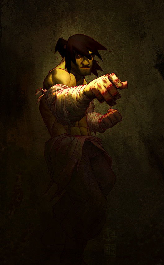
 FabianMonk — Naruto colors step by step

Published: 2006-06-04 00:42:33 +0000 UTC; Views: 77773; Favourites: 718; Downloads: 3766
Redirect to original
Description
//EDIT: it has been brought to my attention that Naruto actually has blue eyes. Shame on me. Also, the whisker marks got lost in the process. These mistakes are fixed in the new final version however: [link] !So some of you may have seen the most badassed warm up drawing that LeSean did of Uzumaki Naruto. And if you did, then chances are that you also saw how he followed this up with a step by step of how he went about drawing it.
Well I thought it might be cool if I presented something in that same vein, seeing how I had plans on coloring this baby regardless of what happened. An explanation of the individual steps follows below.
Pencils: LeSean Thomas!
Colors: Me (Monk)
Software: Painter IX
The tool I used in Painter was the Dull Conte.
Step by step:
#1: Easy. I saved the line-art from LeSean's DA account onto my hard drive and opened it up in Painter.
#2: Since I already knew ahead of time that I was going to go for a slightly warmer kind of feel, I decided to color the line-art a slightly saturated purple red, to accentuate the sunlight/summer color palette I was going for. I did this by creating a new layer above the background layer in Painter, setting it to "colorize", and filling it completely with the desired color.
#3: Probably the most important step out of all: laying down the flats. I know this step is tedious, and it's boring, and nobody really wants to do it (at least... most people don't), but trust me on this one, it's a vital step. Lay down your flats, all of them, before you go in to start rendering your piece. Laying down your flats gives you a very good idea of how you're going to approach your piece. It will give you a better understanding of the palette you are going to use, thereby giving you a better feel of the atmosphere and mood that you're going to create (and I can't stress enough how important mood is). I know it's tempting to just lay down flats in one area and then immediately go into rendering it, but especially if the piece is more elaborate and complicated, you might want to have a complete idea of the entire picture before you move on. I basically always work from dark to light. I put down very dark flats, and then slowly apply more and more highlights.
The way I lay down my flats in Painter is by creating a new layer above everything else, setting it to "gel", and the just filling in areas with the brush tool (in this case Dull Conte).
#4: The first layer of highlights. Pretty simple, I create a new layer, set to normal, and just paint away. Obviously I kind of avoid the pencil lines, since I'm painting above them and don't want to ruin them - but it's not a tragedy if I happen to cross them from time to time, as long as it's nothing major. The thing with the first highlight layer is, I basically fill in all the areas that LeSean didn't designate as shadows. I go all the way up to the pencil line with my colors on this layer.
A general rule of thumb for me for highlights is that the first couple of highlights work towards a VERY saturated highlight, and then I slowly work back to a more desaturated color. Of course sometimes I stay completely saturated, sometimes I don't even do saturation to begin with - it depends on the mood I want to achieve. In this case, bright warm colors = saturated colors.
#5: Another layer of highlights. Basically the same as step four, only that on some select few parts, I don't draw the highlights all the way to the pencil line. The light source is set so that it's coming from the left. Accordingly, more light will be hitting Naruto's right (our left) side. So I extend the highlights all the way to the pencil on the left, but I kind of fade them a tiny bit towards the pencil on the right, if that makes sense.
#6: Same as step five, another layer of highlights. As you can see, I'm getting more selective with where I'm putting my highlights. It's time to put some thought into which areas you think stick out more, aka which areas get hit by more light. For example, I'm not applying the highlights of this layer to the area right underneath Naruto's right arm (his right). Or to the far right (his left) of Naruto in general. This time around, I choose to put highlights only where I think they would actually show up. But I don't get too picky quite yet, I still stay somewhat broad.
#7: NOW I get selective. This is the last layer of highlights, and I decide carefully where to put it. Not much to say here, I basically shrink down the area of where I put highlights the further I go. It's more of a practice thing to know where to put your brightest highlights and where not to put them. Also, observing how light and shadows behave in real life helps a LOT.
#8: I'm done with the highlights, more or less. But seeing how LeSean pencilled in the shadows already from the beginning, you can see that there is a lot of contrast in the picture right now: very dark shadows compared to rather bright highlight areas. In fact, it's too drastic for my tastes, so I decided to color in the shadow areas as well, make them lighter. This is exactly the same process as the highlights. I just fill the pencilled in shadow areas with approximately 2 - 3 very subtly lighter colors. Shadow doesn't mean that no light hits that area, it's just less light hitting it. So, shapes in shadow still appear "3D" - I still render them like any other object that's hit fully by light. It's just that the transitions inbetween the individual highlights are very subtle (if you put as many highlights in the shadow as in the actual highlight area, then it wouldn't be identifiable as a shadow any longer now would it).
Small note: in case I don't agree with the way LeSean layed down shadows in one area, I can just completely paint over those areas with highlights. In this piece, I did that with the drop shadows from the small pieces of debris swirling around Naruto. Nothing major at all though, and LeSean has a very solid idea of light and form anyways.
#9: Another slight tweak to the shadows. I still thought that at some parts the shadows were too drastic, especially in the transitions between light and dark. So on the left side of Naruto (his right), as well as on his right leg, I smoothed over some of the shadows a bit, brightening them a bit. I did this also because like I already said, I wanted his right side to be hit by light stronger than his left, to sort of create a focus (instead of having the piece contrasted equally all over, leaving no room for a center of attention).
#10: Last step! I thought it wouldn't hurt the piece to spice it up just a little more, so I added a white "rim lighting" on Naruto's right side. You can see this in a lot of Hyun Tae-Kim paintings, and it's a great way to not only pop the character from the background, but also to accentuate certain forms. Plus, it looks neat.
That's it. I'm done with this one, and I call it a wrap.
Some very very minor things are out of order in the step by step, but have no influence on the process whatsoever (such as the fact that I added my signature in last, but on the very first layer, so when I created the step by step it shows up from the beginning). One last thing: in LeS's step by step of the drawing he also noted the time it took him to draw the image. I didn't do this hear, since I stretched this piece out between several projects and evenings. But I can guarantee that it took me a lot longer than 2 hours (which is how long it roughly took LeS to draw the lines). This is mainly because I'm not the fastest, but also because the tool I used, the Dull Conte, is a little special. In order to get a good effect with it and in order to not ruin it's beautiful texture, you have to kind of plan your strokes a little in advance, and lay them a bit slower and more carefully than normal (it's not brain surgery, but it does draw out the process a bit).
Okay, the end. I hope this was informative to at least some of you. If people still have questions, I'll be ready to try and answer them madscore. Also, thanks again at this stage to LeS for the seriously fun drawing.
Cheers!
Related content


Comments: 174

I also forgot his whiskers. I fixed this in the final version though, check the image description.
Thanks!
👍: 0 ⏩: 0

great man used it , had to practice it alot to get what ya was saying but anyway thanks for the contibution, coloured a naryto with the method - [link]
👍: 0 ⏩: 0

With regards to layers, do you layer each area, such as arm, headband, etc, and work highlights into them?
Or do you colour the whole image and then add a new layer for each batch of highlights, to the whole drawing?
Hope that makes sense....
👍: 0 ⏩: 1
In this tutorial, the second one would apply. But by now, I usually do everything on one layer.
👍: 0 ⏩: 0

Great tutorial, very clear and helpful! Your finished product is amazing, its easy to see why people call you the best colourers (or whatever the term you'd use is lol) on this site.
I'm just starting to get into stuff like this, and I'm having a really hard time on the highlights in general...I really don't grasp what colours to use while highlighting. You say "Pretty simple, I create a new layer, set to normal, and just paint away." I've been trying a few different things, but I can't seem to get a good effect...When highlighting, do you just use a brighter shade then the surface your highlighting, (for example, using a brighter orange when highlighting Naruto's shirt) or do you set your foreground colour to white, lower the opacity, and then do all the highlights like that?
I'm sorry if I'm not clear on what I mean, but it's getting really frustrating, and I was hoping you could help me out. Once again, I'm sorry for bothering you, but I'd really like to get good at this. Hope you can get back to me, I know you're busy.
👍: 0 ⏩: 1
I use a new, brighter color with every layer of highlights. I never use white for highlights. It tends to make things look like plastic.
👍: 0 ⏩: 1
Alright, thanks alot.
By the way, I hope you had fun at the SDCC, I was gonna show up, but it was just too far away for me.
👍: 0 ⏩: 1

Thanks for posting this tutorial ")
it really helps out aspiring artists like me
👍: 0 ⏩: 0


oh.... sorry I'm ADD and couldn't make it all the way through.
👍: 0 ⏩: 0

Great lesson! I have trouble with painter ")
In Painter...there are a billion and 1 controls for EACH type of brush. It;s very cool...but very frustrating.
I hope this tut can help me shed a bit of 'light' on my painter skills....
thank you!
👍: 0 ⏩: 0

damn this is beautiful.... i am going to print out the text you posted so I can read it along with each step..... hopefully i can try something similar in Photoshop because i can't get painter on my pc.....
👍: 0 ⏩: 0

Amazing, after #7 I cant tell the difference, and I have great vision.
👍: 0 ⏩: 0

You did a steller job on this! This is extremely impressive!!! It's also very generous of you to share your creative proccess on this piece. I wish I had a project you could color for me! Great Job!
Peace!
👍: 0 ⏩: 0

Wow really nice! ^.^ Amazing!
👍: 0 ⏩: 0

Thanks for the lesson.
It's not every day that a professional shares it's secrets - most helpful!
👍: 0 ⏩: 0

Yo! So by laying down the flats you mean straight dark colours (in your case), with no shading and such? And on top of the lineart layer? In photoshop what would be the equivalent?
👍: 0 ⏩: 1
In photoshop I guess the equivalent would be setting the layer of the flats to multiply. At least that's one way to do it.
👍: 0 ⏩: 0

you're one of the best colorists here in DA, man. kudos...
and I also paint from dark to light -- not in its most finetune i might say because i tend to paint over some shadows when i see it fit. You've mastered light to dark, man.
I've been painting on photoshop and painter for almost 4 years. I made reference to this a while back and I did get some useful pointers here and then got some pointers as well from pacman23's -- His low opacity, low flow brushes seems adequate for me but I use your dark to light pointers.  (Wink)")
Well, Alex Ross would be playing on god mode when it comes to watercolor.
Sheesh. I blabbed too much, eh?
Kudos, monk.
 (Smile)")
👍: 0 ⏩: 0

Your stuff is great. My question for you is...Do you apply a mask and/or selection or do you realy spend the time to magnify and color around the pencil drawings.
👍: 0 ⏩: 1
Depends. I only use selections for laying down the flat colors, but I also only do that in Photoshop. I'm not comfortable with the way selection tools are handled in Painter, so I avoid them there.
And since this is Painter, I didn't use selections on this. But I didn't color "around" the pencil drawing either. Only underneath or on top of it.
👍: 0 ⏩: 0

This is the best tutorial ever man!O.O You make it look easy! When I saw you start step 3 I was like!O.O Oh . . .my. . . god! This is already good! Then once you got to step 8 I was like" It can't get any better than this. . ." but I was wrong! You ROCK MAN!!!!! Inspiration to the foolist on this one!!!!!!!!!
Is it just your taste to start coloring from dark too light or is that how you're supposed to do it?
And do you always color from dark to light? ( cause I see some of your other pics and I can't help but begin to piss applesauce and candycorn!!!!). . . ( IT'S THAT GOOD!!!!! )
👍: 0 ⏩: 1
Coloring from dark to light is my personal preference, and I usually do it like that, yes.
👍: 0 ⏩: 0


Awesome job and thanks for the step by step. Do you just choose the brush or have you defined any settings on it?
👍: 0 ⏩: 1
Nah, it's the default Painter one.
👍: 0 ⏩: 1
Ah, alright. Thanks ^_^
👍: 0 ⏩: 0

I know this is kinda late, but um, you didn't blend what so ever right?
👍: 0 ⏩: 1
Not really.
Just applied more layers of highlight (carefully).
👍: 0 ⏩: 1
So Dull Conte is automatically smooth at the edges like yours?
👍: 0 ⏩: 1
If you apply less pressure (if you have a tablet).
👍: 0 ⏩: 1
Lol, yea, that's where I lose. I'm trying to get one, but I'm not my own man yet so mother is teasing me.")
👍: 0 ⏩: 0


Hey monk! Awesome job, the tut is insanely detailed xDD. in fact, it's probably one of the best tuts i've ever seen xD.
I hope you can help me out a bit more though. About the saturated colors. A lot of your work has great saturation, and it really makes your style stand out among others.
I only have been using ps cs2 (want to get good at it before trying painter or oc) and i can't really find out which colors are saturated and which arent @_@; *yes, i'm that dumb XD;*
in the color picker specifically (i don't use the swatches), would saturated colors be to the right, left, up, down? i'm completely lost on this XD;. i'd really appreciate your help man, and keep up the awesome work...it's soo inspiring *dayum...i don't even know if you even use ps cs2 >.>;*...well, any info on saturated colors would help >:3
👍: 0 ⏩: 1
Obviously, saturated colors are to the right. In the color picker, the further right you go, the more saturated the colors get...
Notice how every single color on the left hand side is gray?
Thanks man.
👍: 0 ⏩: 1
yeah, "obviously" XD. all right! thanks again bro.
👍: 0 ⏩: 0

wicked cool!!!
question:
looking at your process, and reading about your turnaround time, do you ever find yourself in a bind time-wise when it comes to freelance? i have purposefully stayed clear of any color work because of this learning curve... but i just wanted to pick your brain on this..

👍: 0 ⏩: 1
I usually get my stuff done on time. Mainly because I tend to not accept jobs that have super crazy deadlines...
👍: 0 ⏩: 1
thats very smart!
you will do very well, young skywalker!
heh!
👍: 0 ⏩: 0

very methodical and polished to crazy perfection! and the textures of the colors really add something to the image
does it always work, coloring from dark to light? i start from midtones, then shadows, then highlights and it's a pain sometimes. and i don't even know if i'm doing it right so i wanna know what works best. your thoughts?
👍: 0 ⏩: 1
Whatever works best for you is fine. I work from dark to light, basically always. But it's a matter of habit, if you're used to starting out with your midtone, and it works for you, then you don't need to switch. Why would you.
👍: 0 ⏩: 0


instant fave!
colors, tones, tints/shades... all awesome!
dull conte hmm.... i gotta try that.
👍: 0 ⏩: 0
| Next =>