HOME | DD
 FabianMonk —
Always Funk
FabianMonk —
Always Funk

Published: 2007-11-29 01:26:39 +0000 UTC; Views: 127642; Favourites: 5655; Downloads: 8503
Redirect to original
Description
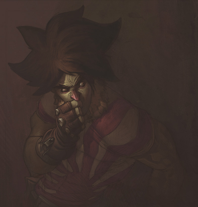
FUNK TILL THE BITTER FUCKING END!!So this is the pimped out version of the right hand side image of the Badfunk Triptych .
Not really much to say here other than that it was hella fun to do some serious rendering again. I don't think I'll be painting any of the other Triptych pieces like this, cause frankly I don't have a lot of time, and other, to me more pressing, ideas in my head that need to come out.
By the way, let me know what you think of the typography. I just want to know if it's readable to you. The kind of effect I am going for is that it is easily enough readable when you're looking at it, but doesn't constantly penetrate your vision when it's only in the corners of your eyes, if that makes sense. Basically I hope it's not super distracting and attention demanding, but not hard to read either when you try.
//EDIT: by the way, beats me why I didn't mention this three years ago or whenever I posted this, but I didn't invent the type. I don't want to take credit for something I didn't do, Eduardo Recife from Misprinted Type ( [link] ) is the brilliant mind responsible for that. I hand lettered this particular one, just for the visual effect. Also, that's not supposed to be an excuse, if you think that anything about the typography doesn't work it's definitely my fault. Just wanted to give credit where it's due (even if waaaaaaayyyyyy too late, really).
Just for fun, process screen shots:
1: [link]
2: [link]
3: [link]
4: [link]
5: [link]
6: [link]
7: [link]
8: [link]
Plus, some people asked for wallpaper version of the Triptych. I never provided any of those. If there's still interest, let me know. Meanwhile, here's a wallpaper-able version of this one: [link]
Done entirely in Photoshop CS.
Pin stripes are ballin'.
Related content


Comments: 537

Don't ever think that. It's never gonna be easy, but trust me: as cheesy as it sounds, it's a matter of willpower. Just a matter of time and dedication. :]
👍: 0 ⏩: 0


No, I'm afraid the font isn't working for me; I was about to comment on that even before I saw your question.
The worst part is that lowered L, which pretty much vanishes next to the large initial A, but even without alignment issues there are too many doodles for a transparent outline. This lettering might work with a color fill that clarifies the shape of the actual letters, or this unfilled outline might work with slightly less doodled letters, but the combination is, to me, unreadable.
Which is a problem because it distracts me from yer totally kickass art. Instead of fading into the background, the words take up too much of my attention.
The near-photographc guy should be our focus, followed by the baroque-noveau abstraction of the smoke. 'S one helluva picture. But once I start trying to figure out the font, I'm both confused and mildly annoyed and I no longer really notice the rest of it. And that's a real waste.
Okay, okay, so I see from the comments that this is three years old despite the DD being today. But still.
👍: 0 ⏩: 1
Well I appreciate the honesty, so no worries there. I surely won't go back and change anything, but thanks nevertheless.
👍: 0 ⏩: 0

Always liked this one.
Congrats on the Daily Deviation!
👍: 0 ⏩: 0


LOVE IT...as for the typography, in my opinion you have the balance just right, and achieved what you set out to do. Respect!
👍: 0 ⏩: 0


Awesome rendering, but it's not that that I love about this piece, it's the colour, texture, and most of all, the typography ")
👍: 0 ⏩: 0

Awesome. The guy himself kinda creeps me out a little, but he dresses pretty snazzy. 8D
👍: 0 ⏩: 0


Now that's my kind of art! Everything rolls out perfectly! I love it!
👍: 0 ⏩: 0


This is really cool. I see what you mean with the text. It is readable, if not a little difficult, but I think the style fits the overall feeling of the piece. Good stuff!
👍: 0 ⏩: 0

awesome picture, about the typography.. when I saw it I immediately wanted to know where it was from, it's simply superb in this picture. Because it has exactly the same feel as the smoke coming from the cigarette it doesn't interfere with the picture, but its quite readable at the same time aswell. I just don't understand why the K in "FUNK" is raised, keeping in tune with the smoke above it it would've made more sense to lower it a bit. oh well, great picture anyways
👍: 0 ⏩: 0

Sweeeeeeeeet. I never really understood what funk was, but it must be awesome.
👍: 0 ⏩: 0

This is sikkkkk... love very much
👍: 0 ⏩: 0


Creepy but cool and an exceptional end result!
👍: 0 ⏩: 0


nice combination of flat and 3d graphic. Really nice work
 (Smile)")
👍: 0 ⏩: 1
There is no actual 3D in this piece though.
👍: 0 ⏩: 1
As you said. I was referring to the combination of 2d and 3d visuals, not so much the use of 3d software. You've really done a beautiful job. Have to add the typography blends in well too.
👍: 0 ⏩: 0

This is awesome...everything about this work seems perfect

👍: 0 ⏩: 0


")


Is it just me or does the dude look like the perfect description of a buggzy from the book demons...very close in my mind.
Still for the way you meant it i must applaud you. Bravo.
👍: 0 ⏩: 1
I don't know anything about Buggzy, but thanks!
👍: 0 ⏩: 1
In the book it was one of the first few waves of demons to take over the human world. It was a creature that looked human for the most part. It looked like it was wearing cloths but they were part of it's skin. Looked like it was smoking a cig but it was part of it's skin. It liked to toy with it's victims feed of their reactions they became it's prisoner till it was done with them and it killed them. Evil creature but very cool in my mind. It was one of the more human ones that came.
You're very welcome looks really cool.
👍: 0 ⏩: 1
Damn, that sounds like a really cool idea. What's this again, the book of demons? Is that the title?
👍: 0 ⏩: 1
The book is called Demons. Came upon it by chance in the library every since they came out with angels and demons to a book just called 'Demons' is hard to find. lol. Though it is definitely a must read on my recommended list. Even more so if you're one to think the government is out to kill us. ^^
👍: 0 ⏩: 0

hey nice work...im getting a 404 on the wallpaper version. can u upload again?
best regards
👍: 0 ⏩: 1
thanks alot, it will suit my desktop background...
best regards Esbens
👍: 0 ⏩: 0

nice light and amazing technic...
👍: 0 ⏩: 0


the wallpaper is down.... 404 error pls send it to my email laser1675@googlemail.com
thankls a lot
👍: 0 ⏩: 1
Sorry for the super late reply. Try this: [link]
👍: 0 ⏩: 0
<= Prev | | Next =>