HOME | DD
 FabianMonk —
Always Funk
FabianMonk —
Always Funk

Published: 2007-11-29 01:26:39 +0000 UTC; Views: 127439; Favourites: 5656; Downloads: 8503
Redirect to original
Description
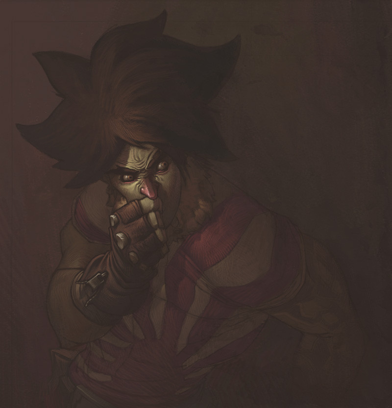
FUNK TILL THE BITTER FUCKING END!!So this is the pimped out version of the right hand side image of the Badfunk Triptych .
Not really much to say here other than that it was hella fun to do some serious rendering again. I don't think I'll be painting any of the other Triptych pieces like this, cause frankly I don't have a lot of time, and other, to me more pressing, ideas in my head that need to come out.
By the way, let me know what you think of the typography. I just want to know if it's readable to you. The kind of effect I am going for is that it is easily enough readable when you're looking at it, but doesn't constantly penetrate your vision when it's only in the corners of your eyes, if that makes sense. Basically I hope it's not super distracting and attention demanding, but not hard to read either when you try.
//EDIT: by the way, beats me why I didn't mention this three years ago or whenever I posted this, but I didn't invent the type. I don't want to take credit for something I didn't do, Eduardo Recife from Misprinted Type ( [link] ) is the brilliant mind responsible for that. I hand lettered this particular one, just for the visual effect. Also, that's not supposed to be an excuse, if you think that anything about the typography doesn't work it's definitely my fault. Just wanted to give credit where it's due (even if waaaaaaayyyyyy too late, really).
Just for fun, process screen shots:
1: [link]
2: [link]
3: [link]
4: [link]
5: [link]
6: [link]
7: [link]
8: [link]
Plus, some people asked for wallpaper version of the Triptych. I never provided any of those. If there's still interest, let me know. Meanwhile, here's a wallpaper-able version of this one: [link]
Done entirely in Photoshop CS.
Pin stripes are ballin'.
Related content


Comments: 537

Christ you've got mad skilz (I can't belive I just said "mad skilz"...that's how mad your skilz happen to be). The text isn't over powering and mostly readable, I thought the "f" in funk was an "r" for a moment, but sometimes I think I'm mildly dislexic so you might want to ask someone elses opinion.
👍: 0 ⏩: 1

Nah I'm sure people could see that R, it's all those swirls... so long as you realized it!
👍: 0 ⏩: 0


great job man the wall paper size is top qaulity, those horns look almost real
👍: 0 ⏩: 2
Hahahaha, ELEVEN!!
That's gotta be some kinda record.

👍: 0 ⏩: 0
JESUS CHRIST!!!
Hahahahaha, damn son way to go!
👍: 0 ⏩: 0

Oh my god, those hands, THOSE HANDS. They're so lifelike I feel as though I could shake them through the screen.
You're so kind of master.
👍: 0 ⏩: 1
Thanks a lot man! I'm glad you like it.
👍: 0 ⏩: 0


holy crap. i was so excited for this ever since you said you were gonna make a big version of it. and, wow, you really didn't disappoint. the detail in here is amazing
👍: 0 ⏩: 1


Oh dang!
now this is all kinds of wicked right here.
that jacket's lighting is so realistic, it's ridiculous
👍: 0 ⏩: 1
Thanks mate.
I can totally say things such as "mate" now and feel absolutely legit about it, they say it all the time in England. VOCABULARY UPGRADE!!
👍: 0 ⏩: 1

This is a great big plate of yes! I love this style, you need to have more like this. The detail is amazing. You have each small ridge separately shaded with an equally important part as the big areas. The added red and yellow on the skin, and the glossy finish and stripes on the coat are phenomenal. You are amazing. It looks like a comic, but feels like a painting, and has design aspects (the smoke). This IS my new wallpaper. I would do a screen cap right now, but I think you believe me.
👍: 0 ⏩: 1
Thanks a ton for the in depth compliment dude, really appreciate it!
👍: 0 ⏩: 1
No, thank you. I just hope you never stop hosting your process pics because they are really insightful. Incompetent people like me need inspiration every now and again. The only thing it doesn't show is the brushes you used during each step. I can assume you used a new "special" layer for the reds and yellows, such as overlay or something like that. I just don't know how you have such smooth shading with such tight ridges (such as the edges of the smoke and where the color meets the jacket).
👍: 0 ⏩: 1
I don't really understand what you mean by color meeting the jacket...
For details I just use really small brushes and do the shading with hatching. It's not at all uncommon that I'll be using a 1 pixel wide brush on details for a painting like this.
👍: 0 ⏩: 1
Haha whoops. I meant where the collar meets the jacket. Don't know how I made that spelling mistake.
👍: 0 ⏩: 1
Oh haha, that was dumb of me I should have gotten that, haha.
Yeah well it's just a small brush then. Selections help too.
👍: 0 ⏩: 0

Glad to see something fresh from you man, and not the usual characters. the type is cool, but it may have some problems when printing if not handled right. I dont think that the eye will get distracted much from the main guy if you increase the intensity of the type just a bit more.
Afterall you are your best critic if you see or feel something wrong, dont fool yourself and fix it.
👍: 0 ⏩: 1
I will have to keep those things in mind if it ever goes for printing. Thanks for the input!
👍: 0 ⏩: 0

very nice picture..i loved seeing the process...
👍: 0 ⏩: 0

Very nice. I like the text and how it envelopes his arm. I read it fine without any problems though it might pose a problem for others. I also think it's very detailed but in this piece it works. If it was anything more simple it would lose the effectiveness it brings.
👍: 0 ⏩: 1
I'm glad you think that. I really didn't want the text to be incredibly simple to read, otherwise I would have taken a different approach. I just didn't want it to take any effort either. Cheers!
👍: 0 ⏩: 0

love the mixed styles and the color values
it's extremely hot
the textures really add some flavor
👍: 0 ⏩: 1
Thanks, glad you like the textures!
👍: 0 ⏩: 1
Love it all sweety.
good sense of lighting, the character is appealing, and I love the color pallet.
I like how you used a dark green as the shadows. Makes the red pop
alright, I'm done going on
")
👍: 0 ⏩: 0


you are quite amazing. i really like it. it reminds me of the movie "The Mirror Mask." well done, my friend.
👍: 0 ⏩: 0
<= Prev |