HOME | DD
 FabianMonk —
Always Funk
FabianMonk —
Always Funk

Published: 2007-11-29 01:26:39 +0000 UTC; Views: 127435; Favourites: 5656; Downloads: 8503
Redirect to original
Description
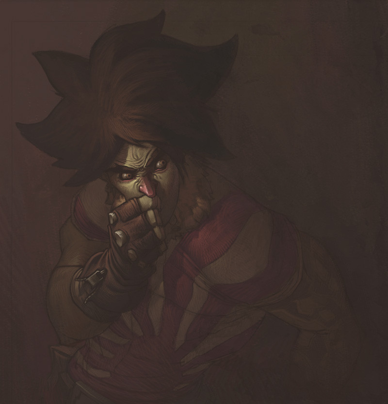
FUNK TILL THE BITTER FUCKING END!!So this is the pimped out version of the right hand side image of the Badfunk Triptych .
Not really much to say here other than that it was hella fun to do some serious rendering again. I don't think I'll be painting any of the other Triptych pieces like this, cause frankly I don't have a lot of time, and other, to me more pressing, ideas in my head that need to come out.
By the way, let me know what you think of the typography. I just want to know if it's readable to you. The kind of effect I am going for is that it is easily enough readable when you're looking at it, but doesn't constantly penetrate your vision when it's only in the corners of your eyes, if that makes sense. Basically I hope it's not super distracting and attention demanding, but not hard to read either when you try.
//EDIT: by the way, beats me why I didn't mention this three years ago or whenever I posted this, but I didn't invent the type. I don't want to take credit for something I didn't do, Eduardo Recife from Misprinted Type ( [link] ) is the brilliant mind responsible for that. I hand lettered this particular one, just for the visual effect. Also, that's not supposed to be an excuse, if you think that anything about the typography doesn't work it's definitely my fault. Just wanted to give credit where it's due (even if waaaaaaayyyyyy too late, really).
Just for fun, process screen shots:
1: [link]
2: [link]
3: [link]
4: [link]
5: [link]
6: [link]
7: [link]
8: [link]
Plus, some people asked for wallpaper version of the Triptych. I never provided any of those. If there's still interest, let me know. Meanwhile, here's a wallpaper-able version of this one: [link]
Done entirely in Photoshop CS.
Pin stripes are ballin'.
Related content


Comments: 537


DUDE! You are killing me. This is utterly amazing!!! The jacket i so believable, and the texture and color you got in his skin wrinkles are beyond... You are truly one brilliant madman. Holy mAx~
I have to... scope it out, no worries, I just had to put it out there... [link]
👍: 0 ⏩: 2
Dude, you are really nailing winners, my compliments can't fathom the respect I have.
As for the contest, I set a deadline of Feb 1 for the time being to give people plenty of time. I just had to throw it out there because I dig your stylin'. Monk's art is number 1, so crank your stuff first of course. I have millions of ideas crankin always, I know how that goes bud
 (Wink)")
👍: 0 ⏩: 0

Thanks for the compliment!
I'll have a look at the contest too, don't know if I'll have the time to participate though. I got a couple of ideas I need to get out of my head first.
👍: 0 ⏩: 0

man, that is inspired! and technically amazing! Critical question though.. is the smoke done on illustrator?
👍: 0 ⏩: 1
Nah, this was all done in Photoshop. I don't really know how to use Illustrator properly yet.
Thanks!
👍: 0 ⏩: 1
yeah me neither, kick ass art bro! welldone
👍: 0 ⏩: 0


Wow, thank you for sharing the process, amazing!
👍: 0 ⏩: 0

dude! your work is tight! man, i love the idea you had with the smoke coming out of his mouth. and the hands, they look completely 3d.
love the typography, yes it is legible and it flows great around the character's arm.
major props.
👍: 0 ⏩: 1

If you mean the somewhat disproportionate hands, that's kind of on purpose. I wanted them to seem somewhat clunky and heavy in comparison to his head. I was watching this video in class and there was an old dude there that totally gave me this idea, he seemed like he was a puppet almost, haha.
Cheers man, I think I might do some more, sometime, haha.
👍: 0 ⏩: 0

omg freaking holy hell mr-monk ur bananas u freaking color junkie!My god man, im fav'n man, im fav'n.Sweet stuff man.
👍: 0 ⏩: 1
Conz man, thanks a ton! Great to hear you dig it!
👍: 0 ⏩: 1
nah, dude thank you.Now u've made this coloring junk personal
👍: 0 ⏩: 0


wow!!! that its fantastic i really love, the smoke on a style, the caracter in other one, the text, make a fantastic work, great congratulations!
👍: 0 ⏩: 1

A damn cool piece.
Great job working in the graphics.
And thanks for the steps:]
👍: 0 ⏩: 1
Damn, thanks man. Dig your work quite a bit!
👍: 0 ⏩: 0

Really amazing! one of my favorite pieces of yours.
I like the color and the smoke is spectacular.
Fav, of course.
👍: 0 ⏩: 1

holy . . . .shit. . . . .this is like. .damn dude. this is toooo sick. .
👍: 0 ⏩: 1
Thanks man, that's saying something coming from Mr. Detail himself.
👍: 0 ⏩: 0


This is a wonderful picture! But um.. I can't really read the text at all. It was only when I looked at the deviation title that I could decipher it. :-/
👍: 0 ⏩: 1
Really? Damn... other people haven't had that problem so far...
👍: 0 ⏩: 1
Heh well perhaps my powers of literacy are failing me. T_T It looks good, anyhow, which is really all that matters
 (Smile)")
👍: 0 ⏩: 0

I've been an adirerer of your work and this piece just reafirms that admiration.
It is awsome. The abstract character, the colours, the swirling designs, and the way the swirling text makes your vision flow over it is cool. It's all great
Cheers dude.
👍: 0 ⏩: 1
That's really great to hear! Thanks a lot!
👍: 0 ⏩: 0


I like the types. But due to the desaturated color and the dark background it does make my eyes dance a little bit to understand them.
But on the painting side
you god damn nailed those values. damn.
👍: 0 ⏩: 1

Back da FUNK UP!!! That's off teh chain!!.....achemm...ok I'm not youngenugh to pull off the language, but the sentiment is on point. This is amazingbro!! Excellent job!!!
👍: 0 ⏩: 1

ohhhhhh :0 thank you so much for posting the progress shots! this is seriously amazing

👍: 0 ⏩: 0

This is outstanding!! I love those really decorative smoke swirls. Very graphic.
Did you stroke those?
I went through your steps, and I'm just wondering how you kept them all straight.
Amazing work. Really great color, shadows, and values.
Way to go.
Oh, and I didn't have any problem reading the text.
👍: 0 ⏩: 1
For the swirls I just made rough sketches and then refined the lines on a separate with a 1 pixel hard edge brush. In some cases I used the circle tool to create a perfect circle here and there, but I didn't use those in the final line art, I traced over them too, to integrate them better with the rest.
Thanks!
👍: 0 ⏩: 1
Hahaha, cheers. How's the Deutschlands treating you?
👍: 0 ⏩: 1

wow alter, Berlin ist am bestem ")
👍: 0 ⏩: 1


the diagonal stripes do affect my vision though..its still readable
👍: 0 ⏩: 1
I was thinking about those for a while. It didn't really look that good without them, and also not so hot with a solid fill (even if semi transparent). I chose this in the end, but I'm sure I missed some options.
👍: 0 ⏩: 1
right i understand...yeah im sure there are more options too..but with that stye of lettering i believe the lines do kinda work..didi u try like a gundge look?
👍: 0 ⏩: 0
phenominal bro..drawn by the lighting and everything is crisp and clear..dope!
👍: 0 ⏩: 0
<= Prev | | Next =>