HOME | DD
 FabianMonk — Badfunk Triptych

Published: 2007-11-18 02:59:07 +0000 UTC; Views: 24305; Favourites: 957; Downloads: 1660
Redirect to original
Description
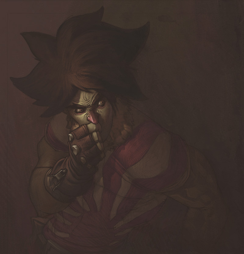
BIG SIZE IS BIG!At least moderately.
Alright, it doesn't not really work as a triptych to be honest, because the center piece is the weakest of the three, in my opinion, but I couldn't really find a better name.
Anyway. This is a class assignment, a postcard project. We were given three themes, and three deadlines. What we had to do was make draw an image relating to each theme, onto a postcard, and post it anonymously to our teacher. The whole point was basically that a whole lot of different people would see the work (everyone involved in the post office, people at Uni walking by the postcards mounted on the wall, as well as the people from our own class, etc.) without knowing whose work they were looking at.
I guess that defeats the point of the exposure, but at the same time I really dug the concept, because it was definitely something new for me.
The first theme was Dreams, the second was Confessions, and the third one was Psychological Fears and I guess I did it backwards. I mean I submitted each postcard in the right order, but the actual order of viewing them is the opposite. Just for fun.
The back of the first one (aka the last one in this set) read "never underestimate a child's imagination". The back of the second read "at least 1000 skeletons in my closet, none of which are mine". And the third one will probably read "you can't stop time, the sooner you learn it the better", or something to that effect. The deadline for the third one hasn't arrived yet, but I figured I would make the card now, so I can get back to my other projects sooner.
Also, each of these cards had to have some kind of factor that linked them all together, and as you can probably see, I got multiple (also I was really pressed for time so I was happy to take some shortcuts).
And the character depicted in each card is the Chairman Badfunk, of Satellite Soda.
I think that covers all of the necessary information!
Software: Photoshop CS.
Lastly, I totally plan on making the one with the old Badfunk into a full blown painting. I hope I can find the time.
Related content


Comments: 166

Nice! The only problem I had with viewing and picking out the details was that it took me a while to notice the subtext underneath the main 3 words, and my eyes strained to read it.
👍: 0 ⏩: 1

Yeah, the text is pretty hidden. I should have probably mentioned that another requirement of the assignment was to have text on there. I wouldn't have put any, if it weren't for that requirement, so in the end I just put some because I had to. I don't really care if it's easily legible or not, because I most absolutely don't want it to be the main focus.
Although it is pretty easy to read in print.
👍: 0 ⏩: 0

This is really nice! I love the concept of it.
👍: 0 ⏩: 0


")

this is crazy cool monk - i love it ;D
👍: 0 ⏩: 1

Wow, this is really awesome! I can't believe you used Photoshop for the whole thing. I would have thought the swirls were done in Illustrator.
👍: 0 ⏩: 1
I don't own Illustrator. And even if I did, I wouldn't know how to use it properly yet. Shit I don't even know how to use the pen tool in any program, for that matter.
Thanks!
👍: 0 ⏩: 0


Amazing!
I love how they all have horns. . . Beside the themes being related to each other, the people in them seem to be related, too!
👍: 0 ⏩: 1
Actually those are tentacles, not horns, haha. But it's cool, I can definitely see the horn resemblance, especially in the middle one.
Cheers!

👍: 0 ⏩: 0
<= Prev |