HOME | DD
 FabianMonk — Badfunk Triptych

Published: 2007-11-18 02:59:07 +0000 UTC; Views: 24305; Favourites: 957; Downloads: 1660
Redirect to original
Description
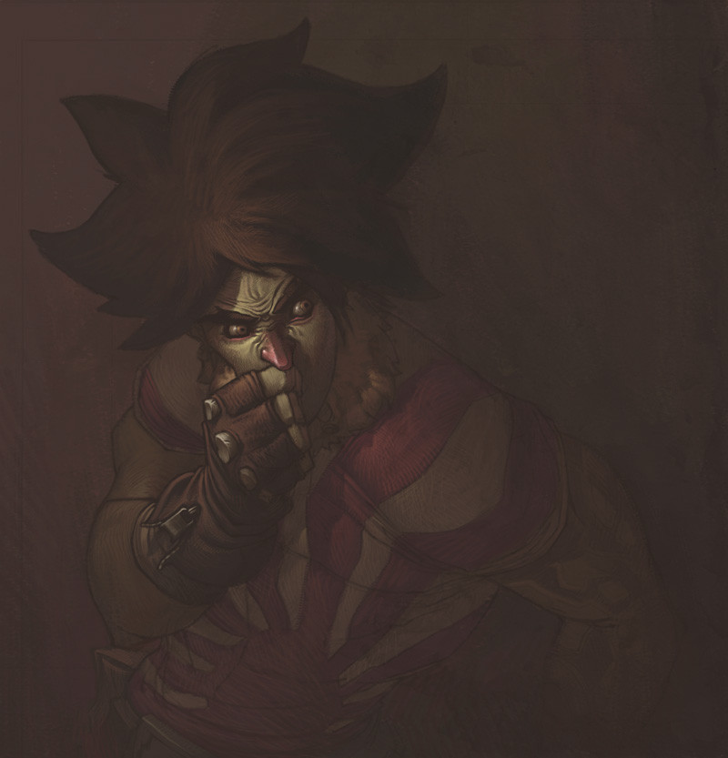
BIG SIZE IS BIG!At least moderately.
Alright, it doesn't not really work as a triptych to be honest, because the center piece is the weakest of the three, in my opinion, but I couldn't really find a better name.
Anyway. This is a class assignment, a postcard project. We were given three themes, and three deadlines. What we had to do was make draw an image relating to each theme, onto a postcard, and post it anonymously to our teacher. The whole point was basically that a whole lot of different people would see the work (everyone involved in the post office, people at Uni walking by the postcards mounted on the wall, as well as the people from our own class, etc.) without knowing whose work they were looking at.
I guess that defeats the point of the exposure, but at the same time I really dug the concept, because it was definitely something new for me.
The first theme was Dreams, the second was Confessions, and the third one was Psychological Fears and I guess I did it backwards. I mean I submitted each postcard in the right order, but the actual order of viewing them is the opposite. Just for fun.
The back of the first one (aka the last one in this set) read "never underestimate a child's imagination". The back of the second read "at least 1000 skeletons in my closet, none of which are mine". And the third one will probably read "you can't stop time, the sooner you learn it the better", or something to that effect. The deadline for the third one hasn't arrived yet, but I figured I would make the card now, so I can get back to my other projects sooner.
Also, each of these cards had to have some kind of factor that linked them all together, and as you can probably see, I got multiple (also I was really pressed for time so I was happy to take some shortcuts).
And the character depicted in each card is the Chairman Badfunk, of Satellite Soda.
I think that covers all of the necessary information!
Software: Photoshop CS.
Lastly, I totally plan on making the one with the old Badfunk into a full blown painting. I hope I can find the time.
Related content


Comments: 166

The thing that really catches my eye? Clean, sharply-delineated character work, those neat swirlies connecting them, and then in contrast, all that clutter and noise. You pulled that off, full stop. I dig!
I think the reason the center piece isn't as strong as the bookends is something that'd be a challenge no matter what. Any center piece in a triptych has the hardest time standing on its own because it's got to relate to those pieces flanking it. Some portion of the content and composition gets dictated. That steals some of the spontaneity from the beast.
I think the main trouble's how center-weighted that middle piece is, type and figure right down the line, and equally balanced between swirlies. Maybe push the swirlies around so it's no so balanced? I think if you knock it loose of its stability, you'll get that middle piece more in line with what you want.
Mah two cents.
👍: 0 ⏩: 1

I was honestly thinking of, in the center piece, flipping the art nouveau decals on side up side down, at least partially. Still have them match up with the image it connects to, but having the part that's closer to the ear be flipped upside down on one side, to throw the composition off a little and make it seem less mirrored.
I don't know I might still do that. I kinda liked the look of it once I did the mirroring, but maybe I'll try it out just to see what kinda effect I can get.
Cheers!

👍: 0 ⏩: 0

wow i love it , very expresive,cool idea
")
👍: 0 ⏩: 0

 (Smile)")


")

Anyhow, the design is really weird-interesting-cant-take-me-eyes-off-it cool.
👍: 0 ⏩: 1


Defently the best I´ve ever seen by you
👍: 0 ⏩: 1
That's great to hear!
👍: 0 ⏩: 0


I love the pic, and I love the concept!
👍: 0 ⏩: 1
Any time! I always love your work
👍: 0 ⏩: 0


So like... in your program at school, where do you scale compared to the rest of the class? The higher end, middle, or lower end?
👍: 0 ⏩: 1
That's a little hard to say. For one, it's a foundation degree, which means there is no specialization yet. At least not at this point in the course. Which means we have people who want to do interior design, or sculpting, or fine art, or textiles, etc. etc. all mashed together in one course. And with such a broad range of interests, it's not really possible to say where anyone ranks, because it really just depends on their personal preference.
👍: 0 ⏩: 0

Holy awesomesauce!
Coolest thing I've seen all day, for sure.
👍: 0 ⏩: 1


")


*choke* that's beautiful man! Lovely work - colours and characters and smoky designy swirls are all top-notch!
👍: 0 ⏩: 1

Really strong design here. What's a Badfunk?
👍: 0 ⏩: 1
Badfunk is the name of the character. Just a character from the Satellite Soda gang , [link] .
👍: 0 ⏩: 1

Did you do these? O_o
Holy shit.
The one on the far left is by far the best, but my favourite is definately the one to the right.
Good work, yo.
Nice to see you're still uploading stuff.

👍: 0 ⏩: 0

dude. this is siiiick. diggin the dude on the right.
👍: 0 ⏩: 1

Great work!
I agree that the middle image is the weakest, but I prefer it that way when displayed together. The first image grabs you and then it finishes strong. I'm torn for a favorite between the first and last.
Incredible design. Your choice of color scheme works excellent. I really like the lighting you used on the figures. The texture you used really works in the negative space and balances out the image as a whole.
And finally I really like the font you used. What is the name?
My only suggestion would be a different font for the subtext. I would go with a serif font. It is also a bit hard to read. I would Maybe drop down the thickness of the text outline and filled it with the light green at 50-70% opacity. Maybe even drop the outline all together. That's just my opinion though.
It's a great piece! Thanks for sharing!
👍: 0 ⏩: 1
It's actually easier to read in print. The size of the image right now, plus the fact that it's on a monitor, is what makes your eyes struggle. That and the fact that I really didn't want the text to be really easy to read, because I didn't want it to jump off the page at all. It was part of the assignment to use text, otherwise I wouldn't have.
The name of the very ornate font is "Nasty", and the name of the subtext font is "Diesel", and you can find both of them (plus many more) at [link]
Cheers!
👍: 0 ⏩: 0

nice piece monk.I know ur probably getting tired of hearing that but, wow man.Sweet work.
 (Wink)")
👍: 0 ⏩: 1


If you wanted it to work better as a triptych, I would move "Fear" underneath the first guy, and "vision" under the third. Then I would separate them by splicing the filigree in half on either side of the "Trust" character. This would give you 3 distinct (no pun intended) pieces, yet maintaining one unified piece.
All in all a good job.
j
👍: 0 ⏩: 1
Well I didn't put a very obvious separation between each piece, but if you look close enough, you can tell where each image ends and the next one starts. There's like a cut in the gradients and the textures.
As to moving the text, I appreciate the input, but I really don't want to hide any more of the characters than I need to. I only put the text underneath the character in the middle to balance everything out, but I originally didn't want to.
Like I said in a comment above, it was actually a requirement to use text (and I should have mentioned that in the description), otherwise I would not have done it.
👍: 0 ⏩: 1
Ah, I didn't notice the gradient change before. The muddy lines do separate the 3 pieces into what appears to be 3 equal pieces, and, as with much early Christian religious triptychs, it is not uncommon to have the outer 2 weighted slightly to the center. I like the text, I think it adds one more element of uniformity.
j
👍: 0 ⏩: 0

very nice conceptual effort here
👍: 0 ⏩: 0

Pretty amazing, i really feeel the composition is perfectly balanced.
👍: 0 ⏩: 1
<= Prev | | Next =>