HOME | DD
 FabianMonk — Badfunk Triptych

Published: 2007-11-18 02:59:07 +0000 UTC; Views: 24261; Favourites: 957; Downloads: 1660
Redirect to original
Description
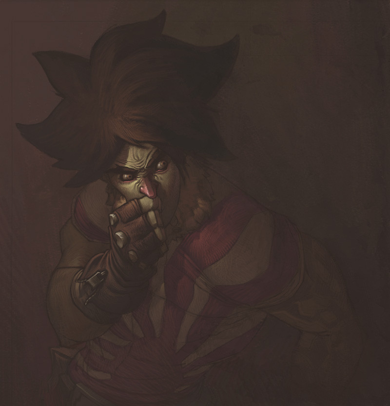
BIG SIZE IS BIG!At least moderately.
Alright, it doesn't not really work as a triptych to be honest, because the center piece is the weakest of the three, in my opinion, but I couldn't really find a better name.
Anyway. This is a class assignment, a postcard project. We were given three themes, and three deadlines. What we had to do was make draw an image relating to each theme, onto a postcard, and post it anonymously to our teacher. The whole point was basically that a whole lot of different people would see the work (everyone involved in the post office, people at Uni walking by the postcards mounted on the wall, as well as the people from our own class, etc.) without knowing whose work they were looking at.
I guess that defeats the point of the exposure, but at the same time I really dug the concept, because it was definitely something new for me.
The first theme was Dreams, the second was Confessions, and the third one was Psychological Fears and I guess I did it backwards. I mean I submitted each postcard in the right order, but the actual order of viewing them is the opposite. Just for fun.
The back of the first one (aka the last one in this set) read "never underestimate a child's imagination". The back of the second read "at least 1000 skeletons in my closet, none of which are mine". And the third one will probably read "you can't stop time, the sooner you learn it the better", or something to that effect. The deadline for the third one hasn't arrived yet, but I figured I would make the card now, so I can get back to my other projects sooner.
Also, each of these cards had to have some kind of factor that linked them all together, and as you can probably see, I got multiple (also I was really pressed for time so I was happy to take some shortcuts).
And the character depicted in each card is the Chairman Badfunk, of Satellite Soda.
I think that covers all of the necessary information!
Software: Photoshop CS.
Lastly, I totally plan on making the one with the old Badfunk into a full blown painting. I hope I can find the time.
Related content


Comments: 166

holy F-BEEEP-
uh... yeah
but shouldn't trust be the "weakest" anyways?
and the brightness, simplicity make sit more, naive/innocent compared to the others
👍: 0 ⏩: 0

I just looked at it, at first, and I actually saw a 'speak no, hear no, see no evil' theme to them. And I absolutely loved the fact that it appears to be the same character, even down to the colors they wear. (though, now reading your description, I see why. :/ ) The atmosphere struck me as powerful, along with its possible hidden meanings.
and I continue to see odd little patterns when I look at it. I think this is one of my favorite images that I've seen lately. O__O Wonderful, skillful work. It's well designed and definitely seems thought out.
👍: 0 ⏩: 1

It is actually inspired by the speak no, hear no, see no evil. It's kind of reversed, since instead of covering up the individual part of the face, they are using it, respectively, but it stems from there.
Thanks a ton for the in depth comment! Very much appreciated!
👍: 0 ⏩: 1
Whoa, I can't believe I got it on the nose! You're very welcome. :3 I couldn't help myself but to really talk about what I saw it in.
👍: 0 ⏩: 0


Fuck! Fuck! FUCK! Dude, this looks way too awesome.
Stop being awesome...
Do you want me to cry like a baby?
Do you?
👍: 0 ⏩: 1
I want to visit you in Holland and party madscore with you is what I really want to do.
👍: 0 ⏩: 1
Sounds like an awesome plan. Get your skinny but here, I'll fill ya up with liquor!
👍: 0 ⏩: 0


this is f-ing cool man! the themes and art are perfect. good job saying a lot with different images. a lot!! peace bro.
👍: 0 ⏩: 1
Thanks man, that in turn means a lot to me!
👍: 0 ⏩: 0

seriously gorgeous work, man. i'm diggin all the wrinkles in the old man version
👍: 0 ⏩: 1
Thanks! Glad you do, since I got bigger plans for that one.
👍: 0 ⏩: 0

your best work till now. This shows you have matured artitically a lot mate
well done
👍: 0 ⏩: 1
That's a big compliment, thanks a lot!
👍: 0 ⏩: 0


awesome stuff man! love the kid badfunk, dunno why but I love how ya did his shirt! haha
only weakpoint is the typography imo, it seems kinda out of place, maybe u should try and "draw" the text in as well?
👍: 0 ⏩: 1
I disagree with it being out of place, at least in regards to the main one, the bigger one. Personally I think it fits.
I totally hear you on hand lettering though. I think I will seriously try that with the bigger painting of the Old Funk. I just didn't have the time to hand letter these, would have taken ages for that same kind of ornate type.
👍: 0 ⏩: 0


 (Smile)")


sick!! i hope you do more stuff like this.. very graphic design style style. and of course i love the grittiness! awesome work!
👍: 0 ⏩: 1
Thanks man, glad you like it! Yeah I'm really starting to get a lot more interested in graphic design, and I think I'll definitely incorporate more of it in my upcoming works.
👍: 0 ⏩: 0

Reminds me of the Speak No Evil, Hear No Evil, and See No Evil concept.
👍: 0 ⏩: 1
It is. :]
Well it's inspired by it.
👍: 0 ⏩: 0

amazing. i could see this as an amazing cd booklet. you have any interest in doing work like that?
👍: 0 ⏩: 1
If I get paid and have the time, yeah, haha.
👍: 0 ⏩: 0

wow...
this amazingly beautiful work! i esp love the the font (custom?) and spiral/floral designs.
cheers. ^_^
👍: 0 ⏩: 1
The font is called "Nasty", and I downloaded it off [link]
Thanks!
👍: 0 ⏩: 0

This is really fantastic looking, I love the design elements and the way each picture bleeds into the next. I think you did a fabulous job!

👍: 0 ⏩: 1

wonderfulness.
i sense some Mignola. Solid blacks and the dull colors.
its a joy to look at.
👍: 0 ⏩: 1
Thanks a lot!
I can see what you mean about Mignola, although I actually don't look at a lot of his work. I think he's a ridiculously sick artist though, I should probably change that.
👍: 0 ⏩: 0


Ohhhhhhhhh snap! This is nice... Great job with the text and those wonderful vector swirls(if those aren't vector you'll have to excuse me) Might be more dramatic if the outer characters were looking outward rather than back into the center. But knowing you, you most likely tried that angle and it didn't look as nice haha... This ones real killer monk!
👍: 0 ⏩: 1
Ah, no I actually never tried that. I thought about it, but I didn't seriously consider it. I thought the connection between the three would be stronger if everything was concentrated towards the center.
Cheers!
👍: 0 ⏩: 0

gefällt mir sehr gut! coole sache! Hätte das muster echt auch in Illustrator gemacht, aber nur weil ich das im LEBEN nicht so sauber in photoshop hinbekommen hätte
")
👍: 0 ⏩: 1
Haha, ja, ich hab da auch ne ganze Weile fuer gebraucht... aber ich weiss einfach nicht wie man es anders macht, und noch macht es mir so Spass, also mal schauen.

👍: 0 ⏩: 1
jo, für die repro allgemein und insbesondere für größere drucke (oder offset wo du jede kante siehst) sind vektoren halt klasse. Die kannst du skalieren so groß du willst, völlig ohne pixelbildung, weil die ja berechnet werden.
Aber schaut subbr aus, so lang man das so machen kann, mach es wie es dir am besten passt!
👍: 0 ⏩: 0


Wow! I love the way you define your lights and shadows!
👍: 0 ⏩: 0

loving the style of your lighting, and these lines are clean and smooth. i like that fear concept alot
👍: 0 ⏩: 0

Would be a bit wide for a wallpaper wouldn't it? Unless you don't mind it taking up only the middle portion of the screen, the rest filled with black.
👍: 0 ⏩: 0

| Next =>