HOME | DD
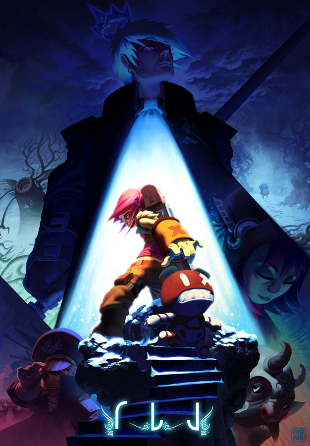
 FabianMonk — Event Horizon Cover

Published: 2006-01-31 20:30:45 +0000 UTC; Views: 10089; Favourites: 116; Downloads: 1243
Redirect to original
Description
As the title says, the cover to an edition of the Event Horizon magazine. I sadly didn't have as much time as I would have liked on this. There are a couple of things I would have changed if it weren't for the tight deadline. But oh well, it was still fun. The tiger's whiskers have been added in the final version, by the way (as well as some other details).Pencils, inks: Enrique Corts!
Colors: Me (Monk)
Software: Adobe Photoshop CS.
Related content


Comments: 42


I'll take that as a very hardcore compliment!
👍: 0 ⏩: 1

youre a very hardcore individual my man. it has to be.
👍: 0 ⏩: 0


THIS IS ABSOLUTELY KICK-SMASH-BAM-BOOM!
(*_*)
you never stop amazing these eyes,bro!
*faves*

👍: 0 ⏩: 0

Fantastic cover. I'm really sad to see this book go away. I think it was filling a very nice, particular niche in the market that not many other books do.
KAB
👍: 0 ⏩: 0

The chick's hair [It is a chick, right?] is sooo adorable. I want it >3
👍: 0 ⏩: 0

dude your colours really bring out this piece....awesome stuff!!! the pencils rock too!!!!!
👍: 0 ⏩: 0


real class man!
Personnaly I m not a big fan of the greenish color on the tiger, but does make the figure jump out more.
**CY**
👍: 0 ⏩: 0

Uber-fresh! Great colours. You and enrique compliment each others style well. Lovin the tiger.
👍: 0 ⏩: 0


O_____o
Can't stop watchin it ..... *mooooooooore need moooore monk*
👍: 0 ⏩: 1

For having a thight deadline this looks nice man. Good job
👍: 0 ⏩: 0


Amazing coloring job!! The detail in this piece is simply awesome ^_^ and the intense light on the tiger is beautiful. For a second tho I thought the girl had a tiger tail hehe XD
👍: 0 ⏩: 1
I thought the same thing for an instant while coloring...
👍: 0 ⏩: 0


amazing man. amazing
we need to do a collab one of these days
👍: 0 ⏩: 1

Hmm can't say much else but that this is really freggen awesome. I like the upper right most zombie's jaw...it looks truely wicked. Keep up the awesome work.
👍: 0 ⏩: 0


The green lighitng on the tiger is a nice touch. I know you say you didn't have a lot fo time to finish this. Any thoughts to another version on your leisure time?
Also, I'm still working Photoshop 7 - is CS loads better?
👍: 0 ⏩: 1
Probably no touch-ups. My schedule's not the lightest at the moment, and I don't really like going back to pieces after a week's time or longer. I start losing interest.
And PS CS isn't loads better at all. For coloring or painting, the only really notable difference is that in fullscreen mode, you can now move the image around as much as you want, and you're not restricted by the image borders any longer. Then there's things such as being able to customize your own keyboard shortcuts, but I don't use that at all, I've gotten so used to the old ones...
👍: 0 ⏩: 0

DOOOOOPPPPPPEEEEEE! I love the Purple alot for some reason. AMAZING DOOD!
👍: 0 ⏩: 1
Haha, thanks homeslice!
👍: 0 ⏩: 1
SLice of bread......mmmmmmm bread.
👍: 0 ⏩: 0

hey fab this is tight dudeeee keep at it cheers mate
👍: 0 ⏩: 0


meh.....this one kinda dissapoints me! ")
but meh, its always better then my stuff! ")
👍: 0 ⏩: 1
Hehe, yeah it happens.
For some reason I really like the green on the tiger though. I think it adds an interesting touch.
Anyway, Enrique and I have done another collab already that I can't show, and that one's better for sure.
👍: 0 ⏩: 1


I have just one problem with it.....Gotcha! Theres never a problem with your stuff. Amazing work as always. The mad skillz Monk strikes again!
EQ!
👍: 0 ⏩: 0


your colors rocks, i could believe you had a lot of fun. when i see this - it looks like a mix from 3 other stories which came in my mind  (Smile)")
👍: 0 ⏩: 0

