HOME | DD
 FabianMonk —
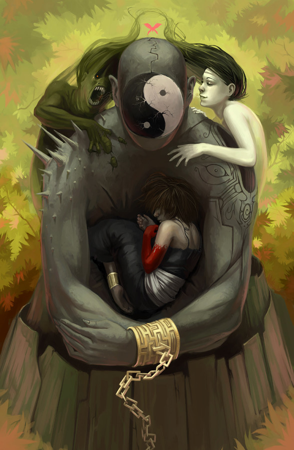
The Tree of Life
FabianMonk —
The Tree of Life

Published: 2006-02-17 14:50:16 +0000 UTC; Views: 24332; Favourites: 719; Downloads: 4536
Redirect to original
Description
You may have seen the beautiful lines for this piece over in Tom's gallery already, and if you haven't you're gay HAHAHAHA. Serious, he's a kickass artist and deserves some love. Anyway, as you can see, I made two versions of this. The first one focuses more on rendering, whereas the weight of the second lies in the color choices and contrast alone, which I was aiming to make as saturated, and as inyourface as possible.Pencils: Tom (Red Monkey)
Colors: Me (Monk)
Software: Painter IX.
Related content


Comments: 129

wow...i love this. it's given me an idea for my first tattoo...hope you don't mind(i'm open to objections")
-amy-
fav.
👍: 0 ⏩: 1

You'll have to ask RedMonkey. He drew this.
👍: 0 ⏩: 0


Wow. This is very intresting. Great job you two!
 (Smile)")
👍: 0 ⏩: 1

The second is far trippier, but kinda two-tone by comparison to the first that really does justice to the image in creating a 'world' as it were.
👍: 0 ⏩: 0

I think the lower one is cooler, but the higher one shows greater coloring skill.
👍: 0 ⏩: 0

Holt crap... this is the awsome. screams neon genesis evangelion all over. love it.
👍: 0 ⏩: 0

This amazes me, even though I seem to be gay for not viewning teh spectacular line art
👍: 0 ⏩: 1

That's very cool. The colors are great and so is the idea. Great work.
👍: 0 ⏩: 0

Arrh yeeeah. Both are great, but the top one is dope!
👍: 0 ⏩: 1


great werk with the colors
u did his lines justice
👍: 0 ⏩: 0

That's really great! This artwork seems to be so strong and powerful. I'm impressed.
👍: 0 ⏩: 0

Awsesome. I like the first one more mostly because I get more of a sense of the body being mirrored. I like the composition more cropped in like that too. Really cool.
👍: 0 ⏩: 1
I personally favour the first one as well. The second was more of an experiment. Glad you like it.
👍: 0 ⏩: 0

Man, I wish I could kick out some decent lineart for you. Prolly wouldn't take much, though, you're colors would make ANYthing I draw look better! lol
👍: 0 ⏩: 0

yeah monk you know you rule man. always! Monk fer president!
EQ!
👍: 0 ⏩: 1


Hooray for first comments
Great work, I really like this idea.
👍: 0 ⏩: 0
<= Prev |