HOME | DD
 FablePaint — BBA Concepts 21

Published: 2010-04-18 10:39:20 +0000 UTC; Views: 9867; Favourites: 178; Downloads: 177
Redirect to original
Description
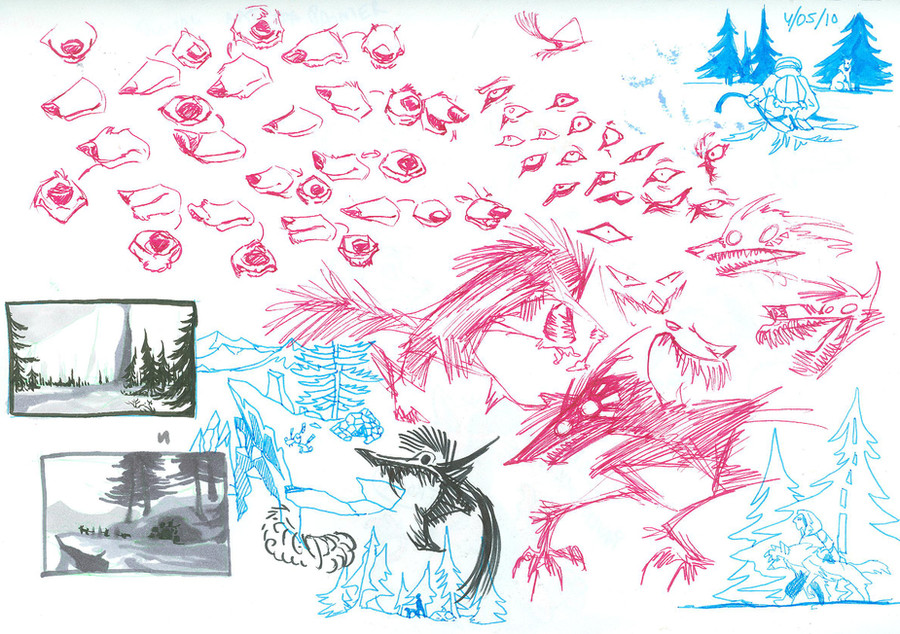
Lots more Swiftkill as I figure out just how far her features can distort before she stops look right. Also getting a sense of proportion and how to keep her face regular. Different angles, different expressions, and a "what not to do".She don't look good shaved
")
Related content


Comments: 18

I hope Swiftkill isn't all emo bitch waa waa like she was beforehand. Hated her because of that... And others did too...
Hope she's cool like Bloodspill is. :}
👍: 0 ⏩: 0

Hehe. Swifty's idea of a haircut: one flag. XDXD
👍: 0 ⏩: 0

Oh man! You give the character great expressions!! Very nicely done!
👍: 0 ⏩: 0


You're drawing her really beautiful... I like more your style than Kay's, really. I'm happy that you will continue the comic (I know with Kay, but always
👍: 0 ⏩: 0

I think you draw them too delicate jaws, and too fluffy cheeks. It looks more like fox than wolf to me.
but I adore how you draw expression and dynamic poses.

👍: 0 ⏩: 1

Depends on the character. Swifty is meant to look a little razzled and vulnerable, hence why I upped the size of her eyes and slimmed down her facial features. As the comic progresses and her attitude changes (and she ages), her looks might come to reflect that.
👍: 0 ⏩: 0


 (Wink)")


Pushing expressions is so much fun, when done right. You're wonderful with it, I do hope it carries over to the comic, myself, it brings so much more life and character to the art that, in all honesty, I felt was a bit stiff in the posted comics. *hides from fans*
Makes sense you're getting Don Bluth comments, exaggerated expressions are a huge part of what made his style in the 80's. (Man, and back in my TLK fandom days they thought random TLK screenshots were funny. They obviously haven't paused any Bluth film. Charlie made the BEST FACES.)
👍: 0 ⏩: 1
I think the stiffness was partly because Kay was struggling to keep the characters consistent with their older looks, when the truth was she'd just gotten way better and was stuffing herself into far too small a box. She's lately taken a real liking to abstract stuff and playing with colors and design; I've asked her about coloring the comic since her color sense is pretty on the nose (she corrected a lot of my stuff to make everything consistent and would make a lot of color suggestions for environments and things).
My stuff was pretty stiff way back then too and it's only through a helluva lotta training in just the last few months that I can feel comfortable churning out stuff like this.
👍: 0 ⏩: 0


Is the style changing like this mostly for the younger history years, or is this a permanent change for the whole series? I mean, I like both styles, just rather accustomed to the less angular style by now for the BBA in particular. Modern Disneyish versus Don Bluthy I guess. lol I dunno how better to describe.
👍: 0 ⏩: 0


Why is your style so alive and expressive ;A;? I love that~ Swifty looks gorgeous too! Really love looking at your concept art :> it;s a learning experience.
👍: 0 ⏩: 0


