HOME | DD

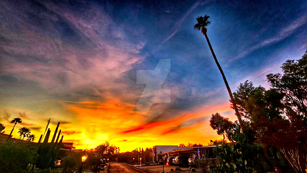
fade-out — the round walk

Published: 2005-02-23 13:48:40 +0000 UTC; Views: 1688; Favourites: 45; Downloads: 321
Redirect to original
Description donauinsel, vienna...i guess this is retro
Related content
Comments: 77

Xmoult [2005-02-23 19:17:43 +0000 UTC]

wann hast du das gemacht????so eine sonne hat wien seit monaten nicht mehr gesehen...
aber sehr faszinierend........

👍: 0 ⏩: 1

fade-out In reply to Xmoult [2005-02-23 19:22:11 +0000 UTC]

gestern
war kurz ein wolkenaufbruch und schöner blauer himmel der natürlich noch etwas bearbeitet wurde

👍: 0 ⏩: 1

Xmoult In reply to fade-out [2005-02-23 19:31:49 +0000 UTC]

geil

👍: 0 ⏩: 1

fade-out In reply to Xmoult [2005-02-23 19:32:35 +0000 UTC]

voll

👍: 0 ⏩: 0

hbynoe [2005-02-23 17:23:24 +0000 UTC]

the tones and saturation of all these colors
are perfect andi

👍: 0 ⏩: 1

fade-out In reply to hbynoe [2005-02-23 19:10:10 +0000 UTC]

oh dear thank you so much for faving this piece
really glad that so much people here like it, cause i think it´s a very unusual piece for my style
thank you

👍: 0 ⏩: 1

hbynoe In reply to fade-out [2005-02-23 19:57:54 +0000 UTC]

it is but it is still very beautiful

👍: 0 ⏩: 0

Corvi In reply to ??? [2005-02-23 17:18:21 +0000 UTC]

Sieht hübsch aus , nur denke ich dass das blau vielleicht eine spur heller sein könnte. Sieht so gar dunkel aus und die weißen Wolken passen nicht so ganz. Aber sonst , gefällts mir sehr

👍: 0 ⏩: 1

fade-out In reply to Corvi [2005-02-23 19:13:44 +0000 UTC]

von den starken hell/dunkel kontrasten lebt das bild ja gerade
hab eh alles probiert mit hellerem rot, hellerem blau, so gefällts mir persönlich am besten!
aber danke für deine kritik

👍: 0 ⏩: 0

Zlatty [2005-02-23 16:42:12 +0000 UTC]

very nice composition
great colors ofcourse !

👍: 0 ⏩: 1

fade-out In reply to Zlatty [2005-02-23 19:14:30 +0000 UTC]

puh, i thought they are way too saturated and stuff...but it seems not to be so
thank you

👍: 0 ⏩: 1

Zlatty In reply to fade-out [2005-02-23 19:20:18 +0000 UTC]

they seem to work well with the setup of the shot
so be proud of it

👍: 0 ⏩: 1

fade-out In reply to Zlatty [2005-02-23 19:32:55 +0000 UTC]

okay, i am

👍: 0 ⏩: 0

Laura-AH In reply to ??? [2005-02-23 16:05:54 +0000 UTC]

....this is so stunningly beautiful. the strong colors and the curves...I love it.

👍: 0 ⏩: 1

fade-out In reply to Laura-AH [2005-02-23 19:16:33 +0000 UTC]

:woot:
thank you so much (for comment and )

👍: 0 ⏩: 0

taoge In reply to ??? [2005-02-23 15:02:36 +0000 UTC]

love the contrast of the colours

👍: 0 ⏩: 1

fade-out In reply to taoge [2005-02-23 19:07:51 +0000 UTC]

thank you

👍: 0 ⏩: 0

Irena-N-Photography [2005-02-23 14:04:35 +0000 UTC]

The rich red and ink blue are making it look like painting, almost.
Amazing shape.
for composition.


👍: 0 ⏩: 1

fade-out In reply to Irena-N-Photography [2005-02-23 14:05:17 +0000 UTC]

thank you

👍: 0 ⏩: 0

Tokebox In reply to ??? [2005-02-23 13:51:15 +0000 UTC]

Nice shapes and interesting colors

👍: 0 ⏩: 0

thecell [2005-02-23 13:50:37 +0000 UTC]

schöne formen, klasse farben...

👍: 0 ⏩: 1

fade-out In reply to thecell [2005-02-23 13:50:58 +0000 UTC]


danke

👍: 0 ⏩: 1

thecell In reply to fade-out [2005-02-23 13:51:57 +0000 UTC]

den himmel hast aber nachbearbeitet, oder?

👍: 0 ⏩: 1

fade-out In reply to thecell [2005-02-23 13:53:05 +0000 UTC]

ja sicher...auch das rot ein wenig

👍: 0 ⏩: 0

Spyru In reply to ??? [2005-02-23 13:49:33 +0000 UTC]

Wow, interesting shapes and colors. This could be put in the abstract section!
Good job.

👍: 0 ⏩: 1

fade-out In reply to Spyru [2005-02-23 13:50:05 +0000 UTC]

hehe...thank you...abstract would work too, you´re right

👍: 0 ⏩: 0


<= Prev |