HOME | DD
 faerieseatsugarcubes — Little Red
by-nc-nd
faerieseatsugarcubes — Little Red
by-nc-nd

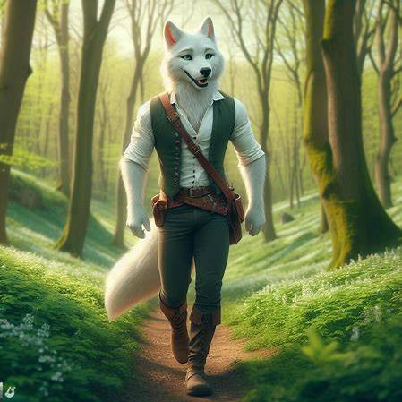
#wolf #bigbadwolf #littleredridinghood #halloweencountdown
Published: 2014-11-02 02:52:23 +0000 UTC; Views: 310; Favourites: 6; Downloads: 0
Redirect to original
Description
This was the picture for 11 days until Halloween that I put on instagram.Related content


Comments: 10

Sorry for the wait. I don't check my notes that much. Lol.
I'd like to start with values used near the lamp. You can see some of the glow from the fire outside the lantern, but the shadows could be a little more prominent. Usually its the anatomy in a picture I have to critiique, but honestly as far as red goes, its done rather well. The wolf could use a little work around the face, but that's not really that important. It fits with the style in which Red was drawn. Other than a value tweak, and maybe a little work on drapery and folds....you did an amazing job.
Commented via request on behalf of
👍: 0 ⏩: 0


Oh! Really nice, I love the face of the wolf! He is amazing!
👍: 0 ⏩: 1

It certainly has a lot of potential here. The scene you set is powerful but the execution needs some work. What I find particularly wrong with this is that the colors seem to be a bit muddled and don't blend smoothly. It gives it this unfinished kind of look to it. Remember that the more time you put into it the better it can get. Also with a scene like this you want to convey emotion as best as possible. One way to do that is with the expressions which you capture pretty well between these two. What you should improve on is the lighting and coloring to affect mood. The scene is dark, but it's too dark. The lantern should illuminate more and create a harsh yellow glow around the characters that brightens those planes and adds a more sinister tone to the overall picture. It's almost there keep it up!
👍: 0 ⏩: 0

Alright, here goes! I honestly have spent a really long time looking for problems, and I still haven't found any real issues. However, I do still have some advice for you. 
Now to the next hand! This is less of an anatomy thing and more of a consistency thing. She looks pretty on edge, yet her hand seems very relaxed holding the lantern. If I were scared, I'd be squeezing the heck outta that thing. Not a big deal, not even technically wrong.
👍: 0 ⏩: 1

Thank you so much for the kind words! Such a good critique ")
 (Smile)")
👍: 0 ⏩: 0

!! Thank you! It means a lot!

👍: 0 ⏩: 0