HOME | DD
 fallout161 — The Demon Tree

Published: 2005-09-10 02:04:01 +0000 UTC; Views: 26813; Favourites: 480; Downloads: 7211
Redirect to original
Description
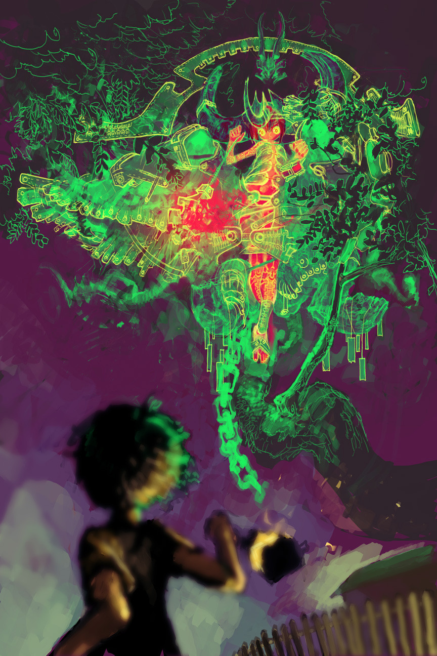
Took awhile "painting" this one. It's not really a true painting--you'd notice just a bunch of crappy globs of color if you removed the lines. Anyway, don't bother trying to figure out what this picture is about. It's all about wanting to draw some interesting looking stuff and throwing it into a picture together.Here are some more versions if you want them
Full color: [link]
Monochrome: [link]
No Background color: [link] (my 2nd personal favorite, despite all the time spent on the BG)
Related content


Comments: 85


so gorgeous. I love the warm colours and the positioning
👍: 0 ⏩: 0

To much of the same colors used, IMO. And the left foot kinda melts in with the tree.
Other than that, great!
👍: 0 ⏩: 0

The full colour one is fucking awesome, I love how you do perspective. <333
👍: 0 ⏩: 0


Wee, Matt, you've improved so much.  (Smile)")

👍: 0 ⏩: 0

Wow.. You are truly amazing and talented. I, too, enjoy the one lacking a background. But this one is lovely, too. Very interesting to look at.
👍: 0 ⏩: 0


Arrrrgh, all the versions are so beautiful. ;o; I love how you paint! I don't care how messy it is without lines IT IS STILL LOVE AND AWESOMENESS.
👍: 0 ⏩: 0

I know you get many a comment like this, but all I have to say is that you're absolutely amazing. I'm also aware you are asking for more advanced commentry on this, but I'm nearly speechless. Just... keep it up. One day you shall be ridiculously famous.
👍: 0 ⏩: 0

Sweet its realy cool! I like the version with no bg too i looks like it came from an art book. I love the style you did with the character too!
👍: 0 ⏩: 0

Glad to see you back, you've been dead a while. Your work hasn't changed! Great as always.
👍: 0 ⏩: 0

That's amazing. I wish you'd erase some of the lines though, but the painting is SUPERB. I love the painting on the...tree? He's holding on to - it's incredible. This is simplly breathtaking, I like the overall colour tones and the ambient feel of it too, it contrasts well with the movement in the picture. Your version without the coloured background is also well worth a nod.
Excellent work!
👍: 0 ⏩: 0

The tree is very tentacular, but I would venture to say that the limb shape/texture/feel don't fit very well with the rest of the picture. It seems more like a monster's writhing tentacle than a tree root that belongs to that forest... The background I love, and the shadow of the root on the ground. IT's almost perfect, and quite Da Vinci-esque.
👍: 0 ⏩: 0

heh.. reminds me of come of the character/monster art done by.. (ahh, i forget his name) for ff6... cool stuff.. mix in a tiny dash of gieger..
as for critisizms... the raised foot isn't super clear.. the boot blends in with the 'branch' a lot, so unless you look close, it's hard to tell what's going on with that leg.. at first i thought he was trying to climb onto it...
and the butt-end of the weapon... it took me a while to figure out what that things was sticking out from behind his face.. for a bit, i thougth it was a really abstract arm going on...
i dunno what i would have done about that... maybe position it so the continuity of the weapon handle was easier to spot, less blocked by the character... or maybe more common elements on the two ends to tie them in 'closer' in the viewer's mind... like the tap n the end.. maybe have a couple strips of it here and there along the handle..
👍: 0 ⏩: 0

awsome i love your unique ideas and perspective.
the only thing i see out of place is that shes running one way and looking another, which in most cases is rare because you tend to focus on what your running to. so in my mind i see her right foot tilted more to the right giving her more push tword the ways shes running as if shes running with the length of the root (thats what i think it is X_x) instead of at it
even considering there is a distance from teh point to where shes running to the way her face is facing the direction seems a little off.
if im wrong, well then disregard it but i hope this helps
i missed being able to comment like this, glad your back ^_^
👍: 0 ⏩: 0

wow! Insanely awesome, Matt

👍: 0 ⏩: 0

Very nice! I'm likin' how serpentine/tentacle-like the tree root (branch?) looks. The monochrome is my favorite btw. Anyway -

👍: 0 ⏩: 0

Gotta love that dramatic foreshortening. The careful highlights on the tree make its texture really pop.
👍: 0 ⏩: 0


ur first complete picture in quite some time. It's good. Of all the versions i agree that this is the best and that the empty bakground is second best. the full color version has a lack of focus in the bottom left corner, the version you have now lets the compostion stay fluid and the colors remain calm and work with the picture. The monochrome was just oo blotty and unfocused. I think the weapon was dont well, the mace/lance/axe. the root was done VERY well, best aspect i think. dynamic concept and render. The mountains are done very well but i dont think it's entirely obvious that they're in the Background and not just a very pretty pile of rocks nearby. Tree leaves are brilliant tho. the ground is the only thing i think needs filling in. nice tone overal tho.
👍: 0 ⏩: 0

It's wonderful how each version can convey a different meaning and emotion. Great work.
👍: 0 ⏩: 0

This is pretty nice... I like all the color variations, though I think this one is best. The only thing that bugs me about it is that in ALL versions, you have tangential lines that flatten the girl to the tree... I thought at first that she was crawling on it, or over it, and then realized that this isn't the case. The reason they look as though they're part of the same plane, though, is the way her knee matches the direction of the lines of the tree's texture, and her nearest hand as well as the leading part of the weapon she's holding match the direction of lines that form the tree branch. Tangential lines will bite you on the ass if you're not careful, by flattening out the overall image.
The color schemes are brillant, though, and if you have the girl as a separate element, then you can shift her into a position where the tangents no longer exist.
👍: 0 ⏩: 1

Wow, I never noticed... she totally does look like she's supposed to be climbing on it .-. man, that looks bad.
👍: 0 ⏩: 2
I still marked this +fav, though, 'cause I dig the color scheme(s).
")
👍: 0 ⏩: 0
Tangents. Getcha every time.
Loston Wallace over at Penciljack is an inker for DC and a general freelancer, and he pounded on me (and anyone else who made this mistake) for years. Now I'm totally paranoid about tangents, which is probably a good thing.
👍: 0 ⏩: 0

this is so amazing! I love the detaill in the tree, and the background! It must have taken absolutley for ever to finish! that's true talent! I especially love her weapon! It just looks so damn cool!!!!!
👍: 0 ⏩: 0

It is nice to see that you are drawing again. I have missed seeing your amazing pics, full of dull yet beautiful colour, and always having some type of action within them.
👍: 0 ⏩: 0

but now that i've seen all of them i think the last one is my all time fav ^^ keep up the wonderful work!!
👍: 0 ⏩: 0

Beautiful. I love your use of space and color, which has this excellent balance to it... wow, nifty. +fav.
👍: 0 ⏩: 0

waiii you've done yet another masterpeice

👍: 0 ⏩: 0
<= Prev |