HOME | DD
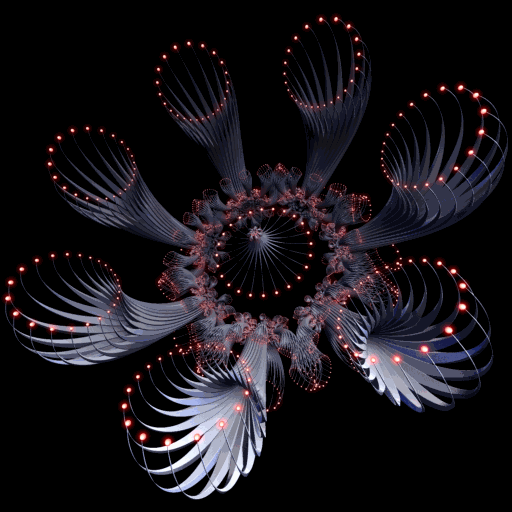
 FantasyPs — Abstraction Power

Published: 2010-09-01 14:44:15 +0000 UTC; Views: 2352; Favourites: 26; Downloads: 0
Redirect to original

 (Smile)")

Related content


Comments: 26

")


")


")


Thanks dear
Glad you like it
👍: 0 ⏩: 1


First off, the concept is really cool and the c4d is pretty awesome. The main issues I notice with the piece as a whole is that the person appears to be floating (for lack of shadows at his feet and a difference in the level of detail between the person and the background).
Also, the cut on the person's right leg does appear to be not contiguous as the skin appears to not conform to the abstract's shape like it does elsewhere on the piece.
More depth and shading in the abstract may enhance the realism that the abstract has and make the piece fit together better.
All in all, it's a cool starting point, but to me it seems like a person pasted on a background because there is little connection between the person and their surroundings.
👍: 0 ⏩: 2
Thanks mate
I wouldn't want to blend the person with BG
first i think about black color background then preferred put a stock ^_^
👍: 0 ⏩: 0

I agree, nice concept, but the guy in the middle needs to be blended in better..
Keep up the good work mate
👍: 0 ⏩: 0


