HOME | DD
 fantazsikart — GCV4

Published: 2005-05-10 00:18:11 +0000 UTC; Views: 858; Favourites: 16; Downloads: 253
Redirect to original
Description
geminicreative.net v4Related content


Comments: 48


thx for the words! glad you liked it...//
 (Wink)")
👍: 0 ⏩: 0

why thank you! glad you like it!

👍: 0 ⏩: 0

niiiice
i love the handwriting in the midst of it all
the chaos is a good thing!
inspiring. (:
👍: 0 ⏩: 1
thank you! i'm glad you liked it! (:
👍: 0 ⏩: 0

nice creativity with typo, could have been better tho.
but keep up the good work!
👍: 0 ⏩: 1
thx for the comment, but how could it have been better? would you care to ellaborate? I would appreciated it...//
")
👍: 0 ⏩: 1
well first of all the composition is pretty boring, but you have executed it well with the colours.
the second thing is the usage of Helvatica, i just dont like it that much you could have picked a better font.
and its a bit too chaothic for my taste.
👍: 0 ⏩: 1
thx for elaborating! much appreciated...//
i know what you mean with the typeface, but Helvetica Neue is a classic and thought it fit. it's something different nonetheless. and by that i mean pairing up that typeface with the chaos. I was just a bit drowned after making my website so clean, I had to do something fucking off the wall. and no offense taken, glad you told it how you saw it!
👍: 0 ⏩: 0

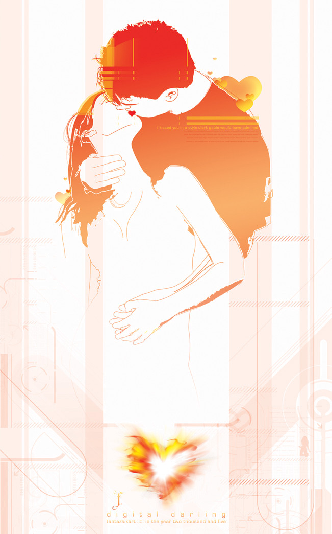
Hate it when I thought I gave my two cents on a work and then realizing that I hadn't. What can I say other than nice work as usual brotha. Tight colors, kind of wish it had more white on the top left for some reason. The wave of dots is off the hook. Great work.
👍: 0 ⏩: 1
ha! it's cool bro! I see what you mean as far as the top left....
thx as always for the words...//

👍: 0 ⏩: 1

color theme is great. Great fonts as well. Really good website & splash

👍: 0 ⏩: 1
thx for the comment bro...// glad you liked
👍: 0 ⏩: 0


 (Smile)")

thx bro. most def love typo!
👍: 0 ⏩: 0

omgosh, I love everything about this. < 333
The lady on top feels a bit odd, but it still works anyways. ;D
👍: 0 ⏩: 0

yea man i like this to.nice work.feelin the colour combo
👍: 0 ⏩: 0

It's a very nice and detailed design. I like the litle chaos at the lower right side combined with the clean part of the whole picture. Well done
👍: 0 ⏩: 0


thx bud! yeh, the site is what it is. i wanted to stay a little on the conservative side with it cuz im tryin to find a job and all. but i had to go f-ing crazy with this poster when i finished the site!
glad you like it.....//
👍: 0 ⏩: 1

Yeah crazy, but awesome....wish I could be as good as you at both vector stuff and flash
")
👍: 0 ⏩: 1
wow, you reply quick! and the site isn't really flash. only a little bit. mostly css. this site was kinda an experiment with learning css. much easier than html and flash!
thx for the fav!
👍: 0 ⏩: 1
Have you got any other websites to show you have made??
👍: 0 ⏩: 1
[link] currently working on it. kinda a wip. making for a client so it's not the coolest thing in the world, but not bad. this is all flash.
👍: 0 ⏩: 2
That looks real nice....I have to go and learn flash now.
👍: 0 ⏩: 0
shit. that link doesn't work. you have to take out the period at the end. here ya go.
[link]
👍: 0 ⏩: 0

dude i am loving this alott. i dunno i think its the colours to start with but hte layout is gret and the use of paint and clean lines is really a nice contrast. the stuff on the left is cool too..
👍: 0 ⏩: 1


yeh. colors are wicked.
thx for the fav bro....//
👍: 0 ⏩: 0

Wow very nice. Great work with the text. I like the dotted sphere in the background.
👍: 0 ⏩: 1
thx... what in the hell is up with your sig?
lol
👍: 0 ⏩: 0