HOME | DD
 fantazsikart — evl:06

Published: 2006-05-25 18:04:08 +0000 UTC; Views: 1177; Favourites: 15; Downloads: 158
Redirect to original
Description
more crapRelated content


Comments: 22

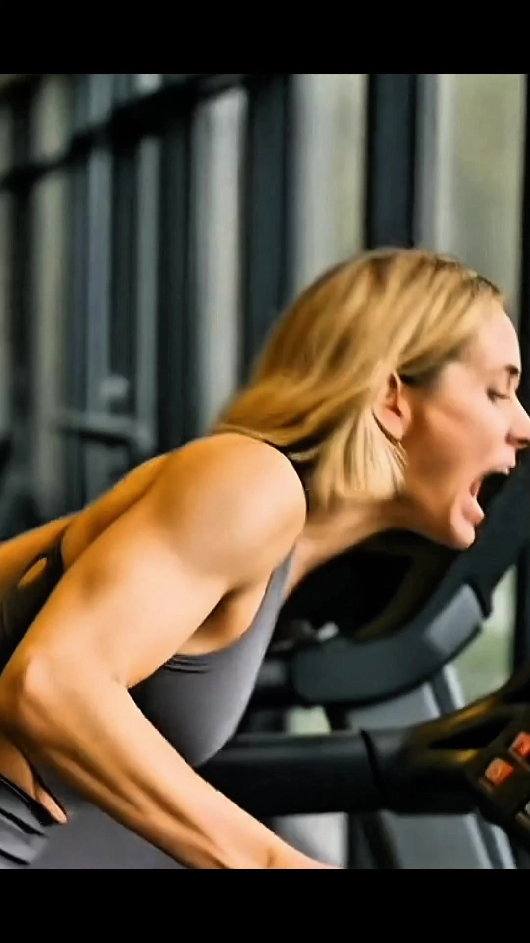
Dig the composition brotha, very nice use of color. Looks very Las Vegas/Ministry of Sound, haha, never thought of that combonation before. Mad props on your choice of beauty.
👍: 0 ⏩: 0

She looks like a sparkling blue fairy!
Heh I love the look
 (Smile)")
👍: 0 ⏩: 0

Is that better ?
I usually really like your work, but this, this is crap, as you said in the description, so don't break my balls just because I agree with your description, asking me for detailed and thoughtfull comments lead the what i said above in the case of such lame works of art.
👍: 0 ⏩: 0

I am so lucky that an artist of your caliber graces my work with your incredibly detailed and thoughtful comments.
Fuck off dude. Stop commenting on my work.
👍: 0 ⏩: 1
Chill a bit dude.
This work is messy, the only part thats nice is lindsay lohan's picture and whatever effects you've used on it are useless and ugly.
The whole piece is covered with ugly texture and brushes (i guess) that dont fit togheter and makes the whole piece look like some noobs first piece trying to imitate wirestyle. Oh I also should mention how lame the quality of the stock is.
👍: 0 ⏩: 1
Art is subjective. I happen to like the textures in this work. There are some things looking at it now that I would have done differently, but hey, it's all in fun and that's what matters to me.
You only comment on my work when it's something you don't like and it's usually some dumb shit, so please, stop commenting. You are absolutely uselsess to me. Goodbye.
👍: 0 ⏩: 1
I guess some cant accept to be criticized...
👍: 0 ⏩: 1
I do like to have my work criticized. What you wrote was not a critique. You need to learn how to effectively, thoughtfully, and most importantly, respectfully give a critique.
👍: 0 ⏩: 1
I gave you a disrespectfull critique after you gave me a rude answer to what was only agreeing with the description...
anyways...
👍: 0 ⏩: 0

sweet piece dude, she's just a bit floating ... doesn't really sit on the piece
👍: 0 ⏩: 1
yeah man, you're right. im gonna have to go back and work on this some more. i think it has some nice potential but i rushed the end of it. thanks for tha suggestion!
👍: 0 ⏩: 0

Thanks! Sorry to hear about your loss, hope all is well. Take care.
👍: 0 ⏩: 1

Thanks man. See you next week...
👍: 0 ⏩: 0

for crap its some pretty nice work man
nice colors and composition !
love the bg
👍: 0 ⏩: 1

honestly i couldnt stand Lohan until i watched MEAN GIRLS, it was written by Tina Fay from Saturday Night Live, now Lohan has some credit with me.
anyway, i like the effect on the legs.
👍: 0 ⏩: 1
yeah, i dont follow that shit at all. i barely know who she is. she is very cute tho and i loved this photo. thx for the words, that leg effect is my fav part of this work too.
👍: 0 ⏩: 0

very nice work
i love the composition and afcurse the pretty woman
greetz
")
👍: 0 ⏩: 0