HOME | DD
 fantazsikart —
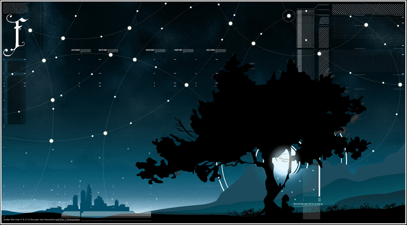
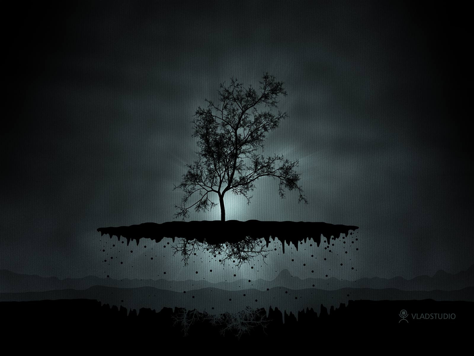
under this tree
fantazsikart —
under this tree
Published: 2005-03-22 23:07:44 +0000 UTC; Views: 34139; Favourites: 802; Downloads: 7056
Redirect to original
Description
I may or may not post the story behind this one..... we'll see.Most work in Illustrator with some obvious objects in Photoshop.
Stock tree from IbiTamas at SXC
okay, so im editing this descrip now. Much love to all that fav and comment. I really appreciate all of them.
 (Wink)")
Related content


Comments: 179

I thought that thetree motive died, but this DD should reborn it. Nice idea - i love the feeling. conrgratz for a DD.
👍: 0 ⏩: 1

thx dude...// much appreciated
👍: 0 ⏩: 0

Wow great work, I love the style. Aww I wanted to see all the little details
")
👍: 0 ⏩: 0


lovely...i love the colors you chose...and how the stars are connected. very nice
👍: 0 ⏩: 0

I agree,the stars are to big some places,liking the different styles you've incorperated intthis one
Other than that,this would have been 'fantastic'
 (Smile)")
👍: 0 ⏩: 0

dude this is awsome! ui was gonna say i didnt like the tree... but its kinda refreshing from the ones he1z and lee25 and even i do. hehe. the asrteomical lines are really clever. tehy have a meaning rahter than yeah jsut being tehre.. lol i like it. spec the city
👍: 0 ⏩: 0


dude!~ this is absolutely fantastic !! what a great vector art !!! .. i like the night sky and the little dots.. look like somekind of stars . and the lines is great too..
Amazing ideas!!
👍: 0 ⏩: 0

The "stars" are so big and it does a big contrast with the background, you should fix it, cause its breaking the image
👍: 0 ⏩: 1
thanks for the comment bro. much appreciated.
👍: 0 ⏩: 0

thanks for the fav! I absolutely think it's one of my best. And it's only going to get better!
👍: 0 ⏩: 0

i like the tech graphic on the top right... nice colour as well ... kid under the tree make the story(i think) ...
👍: 0 ⏩: 1
I suppose it's open to one's own interpretation. I have mine. thanks for the comment!
👍: 0 ⏩: 0

what the hell
dude that looks so awesome , u really surpassed yourself this time man
👍: 0 ⏩: 1
what did i tell you in Pollution! It's only gonna get better from here on out.
👍: 0 ⏩: 1

good job bro.....It reminds me something ")
👍: 0 ⏩: 1
thanks for the comment. I wish I knew what it reminded you of......//
👍: 0 ⏩: 0

Can see the influences, but the style of mixing them and putting in your own touches, makes it a style all your own. Very impressed brotha. I'm glad I'm watching you.
👍: 0 ⏩: 1
superfuckadelicksweetness brotha!
👍: 0 ⏩: 0

very nice, kind of a cross between some styles, kinda big
👍: 0 ⏩: 1
made it a tad smaller for internet view. It was so big cuz it's intended to be printed, and printed very large. It kinda sucks now cuz you can't see all the detail as good, but whatever. Thanks for the comment and suggestion.....//
👍: 0 ⏩: 0
<= Prev |