HOME | DD
 FelisGlacialis — Browse DA vs Eclipse
#classical #da #browse #critique #deviantart #eclipse #feedback #suggestions #classicalda
Published: 2019-08-02 12:30:39 +0000 UTC; Views: 1480; Favourites: 6; Downloads: 1
Redirect to original
Description
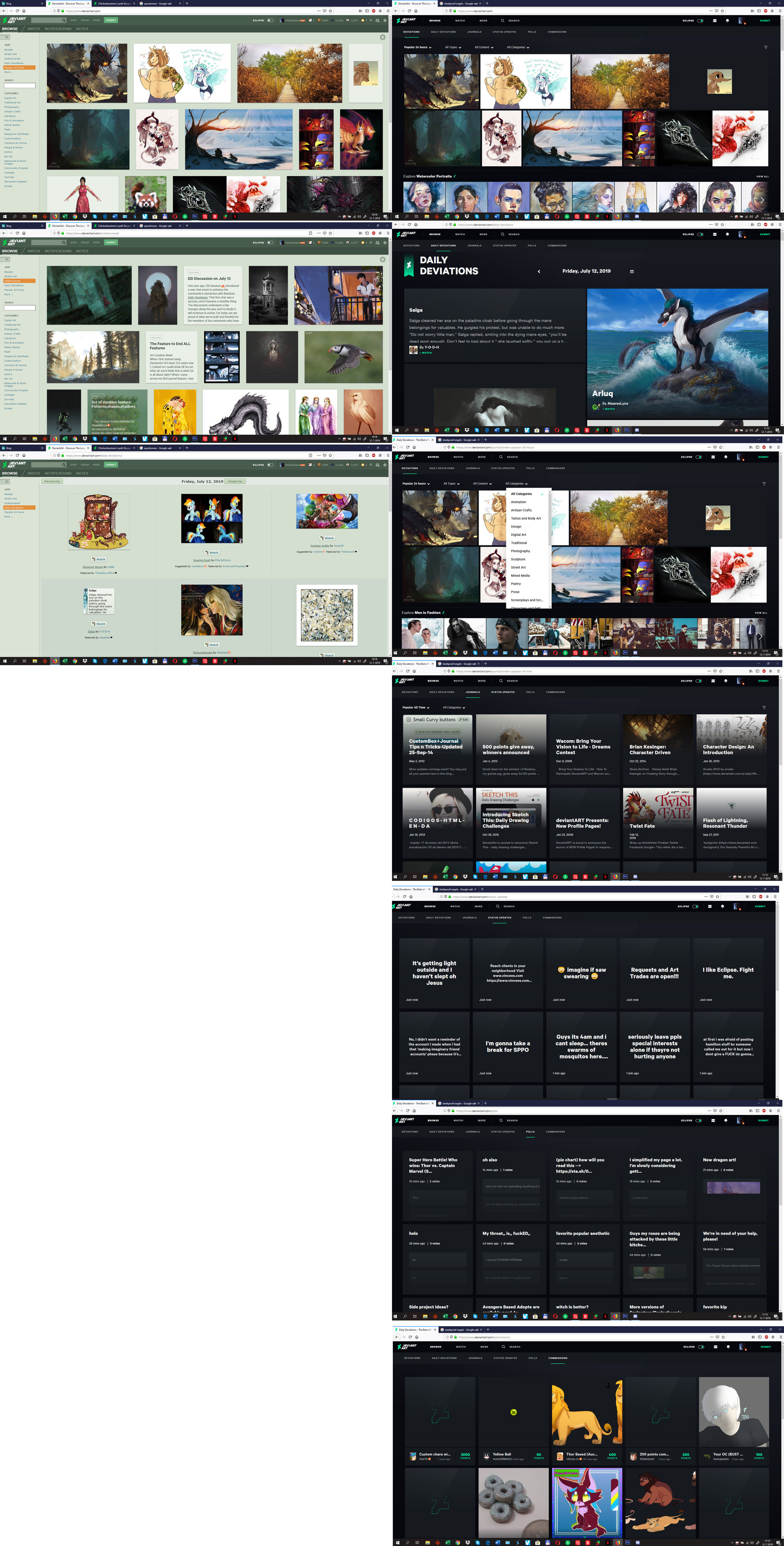
What I want to see improved:
- DD’s should be smaller. Too much in my face now. Too gigantic on a big screen and doesn't invite for clicking and reading the artist comment.
- Also – who is interested in some random person’s status-updates? Those are pointless on DA’s main-page and should be kept MUCH more private as they are now on classical DA.
- Still there is porn and disgusting fetishes.
- I would like the categories in a (vertical) sidebar and not in a drop-down menu. Also – the white menu is disturbing against the dark background.
What I like:
- Overall, the browse section looks rather ok in Eclipse. Haven’t used it much but it looks ok.