HOME | DD
 Feniick — Crappy icon tutorial

Published: 2014-12-09 16:29:49 +0000 UTC; Views: 2039; Favourites: 131; Downloads: 17
Redirect to original
Description
First of all, i dont have a program where I can easily make a tutorial with words on it that looks nice


 so im just gonna write out the steps down here that corresponds to the numbers up there <3
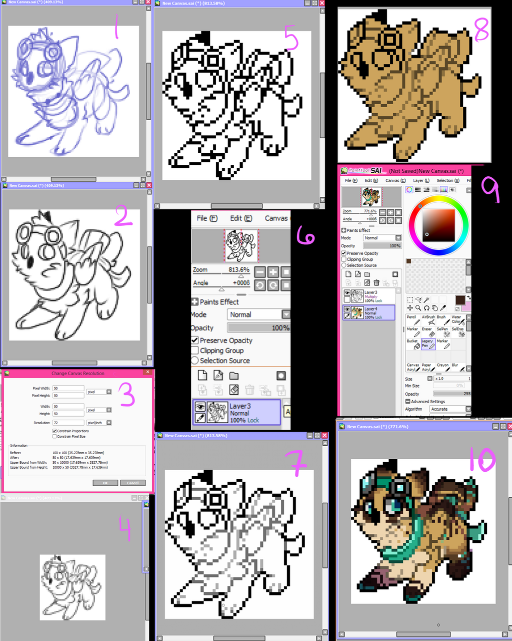
1. On a 100x 100 canvas I sketch out the subject. I use a really tiny marker. At this point im just going for general look. Nothing too neat and fancy. Lines going everywhere.
2. I take my sketch and outline the important bits in black. This step IS IMPOARTANT. The lines dont have to be perfect, but it really helps you to see what you are doing later. You dont have to do it, but for my style I just ahhh its too hard for me to do it without.
3. I work on Sai, so I dont know what the terminology is for photoshop etc, but at this point I change the resolution to 50x50 pxls.
4. This shows kinda what it looks like after I scale it down to proper size.
5. Then I take the legacy/binary tool and outline it in pixels. Note, I am not very careful about if I get L's like three pixels grouped together in a blocky way. I dont go out of my way to add them, but I dont go out of my way to fix too many of them either.
6. Once the outline is done it is important to lock that layer. In Sai its preserve opacity (or something else if you have a different version) This thing is a life saver.
7. I go through using a lighter grey and color in all the insides. I generally leave the very outsides black and important features like eyes, or something I like to stand out i.e. the goggles. After I am done with that grey I get a lighter grey touch up any L's making it so there are no harsh edges (this is why i dont try too hard to get them out the first time) You can wash rinse repeat as often as you like. This gives the outline a "fading" look and gives it more dimension :>
8. Fill in that puppy with a base color. At this point you will want to set your lines to "Multiply" because then they will take on the colors you are putting under them
9. Then I color it in- this is just showing that if you look in the little upperhand thing you can see how your icon looks at 50x50 even if you are working at a HUGE size. I use this a lot to make sure what I add and what not turns out good :>
10. after I get it all colored in I add very simple shading- generally with purple or pink and set the layer to multiply and mess with the opacity.
:> thats it. thats my icon style.
Sorry if im bad at explaining stuff >o< if you have any questions, go ahead and ask~ I dont bite :>
Finished product


