HOME | DD
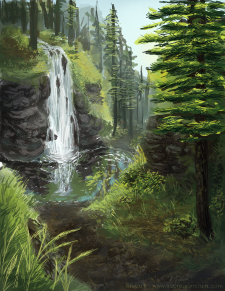
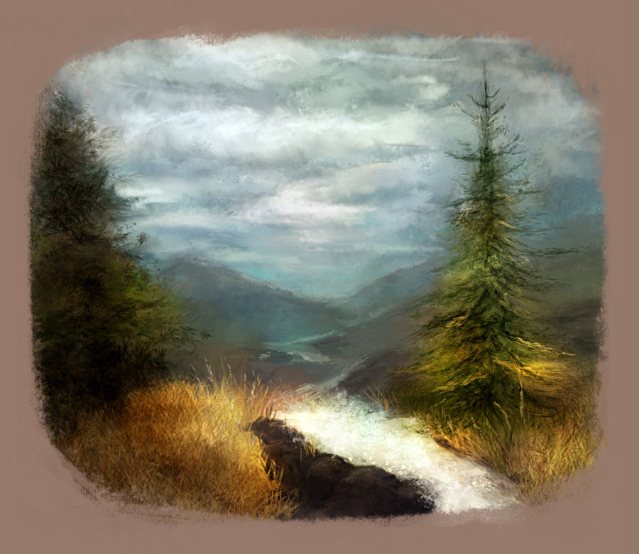
 Firequill — Forest Waterfall
Published: 2011-10-14 02:44:25 +0000 UTC; Views: 1866; Favourites: 28; Downloads: 22
Redirect to original
Description
A little speed painting of a foresty area I did after painting several forests and mountainous landscapes from photos over the last few days. I definitely feel like I'm getting somewhere and my colour choices are becoming more natural!I wasn't thinking much about composition with this and was just sort of uh... *going at it* for the sake of seeing how well I could colour the scribbly sketch this started out as. Critique is always welcome, though!
Related content


Comments: 6

Well, even though you say you weren’t really thinking about the composition I would say it turned out quite well!  (Smile)")
I really like all the natural earthy grays and greens you’ve used here, it makes the piece seem very quiet and serene. The grass, dirt path, and reflection and feel of the water below the waterfall looks fantastic as well
I only have two critiques; the far right tree and the waterfall itself.
The waterfall to me doesn’t really look like it’s water that’s running down the side of the rocks, it is very close mind you, but it slightly looks more thicker than actual water. I think this is because of the shading. There seems to be too much blue in the water, waterfalls are usually more clearish or white. There’s also a certain frothiness to the water as it is cascading over the rocks that’s missing that is present even in slow-moving waterfalls [link] I find this video depicts what I’m trying to explain.
The tree I pointed out earlier seems a bit out of place in this picture because to me, the green used for the needles of the tree seems too bright, and draws attention away from your picture. If the green were slightly lower in hue, I think it would look a lot better
Hope my critique was appropriate and okay with you, I apologize if it’s not ")
Overall, great work
👍: 0 ⏩: 1

Thank you! I can see what you mean with the waterfall and the bright colours in the tree needles! I don't think I'd really studied waterfalls much before painting that waterfall, so there were probably bound to be errors there! xD
I sort of wanted to foreground to stand out with some brighter, more saturated colours, but I think I ended up giving that particular tree most of that treatment while the rest of the foreground stayed more subdued...! I should have paid a bit more attention to the colours I was using all over the canvas instead of focusing in on smaller areas and losing track of the colours of other areas. It seems to be a habit of mine where I'll focus in on smaller areas like that and end up with imbalanced amounts of detail or uncoordinated/inconsistent colours and stuff. xD
Thanks for your comment and critique! C:
👍: 0 ⏩: 1
That happens sometimes X3
Glad I could be of some help!
")
👍: 0 ⏩: 0

Just from that image, I now want to be there. And honestly, I think this quick, just-drawn-up style is better at transporting me like that - it's more natural, focuses on the coloring and light and motion rather than detail, and lets you fill in details. It's more the idea of that kind of area, just the essence, rather than a specific reproduction or planned area.
And so ends my artistically uneducated comment.
👍: 0 ⏩: 0

I am one for natural landscapes. I love this image.
👍: 0 ⏩: 0
