HOME | DD
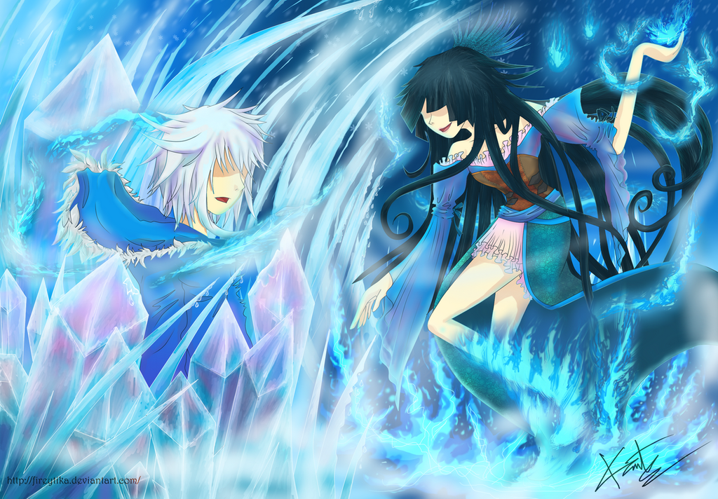
 fireytika — Ice And Fire [V2]
#battle #blackhair #blizzard #bluefire #couple #frosty #ice #maiden #snow #versus #whitehair #fire #blackandwhite
Published: 2015-05-19 09:19:34 +0000 UTC; Views: 1411; Favourites: 58; Downloads: 1
Redirect to original
Description
Battle between Draco and Sapphiria.My OC, Draco can create a powerful blizzard and manipulating ice. It's not easy melting his ice. The fog around him represent how frosty is the temperature around him. But, Sapphiria can easily melting those ice with her fire. Which explaining their power's difference.
They actually are couple, but do a lot of fights, this kind of fight.
Anyway, next time if you survive this battle, don't make her mad, Draco.
Improvement of this one:
fireytika.deviantart.com/art/I…
I only add more values and contrast, the proporsion and other still the same
Thank you so much for everybody who has give the critiques and suggestion for the previous one ^^
I hope this one is better than the previous ~
Draco and Sapphiria belong to me.
Other related art:
Stock i used:
Snow brush: papercaptain.deviantart.com/ar…
Hair brush : snow-body.deviantart.com/galle…
cloth pattern : batik pattern
www.vectoriconwallpaper.com/20…
vecto2000.com/abstract-batik-b…
OPEN COMMISSION
Open Commission
Hello, everyone~
I finally open commission again!
Up to 4 slots open for this month.
PAYPAL ONLY
all prices are in USD.
DIGITAL DRAWING [OPEN]
1) Chibi ( transparent/ simple BG) $15
2) One Character simple BG
Head - waist up : $ 20
3/4 - full body : $ 30
Extra character = +$15 (MAX 3 CHARACTERs)
If you request a detailed Background, price depends on details and difficulty (+$10 - $20)
Examples:
Related content


Comments: 51

Aww thank you so much! I love blue, too ^^
👍: 0 ⏩: 1


I think they make such a cute and well balanced couple
👍: 0 ⏩: 1
Ahaha thanks~! I hope so XD
👍: 0 ⏩: 1

You really acomplished the ice look, you did a great job shading the icicles and I love the right character's hair
👍: 0 ⏩: 1
Thank you very much! Glad you like it ^^
👍: 0 ⏩: 0

This is a really dynamic picture!
You've done a very good job on the magical powers!


👍: 0 ⏩: 1

I first have to say that the title and picture are both great and go together great too, because I saw this and instantly thought of ice and fire from the details, AND THEN I saw the title, moments after that... so you did awesome! All the effects are awesome.
I really like the girl's hair. The hairstyle and drawing style.
Just like before, ass far as critique goes... it seems like other people's have been about background and color, but I can't do those and can only do lines and anatomy and stuff. For this one, I can only say that her torso needs to have more twist in it. Her stomach should probably be at an angle in between the one of her rib cage and the one of her hips. Closer in twist to the hips.
Other than that, I see nothing wrong.
I'm glad you got advice for colors that everyone is happy about.
I'm a little confused about what the male is doing though.
Wow. What a lover's quarrel! 


👍: 0 ⏩: 1
Aww thank you you so much for your praise and critiques ^^
I'm glad that you enjoying this artwork~
Okay, so Draco is bit worried because Sapphiria's fire is surround him. ( the fire makes those ice melt)
Draco don't usually showing his expression, his face is mostly cold and almost poker face~
Yepp, i still need more practice with anatomy and expression XD
👍: 0 ⏩: 0

Great colors  (Smile)")
👍: 0 ⏩: 1

Great use of blues and purples; you are very good with colors!
👍: 0 ⏩: 1

This is so powerful, such a vibrant piece of work and he detail you've captured is amazing, great work!
👍: 0 ⏩: 1
Aww thank you for your kind words! ^^
👍: 0 ⏩: 0

This is a great start no doubt! There are couple issues, but that's okay cause we're all learning right?! I'd just keep practicing on the fundamentals , they are very difficult to master, as even the greatest artists ever struggled severely to become as skillful as they were . Also learning how to master the tools of Photoshop is key! There are some super great tutorials here and on youtube (LEVEL UP, FZD school of design, CUBEBRUSH just to name a few) so make sure you check them out! learning from the pros helps a ton and trying to get through digital painting all on your own with no help is unwise and really hard. good luck!
Thanks for sharing
👍: 0 ⏩: 1
Thank you very much! Especially for those suggestions! Yeayy~
I'll go check it out ^^
👍: 0 ⏩: 0

I really like it!
You could add some eyes maybe
Great job tho!
👍: 0 ⏩: 1
Thank you~! Glad you like it ^^
👍: 0 ⏩: 0


Ugh i'm in love with the fire v ice thing since i was born
👍: 0 ⏩: 1

I really like this one, the expression on the characters faces are made very well and so are the pillars of ice
👍: 0 ⏩: 1
Thank you XD
Glad you like it! I have so much fun creating those ice~
👍: 0 ⏩: 0

Blue earth of wonderful beautiful thoughts established....Wonderful this is..... ")
👍: 0 ⏩: 1

thanks, I'm glad you like it~ ^^
👍: 0 ⏩: 0

Hii, comment from projectcomment.deviantart.com/ !
First thing I noticed on your drawing was the ice, which is really nice! Good job on that!
For your characters, there are a few things I would work on. The girl's arms are not properly done. The two parts of the arm are supposed to be close to the same size, while in your illustation the forarm is longer. Aslo, her hand is a bit too curvy.
For the clothes, I really like the see-thought effect of her dress, it is nicely done. However, hoodie seem too flat. Try giving it more shapes with more shadows (darker ones), always use references when you draw
The composition is great, you have a circle around your female character which really sets the focus on her! Good job!
👍: 0 ⏩: 1
Thank you so much~ ^^
Hhe i put a lot efforts for those ice, glad you like it~
I must admit, i have difficulty when drawing her in that pose, yeah the anatomy still disproportional. I'll try to improve next time~
Thanks for your critiques and advice~!! XD
👍: 0 ⏩: 0

commented on behalf of
hey, i really like the colors here! i also like how you incorporated so much texture - it adds a bit of visual interest to the piece.
the character designs look really original, too - it's good that you didn't draw a stereotypical over-sexualised female fantasy character outfit for the person on the right, if you get what i mean.
anyway, here are some suggestions:
1 - i really love the colors and the textures, but i feel that your background is too bright or too full of detail - it draws the viewer's attention away from the two subjects of the picture. maybe you could tone down the colors of the ice and fire, or simply not add so much detail.
2 - the hood of the person on the left looks kind of awkward. using a reference would help a lot. generally, the insides of hoods don't face outwards, unless they're flipped - but in that case, the hood would be slightly raised because it's inside-out.
3 - the body of the character on the right looks slightly disproportionate. first, the armpits seem a bit too high up. more importantly, the angle of the body is kinda confusing. the torso is 3/4 left, but the legs are drawn almost completely in side view. additionally, the knee looks awkward - maybe move the exact corner of the knee slightly downwards?
overall, good job! this piece is really original and i can tell a lot of care was put into it, so i hope you keep up the good work!!
👍: 0 ⏩: 1
Uwaaaa thank you so much~!! I'm glad you like it ^^
Hhe yeahh i know what you mean about the outfit~
I really like details and trying to make the battle scene more powerfull. I didn't realize that's draw the attention away. And about the girl's anatomy, i have difficulty drawing her pose.I'll try to improve next time^^
Thank you for your critiques and compliments~ ^^
I really appreciate it~
👍: 0 ⏩: 1
you're very welcome!! i love details too, and the pose you drew is kinda complicated, so probably using stock photos as references would be helpful. keep up the great art!
👍: 0 ⏩: 1
Hhe i'll do my best again next time~
Thanks ^^
👍: 0 ⏩: 0

Love your use of colors, movement, and lighting! This is a great piece. For some constructive criticism, I would say work on your anatomy a bit.
👍: 0 ⏩: 1
Thank you very much~
hhe yes, the anatomy is a mess TT.TT
still need more practices on it ^^
👍: 0 ⏩: 0

Your character designs are very interesting - little details are what makes characters unique
The way you used the effects creates a lot of tension and excitement, although it's a little difficult to choose a focus point because there is so much to take in. Perhaps if the blue-flame-ice-crystal that is slowly surrounding the character with the blue hoodie made a straight line from the other character's hand the viewer's eye would be better directed around the scene. I also think the painting could have benefitted from a larger composition - for example place the characters in a larger environment, this will prevent the scene from appearing centralized and hectic. It's all about getting the perspective right. With a larger environment, you could really show off the character's (with the blue flames) overwhelming power (it seems this is what you intented), and it would be in contrast to the other character's (with the hoodie) power creating more tension in the scene.
Great job on creating a thrilling painting!
Commented on behalf of
👍: 0 ⏩: 1
Thank you so much for the advices~!! This is really helpful^^
👍: 0 ⏩: 0
ContraSprite [2015-05-19 22:07:48 +0000 UTC]
This looks great! They are definitely both in focus now! I don't remember if the flames at her feet where the same before or not, but they look really great now! Now sure if it's because you changed them or just something around them, but either way, they are very eye catching now. :] I also really like the purple that you added into the ice crystals surrounding the guy. I can see that you put the color reflection on her clothes as well, it's a very nice addition and makes the how picture seem more balanced. :] The whole thing is really improved! Great work!
👍: 0 ⏩: 1
Aww thank you very much~!! I'm so glad you like it^^
👍: 0 ⏩: 0