HOME | DD
 flashparade — Friday Night Drive

Published: 2007-10-30 19:13:24 +0000 UTC; Views: 13408; Favourites: 104; Downloads: 0
Redirect to original
Description
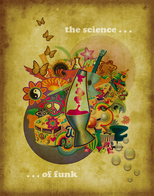
:Edit - Nov 2nd - Had to change a few things per the clients request, which resulted in me having to change the font, and I added a bit of a background, just for more visual interest. A request I made for a band called Friday Night Drive. They were looking for something similar to Urban Decay (at least I think they were!) Anyway, I came up with this, and I really dig it. I just sent it to them to see what they think, so I might end up having to start all over again, but I wanted to put this one up because I really liked the way it turned out.Friday Night Drive is copyrighted.
Car and buildings from SXC [link]
Related content


Comments: 47


 (Smile)")


Very nice and clean design. The colors you chose add a very nice touch to the piece and definitely complete the composition. The tex you chose works well but I'm not so sure about the underlining of it, thats the only thing that I feel doesn't work as well with the rest of the piece.
Other than that this is a fantastic design and a great work. Keep it up
")
👍: 0 ⏩: 1

thank you for your comment, I would change the underlining, but unfortunately it's part of the font
")
👍: 0 ⏩: 0

Your work has been featured in Typographic and Graphic Design Weekly 6 - [link]
+fav! Keep up the good work!
👍: 0 ⏩: 1


")


Nice , I like the look like an ink drawing, but I feel there is too much white around it..... Perhaps a little orange border near the black?
👍: 0 ⏩: 1
oooh that would be cool, I have to make some changes to the original for the client, so I might put a background in when I resubmit it!
👍: 0 ⏩: 1

👍: 0 ⏩: 0

I think the best part of this design is that it's just so...postable. (Yes, I made that word up just this second.)
It's sleek but has a real street art feel to it also, so it's the kind of image that's perfect for posters all over town, on stickers, or whatever else you'd want it on. And a "postable" image is a really great tool for anyone trying to get their name out there, because it's so recognizable and you can use it over and over.
👍: 0 ⏩: 1
awesome!!! I'm glad to hear that I can make work that can be enjoyed by the masses.
👍: 0 ⏩: 0


I'm curious on knowing what kind of band they are... It looks pretty groovy! :3
👍: 0 ⏩: 1
They mentioned that their music was kind of like Yellowcard, and they mentioned another band though I can't recall it at the time.
👍: 0 ⏩: 0


