HOME | DD
 floydworx —
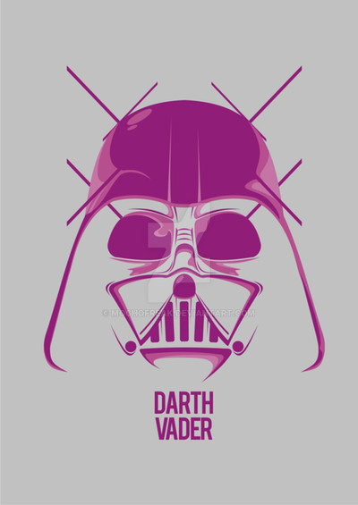
Vader and Stormtrooper typo

Published: 2011-05-30 23:29:23 +0000 UTC; Views: 28223; Favourites: 949; Downloads: 915
Redirect to original
Description
Second attempt in this style. Again, the helmets are using the characters of different true type fonts. No deformation or dingbat fonts used.Previous one: [link]
Related content
Comments: 166

It says it's a .tif head? Any way to get the .tif of this? Thanks! I love it
👍: 0 ⏩: 1

No, it's TTF, True Type Font, it's just a bit narrow 
👍: 0 ⏩: 1

OH! I get it 
👍: 0 ⏩: 1

:] They're out there somewhere 
👍: 0 ⏩: 1

You misunderstood it I guess. The heads are assembled from different characters. They are not standalone characters by themselves.
👍: 0 ⏩: 1

Yes yes I got that 
👍: 0 ⏩: 1

These are pretty cool! Have you seen the Font-bot Project? [link]
👍: 0 ⏩: 1

Thank you!
Not seen until now, thanks. Well THAT's creative!
👍: 0 ⏩: 0

a legújabb délideviationodhoz irtam ezt, de nem tudom miért ide jutott
👍: 0 ⏩: 1

mégis ide került a bejegyzés. szóval jó helyen gratulálok.
👍: 0 ⏩: 1

Yeah, they gave me the inspiration.
👍: 0 ⏩: 0

wow no way! took a while to figure out how the font was used. very creative.
congrats on the DD
👍: 0 ⏩: 1

wow..very cool....i had to really look closely to see what was used
👍: 0 ⏩: 1

Wow! This is brilliant! I bet this took a while! Congrats on the DD!
👍: 0 ⏩: 1

Vader helmet comes off as white -- which is not good.
Stormtrooper helmet is perfect.
👍: 0 ⏩: 1

Hmm, yes, you're right maybe that's my problem with it too 
👍: 0 ⏩: 0
| Next =>


