HOME | DD
 fnook — Autobot Mashup

Published: 2011-04-06 12:33:13 +0000 UTC; Views: 3931; Favourites: 84; Downloads: 19
Redirect to original
Description
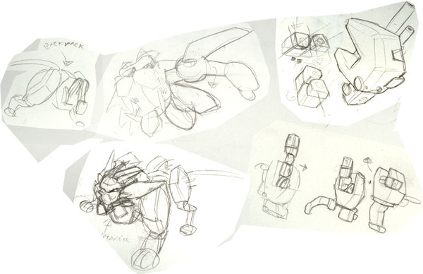
::. UPDATED .:: -- I've added a NEW ballpoint pen drawing that I did just this morning whilst waiting for my scene to render. (Lower-right corner). It seems *Demonysh didn't know I could draw robots like this either..")
I realized this morning that I had these sketches in my sketchbook from ages ago, and I've never uploaded them to dA. So here they are...
They're born from frustration over the crap designs from the Michael Bay Transformers movies. I LOATHED the Transformer designs in the film, and knew whole-heartedly that I could design something FAR more appealing in my sleep. So over a few months my sketchbook pages started to fill with drawings like these..
Yes.. You see a transformer redesign on a Dr. Who Dalek in there. EXTERMINATE! EXTERMINATE!!!! ^_^
Related content


Comments: 47

The top middle one is my favorite. If I weren't so lazy, and had more angles to work with, I'd probably try and build myself a toy version.
👍: 0 ⏩: 1

Hah! That would be way cool to have a toy made of one of my mech designs. I would so have it on my desk at the studio. Maybe one day I'll do a turn - around of one of my favourite designs. I'm no engineer, so there's lots of cheats to just make them believable enough to look like they could transform into a similar alt. mode. But even having a non-transforming model of one of my designs would be sick. ^_^
👍: 0 ⏩: 0


Dude! The alt mode of the bottom right one should be [link]
👍: 0 ⏩: 0
Hehehehe.. It sure does. ^_^ You like these? I sometimes feel that I just keep falling back on the same design elements time and again, instead of challenging myself. Some of them have unique design elements though.. They are a heck of a lot of fun to do when the mood strikes me though.
👍: 0 ⏩: 1

If you don't keep consistent elements in their design, nobody can tell they're all on the same team.... or the same show.
The only thing that is catching my eye as being unnecessarily repetitive are the protrusions on the shoulder blade area, and you had to point out repetition first.
the new transformers movies kept them consistent by making each character made of shattered bits of car-accident wreckage and electronics shards floating over terminator skeletons.
Yay!
Suddenly I feel like watching "Will it blend?"...
👍: 0 ⏩: 1
Hahahaha.. Yeah, I think I keep leaning on the shoulder-region protrusions because I've always liked the silhouette it produces. There are 2 or 3 in there where I stayed away from my habits though. I just don't like to fall into ruts in my design thinking. (it's way too easy to do). I'm particularly proud of the way the female autobot motorcycle turned out. I really like the Inner-skeleton-becomes-the-rider, and the-riders-helmet-is-her-head idea.
The designs from that game "Transformers: War for Cybertron" were BRILLIANT in my opinion. There were some elements that I would personally change, but as a whole they had my thumbs up. Far more appealing than that Bay-poo..
👍: 0 ⏩: 0

Jesus...I wish I could draw like that! I want to be a concept artist, but I don't know if I have the talent
")
👍: 0 ⏩: 0
Then by all means.. You should! ^_^ Iz fun!
👍: 0 ⏩: 1

8D
I know I'll fail epically but it looks soooo fun I'll do it anyway C:
👍: 0 ⏩: 1
Awesome! I can't wait to see the efforts!
I mentioned this in an earlier reply, and honestly I don't do these kinds of sketches often, and the just kinda dribble out of me at random times. I'll get in a robot/transformer drawing mood and then just go at it. I was surprised the first time I really tried that as long as you keep silhouette, and perspective in mind, it's a tad easier than you might think.
👍: 0 ⏩: 0

Dr. Who Robot: Seek! Destroy, Exterminate!
Robot on the bottom left: NOOO DONT DO IT!!!!!
👍: 0 ⏩: 0

Fnook, the Transformers films are a shamockery of the original. The SFX is great but the product placement & the design? please. Great sketches, and they demonstrate how much better the movies would be if you were the concept artist in the first place!
👍: 0 ⏩: 1
If you ask me, the live action films should've been handled by a Japanese director. They've been doing live-action anime adaptations for years, and they've been doing it RIGHT! Honestly, what audience are those movies made for? It's certainly not old-school Transformers fans. It's like they purposely made those films specifically for people who have never watched a single episode.
👍: 0 ⏩: 1
i've been a transformers fan ever since i watched from Armada (doing research from G1) but i dont what kind of fan i am if i actually lke the film designs for realism and that they look mech-ish alien like robots... though it would be something to see these guys in a film and/or of what you said about the japanese
👍: 0 ⏩: 1
Rule #1 about design, less is more. The robot designs from the Bay TF films are so overly complicated, the #1 complaint from the audience is "I can't tell what's going on, and who is whom". That, is NOT GOOD. And whomever thought the "robo-lips" of the faces of the robots was a good idea, needs their head examined. Rule #1 of animation. If you don't want the audience to look at it, don't make it move. So why they decided to make the robots appear to be made out of constantly squirming mechanical worms, is beyond me.
In my opinion, the Bay TF films are nothing more than onscreen CG masturbation, and complete design fail. And I'm not even mentioning the story problems..
👍: 0 ⏩: 2

Let me ask you something, have you drawn something like a bird realistically? What about having to take apart a machine to figure out what was wrong with it? The rules you've described have little application in realism since realism is by nature detail heavy. The Live-action Transformers were complicated because real life machines are complicated.
If the G1 designs were used, they would have stood out too much and looked fake.
👍: 0 ⏩: 2
If you spent at least 2 seconds looking at my profile, you'd know that I've been a professional character designer and animation director for film and television for 17+ years. So yes, I've done both of those things that you ask. I have a very deep and thorough understanding of what does and does not work on the screen for character design. I also know what does, and what does not work for animation and film making. Can you claim the same?
When your audience is confused as to whom they're looking at on the screen, and can't tell what exactly is going on, then what you have there is what's called BAD DESIGN. This series of films shows absolutely no clear design decisions or principals. So what you end up with is a confused audience. Confusion leads to just putting up with what's going on on the screen. THAT is the very definition of bad design.
If you want an example of what would be GOOD design for this sort of thing, then look to the War for Cybertron games. Clear, clean, interesting, and most importantly EASY TO UNDERSTAND design (for when the action starts happening). At least in that series, they had the foresight to put red lights on all the Autobots, and purple ones on the Decepticons. In an environment of twisted metal and wreckage, you can still pick out who's who. That's GOOD design.
👍: 0 ⏩: 1
You're talking to a former graphics student who studies art and anatomy on a regular basis.
The movie designers had to base their designs off of actual machines and had to incorporate every part of the machines into their designs. Try making a realistic transformer design out of your car while incorporating every single part of the car into the design.
And you're forgetting that WfC leads to Prime which doesn't use many of the design decisions you praise WfC for, does that make Prime badly designed too?
👍: 0 ⏩: 1
This is all I'm going to say on this subject because it's tiresome describing the mechanics of designing for screen to people outside of the industry.
I understand your argument, but flooding a design with detail doesn't make it any more readable. It ruins the silhouette, confuses the eye, and in a lot of cases actually acts as a camouflage blending the character into the detail of the environment. Are you naive enough to believe that they didn't cheat those movie designs to make them more appealing? If realism is your standpoint then where did the glass windshields go? Where did the upholstered interiors go? Try taking all that into consideration and you'll quickly discover that these designs need to be cheated to make them physically appealing. And my argument is they still didn't manage to make them appealing, even though they still cheated the designs. If you're going to cheat, at least make them readable on the screen. Your preferences or views on the designs can't and WON'T change bad design into good design. It just doesn't work that way.
The designs from War for Cybertron, and TF Prime both have their strengths and weaknesses onscreen, but they are both far more readable even as a static screenshot than the movie designs. (Prime = good example of using recognizable silhouette, and War for Cybertron = good example of uniformity and consistency depicting faction) - The difference is VISION. Clean, clear design vision. Overkill of detail is NOT design. Not by a long shot. The point is to make sure your audience knows what, and whom they're looking at when it all gets moving around on the screen. If these facts are still confusing to you, then you should continue your studies. Good luck with that.
👍: 0 ⏩: 1

Hold up a sec.... Regardless of design complexity, if the design is a clusterfuck to look at on screen, it's still a POOR design. When we say "less is more" we mean cut the crap that we DON'T NEED to make an appealing design that works both visually and mechanically. The movie designs could have been a hell of a lot better. Visually, they're confusing and, as Fnook stated, on screen CG masturbation. It's wanting to do too much all in one go...
And from an artistic perspective, A bird's anatomy has natural rhyme and reason by design, as does the human form and all other living things. But when you're a designer, even if you're going for something to fit into the real world of a film or video game, the rules Fnook described DO still apply. Any professional character designer will tell you this!
👍: 0 ⏩: 1
1) This is between Fnook and myself so don't be White Knighting for him and let him defend himself.
2) The Transformers are supposed to be disguising as real life and if you have ever taken a machine apart, you'd know that they are composed of multiple parts which all have to be present in the robot form.
3) From the biological stand point, all living things are complex which is why replicating their anatomy is an ongoing study. And the aforementioned only apply loosely; a simple design becomes mechanically complex when you try to execute it.
👍: 0 ⏩: 1
1) Who's White Knighting here? Don't jump the gun there based on a rushed assumption. I'm not defending Fnook, I'm defending the basic principles of solid design work for animation which you seem to find completely invalid. Design is also a topic I happen to be passionate about seeing as it's what I do for a living, thanks. My input here is just as welcome as yours.
2) I understand they're supposed to be disguised in real life. That doesn't excuse visually confusing design choices for their robot modes. Designing for film/games/2D/3D/whatever is an art form. Not all parts need to present themselves, especially when it just jumbles the design unnecessarily.
3) I'm well aware of this. I am a designer, as I mentioned. But as a designer it's ALSO my job to find simple solutions to complex structures to make them work, both for the sake of animation and appeal of design.
Do you think that the movie designs DON'T cheat their shapes to make them appealing? If realism is your standpoint, then where do those upholstered car seats and interiors go? Where does the glass windshield go? The point I'm making here is that not everything has to be shown for a character to be believable within the rules of the real world. And while the designs are definitely cheated, as I said, they could have been designed so much better by knocking out the unnecessary bullshit overkill and concentrating more on developing each of the characters to make them more unique and recognizable for who they were supposed to represent. The difference is VISION. Clean, clear, design vision. Overkill of detail is NOT design. Not by a long shot.
These are the reasons behind both Fnook's AND my arguments about the designs. Whether you agree with me or not, your preference or views on the designs can't, and certainly DON'T change bad design into good design. It just doesn't work that way.
👍: 0 ⏩: 1
Principles that work can hold up under scrutiny and therefore would need defending either.
The designs were meant to be alien which I personally appreciate. And while shortcuts were undoubtedly taken, it still had to be clear what parts in robot form became what parts in vehicle form.
I don't disagree, I'm just saying that calling a design bad is subjective especially when you have never talked to any of designers for the movies and learned why the characters were designed the way they were.
👍: 0 ⏩: 1
You're missing my point and I no longer have the energy to delve into this further. Besides, it was said best here [link]
Good luck to you in your endeavors. I'm done here.
Cheers.
👍: 0 ⏩: 0
i see your point, but i had no problem with it all, just lots to see the first which was eye straining
👍: 0 ⏩: 0
Thanks mate.. It's funny, I don't normally do transformer/robot drawings like this.. They just kinda fall out of me every now and again, like a mood. Heheheh, I'm in a Transformer-y mood.
👍: 0 ⏩: 1

lol well either way they look wicked!
👍: 0 ⏩: 0

IS IT BAD THAT I FIND THESE SO ATTRACTIVE.
Really nice poses, I can't explain it but you can really feel the weight in them.
👍: 0 ⏩: 1
... Why would it be a bad thing?
👍: 0 ⏩: 1
Wouldn't be in my opinion! Machines are the best.
These are nicer than the film versions. Much sleeker and less cluttered. I enjoyed the first "Bayformers" movie but the designs are too busy, I didn't always know what I was looking at, especially in the less well-lit scenes.

👍: 0 ⏩: 1
Well, thanks so much! ^_^ I rarely get an opportunity to draw robots, so sometimes these kinda drawings just kinda tumble out of me. I always have fun with em too, the still-haven't-grown-up-kind of fun.. ^_^
👍: 0 ⏩: 0

I like most these better than the movie ones, the car parts are more pronounced. Nice!!
👍: 0 ⏩: 1
Thanks. Yeah, I really hated that about the movie designs. They were WAY over-complicated. Animation design 101; DON'T bombard your audience with detail. If it moves, they will look at it. If you don't want them focusing on something, don't make it move. And. most importantly, less is more.
👍: 0 ⏩: 0

This makes me want to draw bots.
👍: 0 ⏩: 1
Thanks so much. I really do love drawing robots. It's very therapeutic for me.
👍: 0 ⏩: 1
It would be more of a nightmare for me.
")
👍: 0 ⏩: 1
Why would that be? Believe it or not, I don't really do much robot drawing. And one day I decided to give it a try and discovered it was easier than I thought, if you think about silhouettes over detail. (it's very easy to get tangled up in the details) Sometimes I'll even just underdraw a human form, then kinda convert it to a robot. But most of the time when I do that they end up just looking kinda lanky and unappealing.
👍: 0 ⏩: 1
I'm better with more organic and curvy lines, then again I don't think I've given a real try at a robot. My old tries look like old macintosh monitors with spider legs.
👍: 0 ⏩: 1
Next time you give it a try, make sure to send me a note or something. I wanna see your next robot attempts.. ^_^
👍: 0 ⏩: 1

 (Wink)")
Hehehe.. I admire... ... Stuff..
👍: 0 ⏩: 0