HOME | DD
 foxstory — Alpine Vulpine + Video Draw
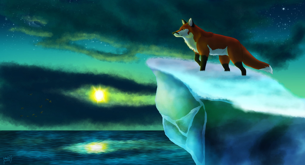

Published: 2014-03-23 00:38:52 +0000 UTC; Views: 1643; Favourites: 54; Downloads: 10
Redirect to original
Description
This artwork comes with a YouTube video draw set to music (“The Rocky Mountains” by Tim Janis), which you can find here:It had been too long since my last picture featuring my fursona. Backgrounds are often said to be the best parts of my art, so I picked a Rocky Mountains scene. Using a few reference pictures and my own imagination, I created this picture without painting over any photos, which had been my approach in last year's “Rocky Moutain Splendor.”
I set out to draw this picture with the aim of making a better painting than any of my previous works. I tend to think of views, favorites, and especially comments as a general barometer for the quality of my art, and I couldn't help but dwell over how my most-commented and most-faved picture “Silvia's Winter” is from 2012. I think I've measurably improved my techniques since then, and I wanted to take on the challenge of drawing my fursona in a pose that I didn't have a similar reference image for. In addition to testing my command of anatomy in this painting, I wanted to work on depth and foreground/background contrast. You can see my guide lines and vanishing point briefly in the video draw, as well as simplified trees used to establish the scaling with distance. I certainly wanted to avoid the flaws of some of my recent (Fall 2013- Jan 2014) work. “Autumn Trails” seems to show each part of the picture as if it were viewed from a different perspective, and the ground almost serves as a wall in “Discover.”
Most likely, I'll be taking time to work on my story outline and manuscript in the next few months. I've found that I write several hundred words per hour of story as a typical pace, so the time involved in creating this could have been used to add thousands to my word count. In any case, I'm glad that I spent so much time on this picture. I like the feeling of having a new “personal best picture” that I've painted.Time taken: 20 hours of drawing (3/12-3/19), followed 3-5 hours of editing recordings and compiling the video draw (3/20-3/22). Programs Used: Adobe's Photoshop, Premiere, and After Effects CS4; Camtasia Recorder and Camtasia Studio 6. Resolutions: 5700 x 3900 original canvas; 1280 x 720 (720p HD) video draw; 2850 x 1950 download available. The brushed aluminum overlay texture is sourced from cgtextures, and I used the Fall and Winter tree brush pack by just-nate, found here: just-nate.deviantart.com/art/F… . Artwork “Alpine Vulpine” and my fursona © foxstory 2014.
Comments are appreciated, as always. I like receiving constructive critcism and finding out what viewers liked best. I often think of what previous comments pointed out when working on successive pictures, and I hope to improve my art skills further with future works.
Related content


Comments: 31

I really like your scenery and the way you mix colors. It makes your art look a lot more finished than if you just had the character with a simple background. Great job!

👍: 0 ⏩: 1

Thank you! I've found that backgrounds are often one of the most liked aspects in my art. I thought that gray, blue, and green would make for a nice general palette in making this mountain scene.
👍: 0 ⏩: 1
Really? Well you did a good job on it and it creates a nice, more rich atmosphere... makes me want to paint some scenery myself

👍: 0 ⏩: 0

As always I really love the texture in the background, especially of the rocks and the log in the river! Some parts of the river are hyper-realistic as well, but then other parts like the bottom left aren't as consistent. It was cool to watch how you populated the piece with trees, and the rough painting of the leaves/pine needles in the foreground make it feel as if a breeze if blowing.
Some of the grass texture appears painted (the horizontal strokes) and other bits look spotted (like in the bottom center). I'm not sure if that was intentional, but it might come out better if the strokes matched the form of the grass (similar to the yellow parts). You sorta did this with the leaves/pine needles, so it'd be nice if the grass was done in a similar fashion.
The only thing I don't like is the sun(?) in the top center. The color, size, and placement feel off to me. I think this piece would look much better without it, but that might just be me. Alternatively, place it in the fox's line of sight, so that our eyes are drawn to the same thing as the fox's.
👍: 0 ⏩: 1
In using the water texture, I shaped it to match the main body of the water, and I now see how it didn't extend to the bottom left. I felt it was important to show my process in a video draw for a more complex full picture like this one. I didn't really make any horizontal strokes in the grass, so I think you might be seeing the brushed aluminum overlay texture (especially in the center of the picture, by the bend in the river, where the texture shows up strongly). I don't put much care into grass strokes, since there are just so many to make. I suppose I could work on that, but I'm not sure what you mean by having the strokes match the form.
The "sun(?)" must have some real problems, then. I only added it after drawing the clouds so that I could set up shadows where I wanted them to appear. Do you think I could have gone with a pure white, or white-yellow smaller circle, then? It's probably a good suggestion to have it nearer to the line of sight, too.
👍: 0 ⏩: 1
For the grass strokes, something like your Halcyon Afternoon or Autumn Trails is what I mean.
For the sun, it's mostly the size/position that is off. I wouldn't mind the color as much if those two things were better, since I can see how the greenness of the color fits with the green in the rest of the piece. That said, it might be a bit too neon. For the size and position, it might be either the shading or the perspective, but I feel as if the sun should be so high up that it wouldn't even be in the frame of the painting. Part of this might be because of the Ponzo Illusion or the light bending explanation, both of which stem from the perception that the sun/moon appear larger when close to the horizon than they do higher up in the sky. In your painting, the sun is both tiny and close to the horizon, which seems unnatural. If the perspective of the painting was shifted (say, rotated a few degrees into the screen if pushing on the upper boundary) so that the sky takes up more space, the sun's size might be less of an issue.
It's good that you were thinking of the position of the light source when shading though! I forget to do that a lot.
👍: 0 ⏩: 1
This kind of feedback should be really helpful for my next picture involving the possible portrayal of the sun. Thanks for putting all that thought into your words.
👍: 0 ⏩: 0


Hey! I'm really sorry that im never active on dA anymore, but i decided to come on again and give ya a lil feedback ;D
Firstly, I loove the style of this, its such a lovely, painterly effect. I can see you've definitely paid lots of attention to the background, such as all the trees, the rocks textures, and the ripple, sheen effect on the water. I would say you could focus on shadows a little bit more, don't be afraid of 'em! Particularly like areas such as the grass; i feel like you could contrast it a bit more and add more shades and more blades of grass. If you want to loose the 'paint' like effect and go for a more realistic effect, I would recommend you use smaller brush strokes, particularly in areas such as the trees
Now, onto the fox. Your anatomy has definitely improved, but i would say that the legs look quite small and stocky in proportion to his body. Most dogs legs tend to have quite long, thin, muscly legs in bigger canines such as wolves, foxes, collies etc. The head of the fox is really good, you've gotten an incredibly good shape for it! The style is very good as well, you're getting good!!
Overall, you have improved in leaps and bounds, and I hope you keep improving!
(if you ever need me to come see your works, just ask on tumblr as usual, i'll DEFINITELY come take a look if i see it on there!!)
👍: 0 ⏩: 1
It's wonderful to see you back here with this comment! (i'll be sure let you know on tumblr when i put up stuff i'd like you to see, and thanks for that offer~)
I'm glad that I created what's known as the "painterly" effect. I also experimented with different strengths of shadows along the way, but I was afraid that they would counter the bright, spring-summer aspect too much. I can also imagine that contrast would have helped the grass, and I know my trees relied on the large, gestural strokes. Someone else pointed that out about the legs, so I'll have to keep that in mind for my future fox art. Thanks for the comment about my improvement! I really value hearing from people, such as yourself, who have watched my art across a longer period of time.
👍: 0 ⏩: 1
Hahah thankyou! Isn't a problem!
Aah that makes sense, if youre going for a bright effect, you could add yellow tones as highlights to counter any darker areas. You have definitely improved in leaps and bounds with youre anatomy, but theres always gonna be room for improvement! Well i'll definitely keep watching, its a pleasure to see your art!
 (Smile)")
👍: 0 ⏩: 0

I think for the anatomy of the fox, They have thin, long legs, so make them slightly longer. I say the the tail should be slightly fluffier and a little bigger ears and more oaf a low swooping arc in the spine, but other then that, It's all perfect!!
👍: 0 ⏩: 1
I think you're right about making the legs longer. I'll also keep in mind your comments on the tail, ears, and arc. This was just the kind of feedback I was hoping for- thank you so much!
👍: 0 ⏩: 1
Oh, awesome!! I'm happy that you think it's ok! Keep up the good work!!
👍: 0 ⏩: 0

I love the style of the background. The trees, grass and mountain almost like they could be painted traditionally. Very interesting effect
👍: 0 ⏩: 1
Thank you! I wanted a scenic, grand landscape with an intricate layout. I hadn't aimed for a traditional-like effect, but it's nice to know that you saw it that way.
👍: 0 ⏩: 0

this is so awesome!
I'm impressed how your backgrounds are detailed, with an excelent sense of depth")
these mountains and the shading on them is so good, and the lines on the water give a nice realistic effect.
I like the way you did the trees, so different of my lazy way, I use a pre-made brush (made by me). also the grass strokes are fine, i'd just recommend you to use some more contrast on the strokes
also you're improving with anatomy!
wow, I'm impressed how these school works are making me pay more attention to the details of things.....


👍: 0 ⏩: 1
Thanks for the detailed comment!
I find that I prefer the way that backgrounds can be taken in many different directions, whereas anatomy has to conform to a standard or ends up looking off. I picked out the mountain shading after placing the clouds, hoping to get the shadows' positions right. Also, I used a tree tutorial to pick up this method. Yes, I've heard that the grass could have used more contrast. Actually, I think I could have made the legs longer proportional to the rest of the body. (also, my fursona's left limbs, further back from the viewer, don't exactly match the others in scale. it's hard to notice but still something i'm not satisfied with.) And thanks, I plan to definitely work on variety in poses.
👍: 0 ⏩: 1
well, I think it can be approved because, as it looks like the viewer is "in the air", the legs are in a right length to show a view from above
👍: 0 ⏩: 0

Aw, I love when the artist suggest a song! Thanks!
Lovely piece. It's really relaxing and refreshing in some sense, like if it through away all problems for a moment. I like the fox expression, the river's waves and the colors most.

👍: 0 ⏩: 1
I actually have lots of other songs I like that could also be incorporated into future video draws. I was hoping to develop a feeling like that with this picture, and the water texture from cgtextures was helpful in adding the ripples.
👍: 0 ⏩: 0

Thank you! I feel that I work best with backgrounds, since they can become so many different things.
👍: 0 ⏩: 0


Thank you. I'm glad to find new individuals interested in following my art.
👍: 0 ⏩: 0
