HOME | DD
 Fraot — Megaman X ~ New Menu interface (test)

Published: 2013-11-11 23:32:01 +0000 UTC; Views: 1603; Favourites: 14; Downloads: 12
Redirect to original
Description
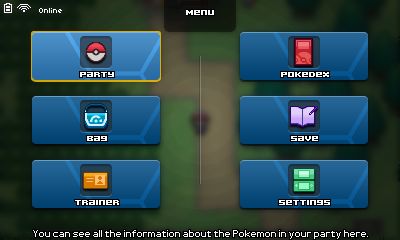
Preliminar menu screen
Very busy with finals on my college...
This is a new remastered menu screen. I love blur and looks way too elegant
")
Added new techno-ish thingies.
I got tired of the old screen because it seemed too archaic and with a lot of text.
It's just in beta, and want to enhance it but I can't get my mind clear to organize the data accordingly.
The subtanks were just cut and pasted from the old screen.
EDIT 1:
- Added red thingies below the weapon buttons, not really sure but it adds a little of swag.
- Added a darker background on the right side, and decided to make it a "sidebar".
- Added separators for each section.
- X looks a little darker... he was too light.
- Changed the font of the sidebar. The time and rank texts are bigger. And also, you wont notice, but the overall font is different. It was Visitor TTK and it's now Acknowledge TTK (for those interested in the fonts' names).
- Added a second visible slot on the elementals section. It looks cool to me with that gradient mask , but I think it will not be done in-game since there's no way to apply masks in a portion of the screen.
- The elementals' names are in a mix of spanish and latin now, like to add a little bit more of variety.
- The blue-ish glowing thing on "Plasma Ray" is the cursor, btw.
EDIT 2:
- Added a separator on the sidebar.
- Added a pop-up menu. It fill the empty space. I'm sure I should have done that before and I think it was pretty obvious how was it gonna be.
- It's pretty much done. About 95% done.
Please comment, I want feedback, destroy my work if you want, I just want feedback.
*Each time I update you might get notified and I will also add the new version below in a large vertical picture to see my progress.
Related content


Comments: 11

It's pretty self-explanatory: for a game I'm making just for fun.
👍: 0 ⏩: 1

Oooooooooo Man this sounds fun. :3 Not like Capcom's gonna give us a game either. :3
👍: 0 ⏩: 0

Awesome improvement
~Liked the diagonal lines in the health bar better though
~The red lines look out of place
~Like the person before me said, the menu arrangement does look out of place now that it's been mentioned and feels like there is space that should be covered with something (example: the middle)
Maybe you should go on a game menus sight seen spree to give you some ideas
👍: 0 ⏩: 1
I prefer the vertical lines because they look more like the classic Megaman X health bar.
I need to work more on how to make the red lines to fit.
The middle will be used when the player presses the Accept Key. You see, a menu will pop up to choose weapons. Taking that into account, I didn't want that menu to overlap with something in there, and I places an empty space.
Believe me, I've been basing myself on some menus and those look so damn good but not mine!
👍: 0 ⏩: 0

This is not my forté when it comes to commenting on anything to do with graphics. So I'll try my best here.
The colour choice is chosen quite well giving a dark and subtle look to it, gives a sort of modern sense.
The text is quite easy to read being clear on colour contrast to the background and in size, although I'd increase the play time text size a bit as it's a tad small.
I'm not sure about how you've decided on the layout as in my opinion it seems fairly random and out of place. I like what you've done with the face cut out though, that was quite a nice feature there.
👍: 0 ⏩: 1
You got it right! Hahaha, it's awkward, since I made this interface based on my old one and that one was made randomly.
You see, I don't know much about "theory" when it comes to layouts and organisation of interfaces, and I'm learning empirically.
The font on the right side is small, I know, but I really want to use as little amount of fonts as possible and I don't really know what font to use
")
P.D: Now that I think about it, it kind of resembles Megaman X4's menu and Megaman Zero 1's too, I think I used them as a base unconsciously.
👍: 0 ⏩: 0
I appreciate your favorites, it's really nice.
But please, comment, I want criticism.
👍: 0 ⏩: 0

Way better
Question:
*Below X's face, is that a health bar?
~If it is, it would be cool if you could have different images depending on the health bar (like for example if it's on red, his face would be weary)
~With the updated menu screen, the retro looking sub-tanks look out of place
Overall amazing
👍: 0 ⏩: 1
- Yes, it's a health bar. The color and different face seems like a good idea!
- I know, they don't look good. I don't know if either i will make new "minimalist" ones or use as place holder some from other games.
Thank you!
👍: 0 ⏩: 0