HOME | DD
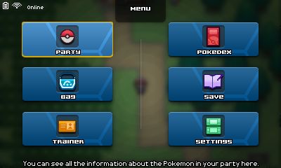
 Fraot — Pokemon ~ Load Screen (mockup)

Published: 2013-09-29 03:00:07 +0000 UTC; Views: 2989; Favourites: 34; Downloads: 39
Redirect to original
Description
Simple, right?I am ashamed of this deviation. Looks horrible. Would like to have more time to make it better.
EDITS:
- I added a female version.
- If you're german, you'd pronounce the name of the town where the dude saved 100% accurate.
Otherwise, it's pronounced: "Toy-blahn" Town.
- Made it brighter. Yeah, it was dark and very distracting.
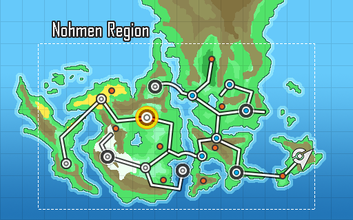
I felt like making one, since the damn Map app is very hard to make without a map made by me to match my style. I'm not organized, I know. But still...
I might not make more interfaces in a while, since I got addicted to Persona 3 Portable (after the obsession with Persona 4 Golden) and use to play it when I'm not doing homework.
That being told, you can guess why I added a "New Game +"; wouldn't it be cool to start your adventure again without losing your items and/or Pokémon and adjusting the difficulty?!


Related content
Comments: 23

👍: 0 ⏩: 0

Do you want to help with my fangame? i could use an amazing graphic designer like you.
👍: 0 ⏩: 1

No, sorry.
I have no time for working on other people's project. I have to step down even from my own projects.
👍: 0 ⏩: 0

I know, right? I think I'll use a totally different background in the end.
👍: 0 ⏩: 0

It is a bit too dark and too much texture for my taste. I think It'd look cleaner if you removed the diagonal stripes or the smaller squares within the squares. Actually maybe just the diagonal stripes. They clash with the other textures.
👍: 0 ⏩: 1

Fixed!
What do you think now? It's brighter and has more readability.
I was testing something I have in mind for a techno interface in my Megaman X, but I failed for now.
I know how to use it now, but it doesn't fit what I try to do with Pokémon.
👍: 0 ⏩: 1

I think that the removal of the diagonal stripes worked out great. It looks a lot cleaner and is easier on the eyes. No big contrasts in the design. Looks great dude
👍: 0 ⏩: 1

Thank you! Also notice the female has a "different" background. No big deal, just rounded white squares instead of black ones.
And I love the pink on the name too. It's way better and more lively for a pink than the old one.
👍: 0 ⏩: 1

Yeah, I noticed the little subtle differences. Anyway, good work on the overall design. Oh, and you managed to put quite a lot of info onto the load screen
👍: 0 ⏩: 1

It that bad? I think the info is not too much. Since there's only 1 screen unlike the 3DS.
👍: 0 ⏩: 1

I said there is a substantial amount of info, lol, I didn't mean to imply there is "too much". It's a good amount of info
👍: 0 ⏩: 0

I think you should have used the background (color scheme) from your PokeCOMP mockup; it's really appealing to the eye
👍: 0 ⏩: 1

I'll have to disagree.
The background for the PokéCOMP fits for a "minimalist" style. I used it because it looks modern and futuristic (at least to me), and it resembles a mobile OS. You know, the PokéCOMP is a... a... modern device? Like an iPod Touch, that's why.
In other words, the PokéCOMP is the only interface that'd fit with that style. (again, to me)
This thing, with the other interfaces, has my style. Or at least, the style I try to pull.
👍: 0 ⏩: 0

I do like it but it does feel quite busy, so the text is lacking in readability a lot of the time. However I don't have any suggestions right now.
👍: 0 ⏩: 1

Was thinking the same, on the right area. You mean that?
I think that, in general, the chess pattern does that. I see what I can do to fix it.
👍: 0 ⏩: 1

Yeah I really think the chess pattern is making this a bit overly busy.
👍: 0 ⏩: 2

Ok.
Problem with the pokémon in the party? I'm about to update this deviation and want to know.
I think the readability is better now. Waiting...
👍: 0 ⏩: 0


