HOME | DD
 PeekyChew — XENOTIME Menu -Completed-

Published: 2011-08-17 12:31:45 +0000 UTC; Views: 3457; Favourites: 25; Downloads: 54
Redirect to original
Description
Update III: I've completed the Pokédex info and party info screens, which took quite a long time to do considering they were originally designed for a much taller screen. The rest of the menu has also had some minor changes made to it which make it even better than before.All of this took a lot longer than it should have. Since I had to switch the version of essentials I was using, I needed to redo all of the scripts as the old ones weren't compatible. It took ages, to say the least.
What do you think of the new parts?
Update II: Added the final part of the menu, the party screen. So it turns out I didn't actually need any help in making the menu, despite the fact I left it for eight months waiting for a scripter...
Update: Added the bag part of the menu, which was surprisingly easy to script.
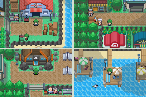
An update to XENOTIME's existing menu system, which you can find here: [link]
I'm really happy with how this turned out, it looks far better than the old one in my opinion.
Credit to Korinkublaster for the trainer sprite.
Related content
Comments: 38

Hey man, not too much honestly. I kind of lost most of my motivation to actually complete the game a couple of years ago, and any progress since then has just been minor changes to the maps as that's what I've always enjoyed doing the most.
I do still plan on using the assets from XENOTIME, such as the maps and the menu system on a couple of other much smaller projects, but I'm afraid to say there's almost no chance of XENOTIME itself ever being released anymore
👍: 0 ⏩: 0

Looks great, but I still think you need to move the pokemon icon's across slightly - especially the one's on the left, as they overlap the purple bit.
👍: 0 ⏩: 1

Thanks! That was mentioned before, and I did fix it, but since I've redone the menu system again the error has returned. I'll have to fix it again.
👍: 0 ⏩: 1

No problem, it was me who mentioned it before too :L
👍: 0 ⏩: 0

Looks nice, more traditional and detailed than my menus but that's okay since I'm not good at building menus. So great job.
👍: 0 ⏩: 1

My only issue is the party script where the writing blends into the background too much, i'd make the shadows darker and possibly outline the pokemon in white? I don't know what to suggest but rattata is also fading into the background in his tail. :3
👍: 0 ⏩: 1

I actually still need to change that to be the same gray colour as the rest. And for the Ratatta, in-game they're all hopping so won't fade.
👍: 0 ⏩: 1

If I am a scripter so now I could make a cool bag system.
👍: 0 ⏩: 1

But it's already finished xD
👍: 0 ⏩: 0

loving the white space. easier on the eyes than those scanlines. dont get me wrong the scanlines were nice but these are..neater.
👍: 0 ⏩: 1

Yeah, they weren't that nice honestly.
👍: 0 ⏩: 0

The completed menu looks beautiful
I like the choice of purple you've used
If I was you I'd change the Icon's :/
So the Pokeball matches pokemon B/W and the Pokemon animations (Cyndaquil etc)
Could be the Pokemon Mystery Dungeon one's?
👍: 0 ⏩: 1

Thank you!
Yep, that's my personal favourite colour.
I haven't seen what they look like in B/W, mind linking me? xD
And sadly I don't actually have enough time to change every one of the icons
👍: 0 ⏩: 1

[link]
There's the sheet with the Pokeballs on them
Also Cyndaquil's nose hangs over the box
Good Work though
👍: 0 ⏩: 1

Thanks I'll consider using them.
Oh I didn't notice that, I'll try and fix it now xD
Thanks again!
👍: 0 ⏩: 0

They background of the items (like where the words are) is very plain and boring. do like you did on the trainer card maybe?
and i think you should move the item image down to where it is originally, where the X is now. That would make the most sense.
Just my opinion thought! It all looks great!
👍: 0 ⏩: 1

To have the same border on the menu as on the trainer card I'd need to make the names of the items closer together. But I don't know how to...
And thanks for the suggestion, it does make more sense!
No problem at all, I love constructive criticism xD
👍: 0 ⏩: 1

what? no i mean the background. like how there's grey behind the words! i think it would look nice if you did like, bars for each row or words... if that makes sense.... on the items... idk haha
👍: 0 ⏩: 0

Simple, but effective
You see all these fangames, with flashy screen's and whatnot :/
But this truly shows, how simple a Pokemon Game can be , but be attractive, and draw in the audience
The colour's are nice, reminds me of R/S/E .. Also it doesn't look photoshopped, which is a good thing 
Good work
👍: 0 ⏩: 1

Yeah, when making the menu system I was trying to go minimalist, but also show some nice colours. The whole game is actually very inspired by R/S/E, my favourite Pokémon generation.
Well, it is a Pokémon game, so has to be pixel art in my opinion xD
Thanks!
👍: 0 ⏩: 1

No problem
I just like to see original concepts
And me too 
Good luck with Xenotime
👍: 0 ⏩: 1

Yay, another R/S/E lover!
Thanks again
👍: 0 ⏩: 0


