HOME | DD
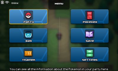
 Fraot — Pokemon ~ PokeCOMP: App selection menu (mockup)

Published: 2013-09-22 05:55:15 +0000 UTC; Views: 1147; Favourites: 11; Downloads: 6
Redirect to original
Description
Pretty quick menu*EDIT 1:*
Added the Phone and Achievement icons. I remembered I said a Phone app would be here.
- First, I tried to make a cross, so the achievements would be inside the trainer card and only 4 icons would be shown, but that'd be a mess. Very complicated to access (lower picture).
- Then opted for a equally-nice plain horizontal view, in my opinion, it looks better and it's easier to code. (upper picture, final)
Dudes, I love minimalistic style. I couldn't help it but to use it. I managed to figure out the only interface that would fit that beautiful style.
I'm not convinced 100% but anyway, I'll change it later. So, stay tuned for any updates here. I used this layout because I wanted to make kind of a "cross" with items in each of the tips; but as I said, I don't think I'm gonna make the Achievements app.
You have to see this in action, it will look cool.
Related content


Comments: 13

I've been wanting to make some minimal interfaces like this for a while. These look amazing.
👍: 0 ⏩: 1

Yeah, I'd go with the horizontal view. It looks cleaner and more organized. Not that the circular one is bad, but the horizontal one is a bit more appealing.
👍: 0 ⏩: 1

Yeah, it was a pain to code that damn circle cursor movement trying to make it glitch-free.
With the horizontal one, it's easier to code and it also does not sacrifice elegance.
👍: 0 ⏩: 1
Lol, circular movement, not my favourite. I did it for, dunno what anymore, using the equation of a circle (x^2 + y^2 = r^2), and got smooth results. I always used to try doing it as functions of sin and cos, but that was just dumb on my part. Hahha. Horizontal movement is much easier to code.
👍: 0 ⏩: 1
The movement was easy pie, to make it move correctly regardless of the crazy key presses of any player and always go to the desired coordinates with no mistake was the real pain.
It's was actually uniformly accelerated movement for X and Y with the same acceleration rate (I should say deceleration). From left to up; once Y reaches the maximum value before start decreasing, it stops and... so on for the rest.
👍: 0 ⏩: 1
You could always have it calculate the arc distance it has to move from one button to another, and then have it move in a circle until it reaches the desired distance. I had a similar thing like that with 2D paging, where you didn't go through page by page, but rather could skip to pages horizontally, vertically, and diagonally. In principle it's the same thing.
Haha, you were even thinking about acceleration (no matter which direction). I wouldn't have done that. Don't know how it is in Game Maker, but knowing RMXP, correct accelerated movement would be a pain as the movement does not get smaller than a pixel, which can cause (and usually does cause) misalignment.
👍: 0 ⏩: 0

Well... I was going to upload the WIP battle system I am working on, but you have crushed my ego. Congrats on being amazing.
👍: 0 ⏩: 1
Thank you and sorry.. at the same time.
👍: 0 ⏩: 1
Oh well. I will swallow my pride.
👍: 0 ⏩: 1

Once again, this is beautiful (I love minimalism interaces too)
Although I don't think it should be a priority, I think an achievements app would be cool. Who doesn't like being rewarded for stuff they did?
👍: 0 ⏩: 1
Well, you're right. I will add it just as a placeholder (as MOST of my content), but I don't know what to make as a icon. I'll do some magic there.
And btw, since this style is not very consistent with the other in my interfaces, I had to use stroke for the font where the names of the apps are just t make it look more alike. A black font with no stroke fits 1000x better the minimalist style.
👍: 0 ⏩: 0