HOME | DD
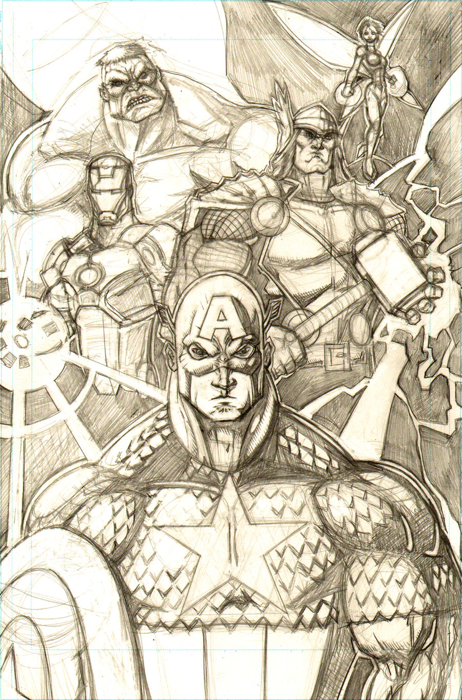
 freddylupus — UPDATED - Avengers Pinup WIP
Published: 2010-06-23 21:40:03 +0000 UTC; Views: 2084; Favourites: 63; Downloads: 49
Redirect to original
Description
avengers pinup i'm working on. also thinking about doing a jla pinup with a similar composition.......Related content


Comments: 24

This looks really good so far - you are really talented and I admire your skills.
I see this was posted last summer, so I was wondering if this is ready yet? I'd love to see the finished piece.
👍: 0 ⏩: 1

this was the last piece i got to draw for myself before starting at the joe kubert school of cartooning and graphic arts. i draw non-stop...but if i could get an asignment where this was applicable i could probably finish it up and use it..
thanks for the kind words!
👍: 0 ⏩: 0

the almost original avengers
cap didnt join until issue 4
and cap is to be honest a bit too buff other then that everybody looks fine and looks like they should
👍: 0 ⏩: 1
thanks, man!
i was going for a lineup similar to one we'll see in the avengers movie coming up.... and yeah, with my figures i usually have to force myself to tone down on the muscles - my spider men are usually built like captain america should be, my caps are built like thor, my thors are usually more built like hulk...and my hulks are rediculous lol
👍: 0 ⏩: 1
the hulk should be ridicilous
he is after all the hulk
👍: 0 ⏩: 0

it's by far my most popular pic believe it or not!
👍: 0 ⏩: 0

love the addition of wasp and thor's armor looks amazing
👍: 0 ⏩: 0


Great picture!
Excellent composition and fantastic pencil work!
👍: 0 ⏩: 1
thanks! it was a fun one...
👍: 0 ⏩: 1

")
thanks! was working on that over the summer and since then have started my first year at joe kubert's comic school....if i'm going to go back to that i'm going to have to find a project i can apply it to lol
👍: 0 ⏩: 0


'preciate the kind words!
👍: 0 ⏩: 0

Lookin good so far, the only thing i could think to add would be the top of caps shield maybe.
Don't forget to choose here your light source is early on o you can be sure to make it look super sweeeet!
So far I am digging thor and hulk the most, maybe shorten up caps nose some, like increasing the distance between his mouth and his nose.
Keep bringing!
👍: 0 ⏩: 1
thanks man! i was thinking about putting cap's shield in there  (Smile)")
as far as the light source goes, i was gonna have it coming from the top left (you can still see the bottom of the lighting cone up there) until i added thor's lightning and iron man's repulsor-blast-thingy. i'm probably going to forgo the first light and just go with the visible light sources, but i'm not sure how best to go about that
...and believe it or not cap's nose was actually shortened before i read this! lol
👍: 0 ⏩: 1
Maybe stay with the first light source and use the other things for secondary light on the figures generating them. Othrwise you will have a bunch of backlit figures in your foreground.
👍: 0 ⏩: 0

thanks man...still a LOT of cleaning up to do
👍: 0 ⏩: 0