HOME | DD
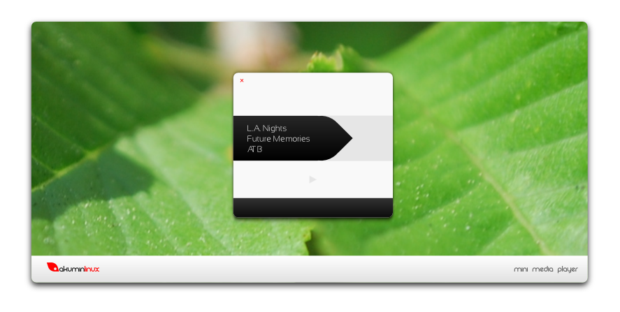
 FrozenTheaterD — Akuminlinux Desktop Mockup

Published: 2009-04-14 15:32:12 +0000 UTC; Views: 6711; Favourites: 32; Downloads: 299
Redirect to original
Description
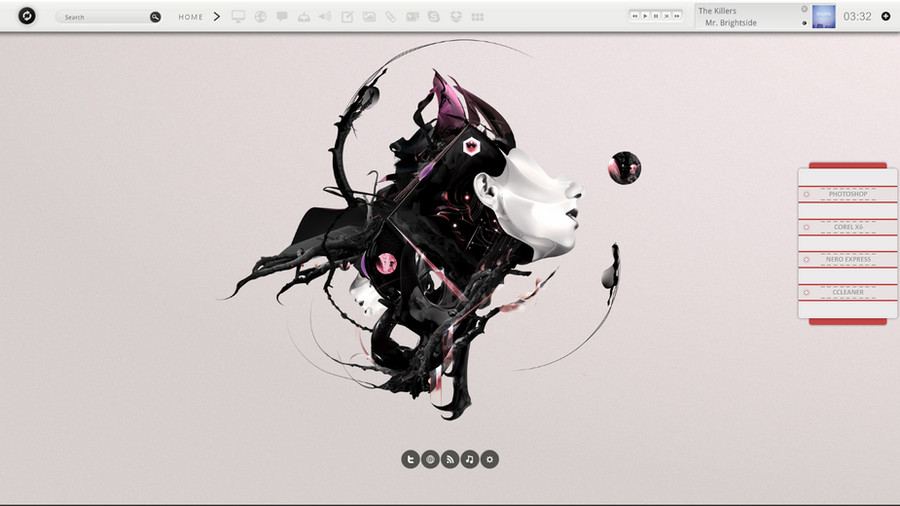
This is what we aim to achieve with akuminlinux. I finally found a sans-serif font that goes well with rezland, the funky titlebar font. It's called sansation! You can download it free at dafont.comRelated content


Comments: 37


 (Smile)")

The system tray icon colors are somewhat of a distraction, but very out-there and interesting!
👍: 0 ⏩: 0


neat! That recycle bin icon is sensational!
I love the flamboyance of the window borders as well.
👍: 0 ⏩: 0

this is superb, have you been able to make it REAL since you first submitted this concept?
👍: 0 ⏩: 1

we have a working alpha, but it is not very visually refined.
👍: 0 ⏩: 0


great concept man! looks very nice!
possible skin and innovative
👍: 0 ⏩: 0


"its not the weather that's trippy. perhaps it is the way that we perceive it that is indeed trippy... mannn, i shoulda just said YEAH"
interesting theme
👍: 0 ⏩: 0


I wish all OSes shipped looking this good! Linux is in especially desperate need of an awesome first impression. Mac and no Win7 look pretty damn good on first boot. Linux is getting there but still dragging it's feet (Ubuntu brown and orange for example). Oh and the teardrop is a perfect metaphor, computer problems have more than a few times induced tears! XD
👍: 0 ⏩: 1
well said and thank you! our site, akumin.com, is going up very soon, keep your eyes peeled.
👍: 0 ⏩: 0

im a big fan of some of your work. wanna help out with akumin?
👍: 0 ⏩: 1

yes have YOU the icons ")
serrious But you want to know if I want to give you some help right?
👍: 0 ⏩: 1
correct. and yes, i have a full linux icon theme which will be released soon.
👍: 0 ⏩: 1
So I am not very proficient in the design interface. I started in the gtkrc Emeral metacity but long ^ ^ But your icons I want to ^ ^
And how can I help you as you wish? Sorry for my English
👍: 0 ⏩: 1
i could use help with the emerald!
👍: 0 ⏩: 1
But it is an idea that I find it unfortunate with emerald is that it clouded over in the process and ram.
Reassures me I understand the question? My English is sometimes ....
👍: 0 ⏩: 1
are you saying that my emerald idea drains ram and processes?
👍: 0 ⏩: 1
Yes and no! ^ ^ This means that your theme seems really cool. But we have to think about those small pc configuration. And demand for them emerald resource ram. Why not instead use metacity user and the other managers could not take advantage?
I think you should offer both.
👍: 0 ⏩: 2
Raahhh Yearrr! Dude it's fun Theme and project.
am pleased that all this
 (Wink)")
👍: 0 ⏩: 0
I am! There is also a metacity that isn't so power hungry. It's much lighter.
👍: 0 ⏩: 1
Yes I prefer to use that too
👍: 0 ⏩: 0

My only constant complaint is the metaphor used in your icons. For example the top icon in the sidebar and what I'm assuming is a HD on the desktop. Those aren't very clear metaphors at all.
Your look is really flashy and it looks like something a person would use when they want to trick out their desktop. But, to me, it doesn't feel like something that could ship default with an OS.
Also, I'd be curious to see what happens to your window borders when a window is maximized. If it retains the current border, I think a lot of screen real estate would be wasted.
All in all, it looks cool. But, I'm not sure how user friendly or efficient it would be.
👍: 0 ⏩: 2
That comment is actually bugging me greatly. I assume that you question the intuition because of the awkward shape of the windows, seeing as thats the extent of your elaboration. The importance of square windows is a general misconception in terms of intuition. I want you to examine several aspects of my design that you've overlooked under your more "conventional" aesthetic.
1. Windows have no reason to fill the entire screen. Apple stopped using that when their screens got big enough to accomodate more windows. Microsoft forgot. Windows should behave according to their content, and in most cases, that means there WILL be space. Cmon. You have a mac. Click the maximize button.
2. Take the manila folders you find in abundance at offices. Theres a reason for the tabs at the top. Protrusions make the windows more accessible. Their shape doesn't fit! It protrudes! And yes, this is good.
3. We are at an inconsistent point in minimizing desktop clutter. Although we obsessively adhere to dogmas of space preservation with windows and their behaviors, we easily create as many desktops as we need; a much better solution to trying to fit an optimal number into a single space. If you want to talk about intuition, I can assure you, having a family of psychologists, that while the mind does attempt to maximize workspace in its environment, its first instinct is to find a new free space. The computer world is losing track of this.
4. The mind functions on the concept of deviation from the norm. Stimulation is defined as deviation from homeostasis. In other words, people are looking for visual brain food. And so companies dish out glossy computers and glossy OSes, and people enjoy them for a while, but then look for more. So computers get glossier and bluer and suffocating, and people begin to think that's the only thing to satisfy their thirst. But if you approach the problem from a different angle, the effect on the human mind is so great! And if you can be subtle about it, you can feed the mind for a long time. Thats how classics in the art world are created. So in other words, yes it doesn't look like a packaged OS. And we're glad.
If you still want to argue that the GUI lacks the crucial space preservation needed by users of smaller-screened computers, I'll remind you that they too can have multiple desktops, and anyone can still use metacity as a space-saving alternative. But netbook computing power isn't a problem. They tend to have ridiculous resolutions and enough power to accommodate custom linux distros including ubuntu with crazy tricked out desktop effects.
And let me remind you that you adopted a similar side bar after viewing my mockups.
👍: 0 ⏩: 1
Wow dude. You read way too much into that.
Like I said, my only real complaint is your icons. The metaphors are not very solid.
I would argue that even though not everyone knows what a HD looks like, that SOME people will know what an HD looks like, MOST people will recognize the metaphor from other OS's, and that is a lot more people than the zero people that will connect a tear drop with internal storage.
I didn't criticize your window borders, I asked what behavior they would take on when maximized. If you've ever used my metacity theme, you would know that the window borders disappear completely when maximized. Or you might not notice the change. But, I think you would notice a quarter inch strip of nothing along the side of your desktop and it would annoy the hell out of me.
Also, I didn't criticize your side dock. I have a very similar side dock. I criticized the icons on the dock.
Don't take it so personally.
You have a very attractive design. It's nice. It's WAY better than it was before. And it gets better every time. But, there's still a ways to go. We are all constantly striving to be better. So, don't get hurt if someone tells you that there are things in your design that can be improved. We all have things in our design that can be improved.
👍: 0 ⏩: 1
Sorry. I tend to be overzealous about such things. The point in what I was saying is simply that there's a huge difference between concept and execution, and you should be careful not to make such definitive statements on the basis of the picture. In many cases, the execution fails to realize the concept to its fullest, but in this case, it's really the other way around. In desktops, reading into the subtle nuances of human interaction is of utmost importance. Akumin's ability to do that actively isn't something easily portrayed by a picture. Heck, show a stranger a picture of the mac OS X desktop and watch them become confused.
I do want critique! Continue! I will contain my hypersensitivity!
👍: 0 ⏩: 1
Yea... I think I'll have to see it now that you've described what you're trying to do. I'd still break up the text though.
👍: 0 ⏩: 0
1. That will most likely NOT be the final icon for the hard drive. But remember this: akumin is linux for the average PC user as an alternative to vista. I can assure you that only half of those people know what a hard drive looks like anyways, so it's not much more intuitive than a teardrop.
2. Funny, thats what critics said about XP and Mac OS when they first came out. Its all relative. People want visual stimulation, and thats what we're giving them.
3. Keep in mind also that the border posted is the emerald, which is for the more substantial and powerful desktops. I'm still working on it nontheless, but notably, the metacity is much less space intensive, which people with netbooks who need to maximize space and power efficiency will enjoy. Trends are beginning to show us that consumers aren't looking for efficiency and brute power. They want sexy desktops that can play their music and collect attention. Granted, akumin is intended for more diverse use, but you gotta make your way into the market somehow.
4. I get things done twice as fast as mac OS.
👍: 0 ⏩: 0