HOME | DD
 FutureMillennium — Jolana font
by-nc-nd
FutureMillennium — Jolana font
by-nc-nd
Published: 2012-07-09 21:29:31 +0000 UTC; Views: 1850; Favourites: 19; Downloads: 485
Redirect to original
Description
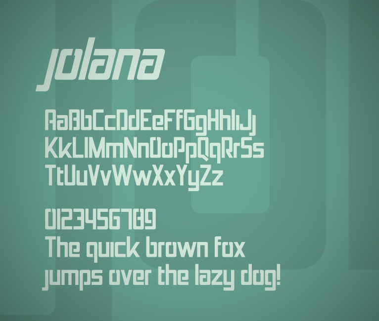
Free for non-commercial use only. If you'd like to use this font for commercial purposes, please purchase a commercial license .A sans serif stencil face.
Comes in regular and italic.
If this font lacks symbols that you need or you spot a strange looking kerning pair, please let me know!
Licensed under the Creative Commons Attribution-NonCommercial-NoDerivs 3.0 Unported License (CC BY-NC-ND 3.0)
Related content


Comments: 6


I don't like the break in O and o but other than that this is quite an excellent typeface.
👍: 0 ⏩: 1

Thanks! The breaks in the O's are of course quite the point of the typeface, but I understand if you don't like them
👍: 0 ⏩: 1
Yeah I get that but the breaks in the other letters are logical to me. A break in the O is seen in script but since Jolana is such a linear and modern design, the O stands out too much for me.
👍: 0 ⏩: 1
Think of it as a stencil! This typeface was primarily designed for lowercase characters and in italics, so the break in the O's might make more sense that way
👍: 0 ⏩: 1
I still can't think of it as a stencil, as the O is usually split in the middle in stencil typefaces. I don't think that's what this O needs though. You have something different from stencil typefaces going on and I think that's a good thing.
👍: 0 ⏩: 0