HOME | DD
 FutureMillennium — Dominik font
by-nc-nd
FutureMillennium — Dominik font
by-nc-nd
Published: 2012-07-08 02:43:32 +0000 UTC; Views: 3977; Favourites: 39; Downloads: 1141
Redirect to original
Description
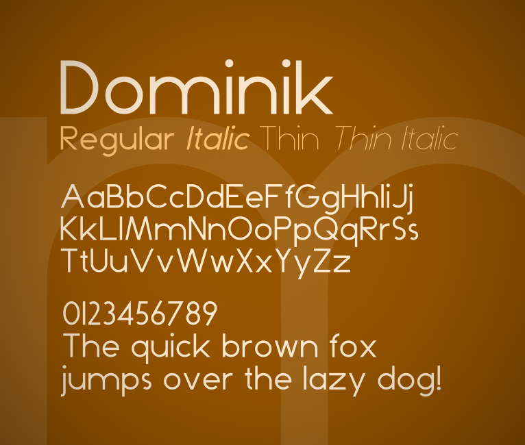
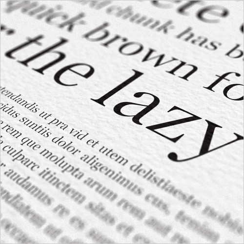
Free for non-commercial use only. If you'd like to use this font for commercial purposes, please purchase a commercial license .A geometric sans serif face.
Comes in Regular, Italic, Thin and Thin Italic.
Update 2012/7/11, version 1.10: Fixed lower case 'e', added Italic, Thin and Thin Italic versions.
If this font lacks symbols that you need or you spot a strange looking kerning pair, please let me know!
Licensed under the Creative Commons Attribution-NonCommercial-NoDerivs 3.0 Unported License (CC BY-NC-ND 3.0)
Related content


Comments: 8


In general nice work but you can certainly improve on a few things:
A/E/V – A bit too wide.
D/H/N/S/U/X/Y – Seems a bit too narrow.
M – I'm not sure this works.
m – The lowercase 'm' should never be twice as wide as 'n'. It should be more condensed. You did it correctly in case of 'w'.
i/j – The tittles (dots) are a bit too big.
P – Usually the bowl of P is taller than the bowl in R to differentiate more and to compensate for the large amount of empty space underneath P's bowl. So I would make the bowl a bit taller. This will also make the letter relate more to the design of the lowercase 'p'.
S/s – They're falling backwards.
h/m/n/u – These letters are too wide. You need to make sure the rhythm is consistent and as you can see with the wide characters it creates gaps in the texture of the text.
z – A bit too wide.
You should also make kerning pairs. Right now there's too much space after the 'o' when v, w, x or y comes after it. The same counts for the uppercase O and other rounded letters.
If you fix these things you will get a much more consistent texture, which improves the reading experience and the aesthetic of the typeface.
👍: 0 ⏩: 1

Thanks for your opinion! Most of those are stylistic choices as I was aiming for geometrical rather than optical consistency. Good tip about the P, I'll see how that looks.
I'll also be sure to make some kerning pairs with o and O for the next version.
👍: 0 ⏩: 1
That's a strange argument. Perhaps you're confused that these "stylistic choices" belong to the geometric style, but the fact is that 90% of amateur type designers begin with a geometric typeface because it's easiest, so in many geometric fonts you will find many flaws. A big one is the extreme width of h/m/n/u (which a very geometric typeface like Futura doesn't have either) and another one is not making rounded letters slightly bigger so they look optically as big as squared letters. I'm not saying you didn't consciously choose what you did but I do find it weird that you would choose to disregard optical consistency because that's a big part of any typeface including geometric. Just have a look at typefaces like Futura, Nobel, Neutraface and Gotham. A well known fact about Futura for example is that the O is actually not perfectly rounded even though it appears that way; that's how subtle these optical modifications usually are in geometric type.
By the way, I just realized in Futura the P and R actually have the same size bowl as well. Perhaps it's because I never did a geometric typeface, but I always try to make each letter differ from the other even if it shares the same kind of design elements. For example, when I've created 'b' I can't just mirror it to make a 'd', nor turn it upside down and make a 'p' or 'q'; all four of those letters are modified so they look optically best. Often when I do revert a 'd' to one of the other letters, it looks off. Anyway, I'm a fan of humanist typefaces myself so I guess because of that some calligraphic features just slip into my designs. To get back to my point though, my personal preference to make each letter unique indeed applies to a WAY less extent to geometric type. You will have to see for yourself what you like best.
Off-topic but you might find this interesting: there's a typeface called 'Legato' by Evert Bloemsma which I would classify as "fluid type" and it's actually the only typeface I know in that category. What the man did is make each letter including the shapes of the white space very different from each other. Supposedly it reads better than any other sans serif at text size, but there are so many theories on how to make the perfectly readable typeface that I couldn't judge on that, but it IS incredibly legible. You should have a look at the details. It's nothing for geometric type but it's something incredible which many type designers aspire to. I'm hoping there will be more typefaces like that in the future. I guess I would do one myself when I'm more experienced.
👍: 0 ⏩: 1
Well that's the thing; I wasn't trying to create another Futura, Century Gothic, etc. I did study geometrical typefaces (among other things) and know very well what you're talking about - I just wanted to do things slightly differently. I know there are many conventions like that in type design (and for good reason!), but that doesn't mean we have to strictly adhere to them all the time.
In all of my typefaces so far I experiment in one way or another - not because I'm necessarily trying to be different, but because I want to see if it would work - and I must say I'm fairly happy with how this one looks. As a web designer I tend to think of most of my fonts as typefaces for logos or more rarely headlines, since for text you're usually limited to web-safe fonts (not as limited nowadays with webfonts, but still prevalent!), and for those purposes some of the features, like the 'm' that's double the width of 'n', actually work really nicely, while things like legibility and flow aren't nearly as important.
You're absolutely right about geometric and especially square typefaces being easiest to make, and I'll admit to making some of the things you mentioned as mistakes in the past (which is why I'm updating some of my fonts, especially those from 6 years back), but for this one it really is a stylistic choice.
Humanist typefaces are of course a different matter entirely and I'll probably tackle those some day as well, but personally I'm a big fan of strictly geometric and futuristic typefaces (you can probably tell!), so that's what I'm mostly making!
Legato is an interesting looking typeface indeed and quite an intriguing idea for increasing legibility! I do have some ideas regarding legibility myself so I might give making actually legible fonts a try in the near future.
👍: 0 ⏩: 1
I get your point. I follow most rules but it's certainly fun to break some. I've done a lot of failed type experiments but every once in a while a really good idea comes up. Actually when I saw your typeface I thought it looked half like Futura (so I perhaps erroneously concluded that this was your main inspiration) mixed with some Venetian proportions. I really do think it's interesting but I still maintain the points of criticism I mentioned.
I've never gotten to web fonts production. I haven't researched the production process thoroughly but I believe hinting is very important and I guess that's just a step I will eventually come to in a few years in case my passion for type stays with me. For most of my typefaces I actually didn't even get to programming and spacing/kerning yet.
I think just about every type designer made the mistakes I mentioned in the beginning. I worked over 130 hours on this typeface called 'Celente' which was my first serif typeface and not too long ago I opened it again and it's quite terrible. The concept is good but the way I used vectors is bad and I believe there were still mistakes in the height of the rounded letters. Perhaps I will re-draw it someday but for now I have more potential works going on. It's nice to see I made progress in the quality of my typefaces and my knowledge though.
👍: 0 ⏩: 0

No jo, ty aby ses neprojevil
👍: 0 ⏩: 0