HOME | DD
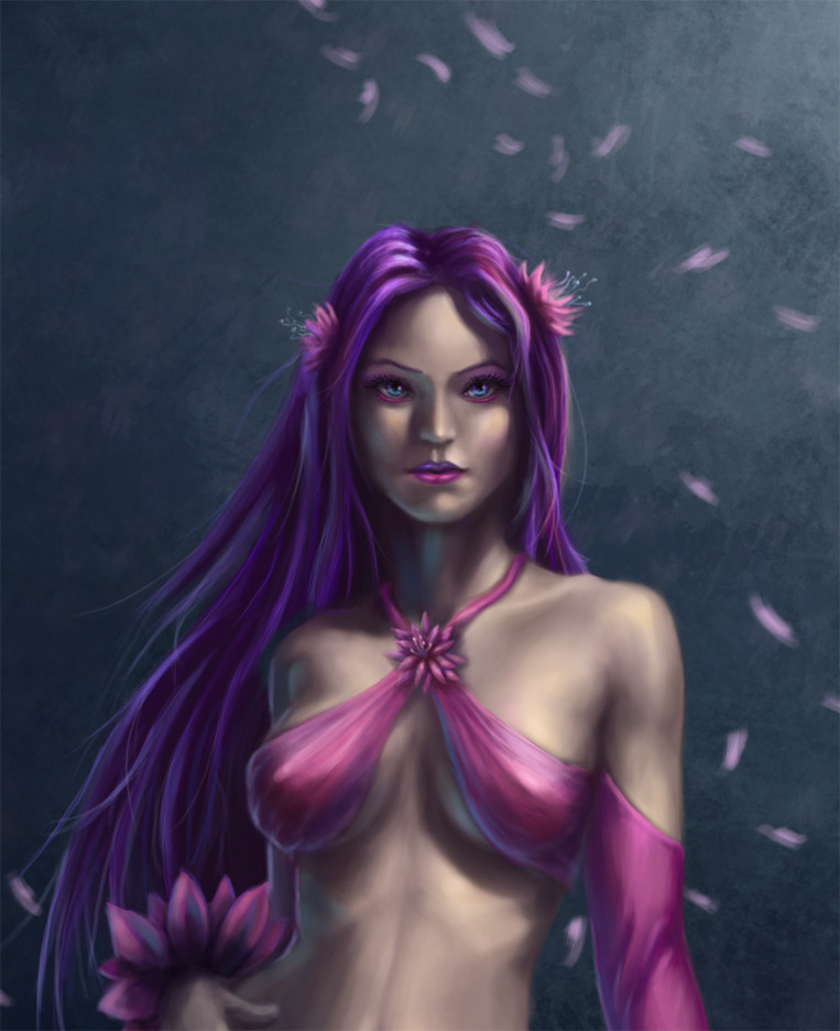
 Fuzzybunikins — Flow Mascot - Close up

Published: 2010-02-13 02:05:21 +0000 UTC; Views: 966; Favourites: 29; Downloads: 35
Redirect to original
Description
Edit: Well I am finished with this for now but I have every intention of returning to this image sometime when I have the time so I would still greatly appreciate any critiques you guys have to offer!


The full version may be viewed here:
[link]
Related content
Comments: 27

There's something about this piece that seems to bug me. Perhaps her flesh lacks warmth, it just looks lifeless in a way.
👍: 0 ⏩: 1

Indeed, me and some of my friends were talking about this. Thanks for pointing it out, the conclusion that we reached was(and I am not sure if this is correct): My colors are far too muted especially with how pink the outfit is. Because I did this image in a bit of a rush I spent very little time expanding my color palette to include more greens, reds, blues and colors that are very important to make skin feel lifelike. If you look at a really well done figure (I think: [link] is done quite well) there are a lot of variations in skin. I am hoping that by the end of this terms figure painting class I will have a better understanding of it.
That said I think that my approach to the color in this image in general leaves something to be desired. Having such a strong pink color on such a muted skin color leaves her feeling... washed out? It is something that I am -hoping- I will be able to fix once I come back to it.
👍: 0 ⏩: 1

Yeah, I'm certain with practice you'll overcome it. Frankly it is very washed out and it bothered me looking at it. I had a feeling you were going for the even look in the complexion but somehow you got lost in the color choices (you did after all mention your lack of RGB application) But play around with it. You'll find your 'zone' soon enough
👍: 0 ⏩: 1

God I hope so, I always feel so exasperated after this sort of thing, like the more I work the more I see how far I am from my goal.
👍: 0 ⏩: 1

Don't be afraid to make major changes to the piece during the creation, that's the beauty of painting. Granted digital media does change the approach we have towards applying colors it can also come out stunning to the viewer when done with more natural flow and application.
👍: 0 ⏩: 1

Oh for sure, I cannot tell you how much I miss being able to just completely repaint something and hide the layer if I do not like it when I work in oils XD.
👍: 0 ⏩: 1

What I normally do to emulate that 'feel' is never use the Undo feature. Instead paint over any mistakes or changes to promote that homegrown feel in a design. Its a nice touch I think
👍: 0 ⏩: 0

Thank you! I am not so great at lighting things out of my head but I think it turned out okay this time.
👍: 0 ⏩: 0

Annnnndddd.... its finished!
👍: 0 ⏩: 1

Awesome work. I wish that my art was as "horrid" as this!
👍: 0 ⏩: 1

Well I find the better I get, the more I notice how many mistakes I make so I feel like I am often getting worse. 
👍: 0 ⏩: 0

Awesome work, very beautiful, i like how you do the variations of violet colors, great job in this
👍: 0 ⏩: 1

hehe glad someone appreciates it, I had a headache from staring at all the swatches I put together so I could try to get it to look like that >,>
👍: 0 ⏩: 0

Looking great. If there are any horrid problems I can't see them.
👍: 0 ⏩: 1

I cannot either... but then one day I will be getting a critique where someone points out something really obvious and it makes me facepalm and feel silly.
👍: 0 ⏩: 0

Glad you like it, thanks!
👍: 0 ⏩: 1


